

Analyze user behavior
Frustration
Now let’s see how the same type of analysis can help us understand if our end users are experiencing friction interacting with the application.
Return to the Project Analyses and open the Frustration timeseries.
Explore the chart, data table, and session replay.
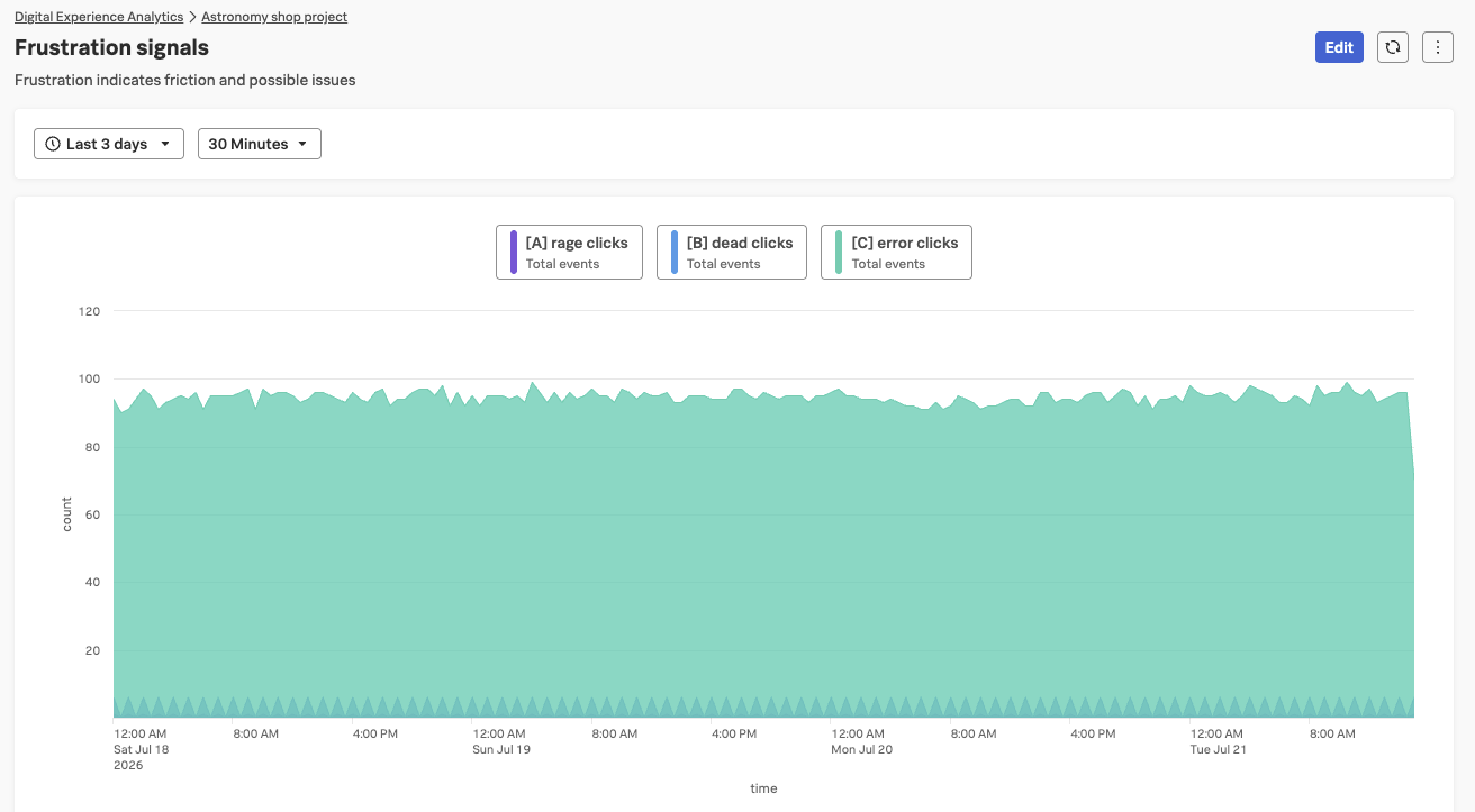
- What does this chart tell us?
- Can you tell why users are expressing frustration?
- This chart is tracking different types of frustration signals over time - such as rage clicks, errors, and dead clicks. Multiple users are experiencing points of friction!
- Did you find the useless “Show all reviews” button? Some users try to click it, it does nothing, and then the user rage clicks.
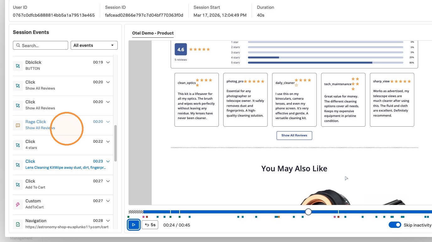
Because we are monitoring these frustration signals, we can take steps to improve our application and its content, and hopefully see those frustration signals drop over time. The better we can optimize our application, the happier our end users will be, and the more successful they will be.
Speaking of frustration, let’s now take a look at how to understand what’s going on when our end users are not able to do what we expect them to do.