Exploring Charts
In this section, we’ll start by exploring how charts are built and displayed in Splunk Observability. By examining and interacting with an existing chart, you’ll get a feel for how the chart editor works—how data sources are selected, how visual options are configured, and how different settings shape what you see.
1. Select a chart
To get started, make sure you have the SAMPLE CHARTS dashboard open and adjust the time range in the top-right corner of the dashboard back to -5M for Last 5 Minutes or select reset to default
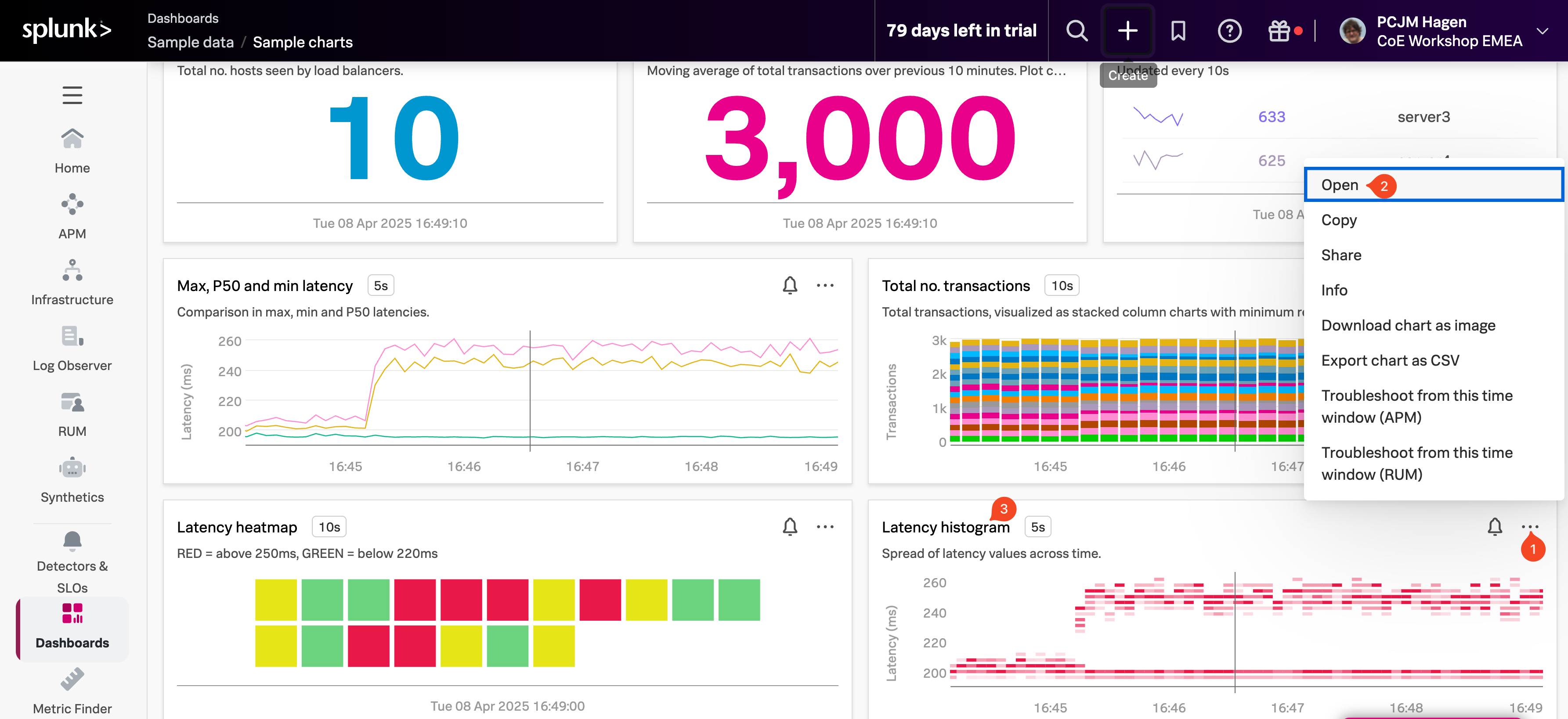
Find the Latency histogram chart, then click on the three dots (…) (1) in the upper-right corner of the chart. From the menu, select Open (3). You can also simply click on the chart title (Latency histogram) (2) to open it directly.
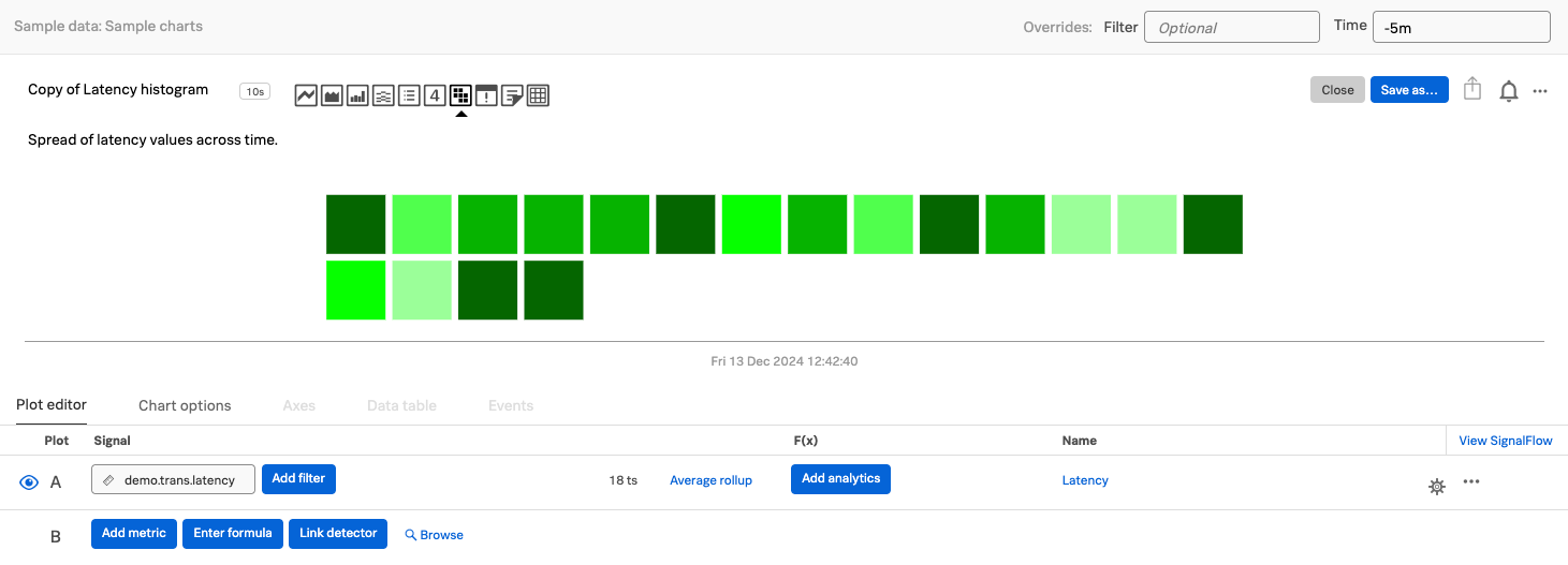
Once the chart editor opens, you’ll see the configuration settings for the Latency histogram chart.
The chart editor is where you can control how your data is visualized. You can change the chart type, apply transformation functions, adjust time settings, and customize other visual and data-related options to match your specific needs.
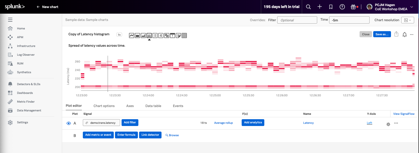
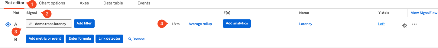
In the Plot Editor (1) tab, under the Signal (2) section, you’ll find the metric currently being used: demo.trans.latency (3). This signal represents the latency data that the chart is plotting. You can use this area to edit or add additional signals to compare or enrich the visualization.
You’ll notice several Line plots displayed in the chart. The label 18 ts (4) indicates that the chart is currently plotting 18 individual metric time series.
To explore different visualization styles, try clicking on the various chart type icons in the editor. As you hover over each icon, its name will appear—helping you understand what each type represents.
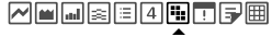
For example, click on the Heat Map icon to see how the same data is represented in a different format.
Note
You can visualize your metrics using a variety of chart types—choose the one that best represents the insights you want to highlight.
For a detailed overview of available chart types and when to use them, check out Choosing a chart type.