Using Filters & Analytics
1. Filtering and Analytics
Splunk Observability makes it easy to explore large volumes of metric data by using filters and analytics functions. Filters help you focus on specific segments of your data—such as a particular service, host, or location—while analytics functions let you transform and analyze that data for deeper insights.
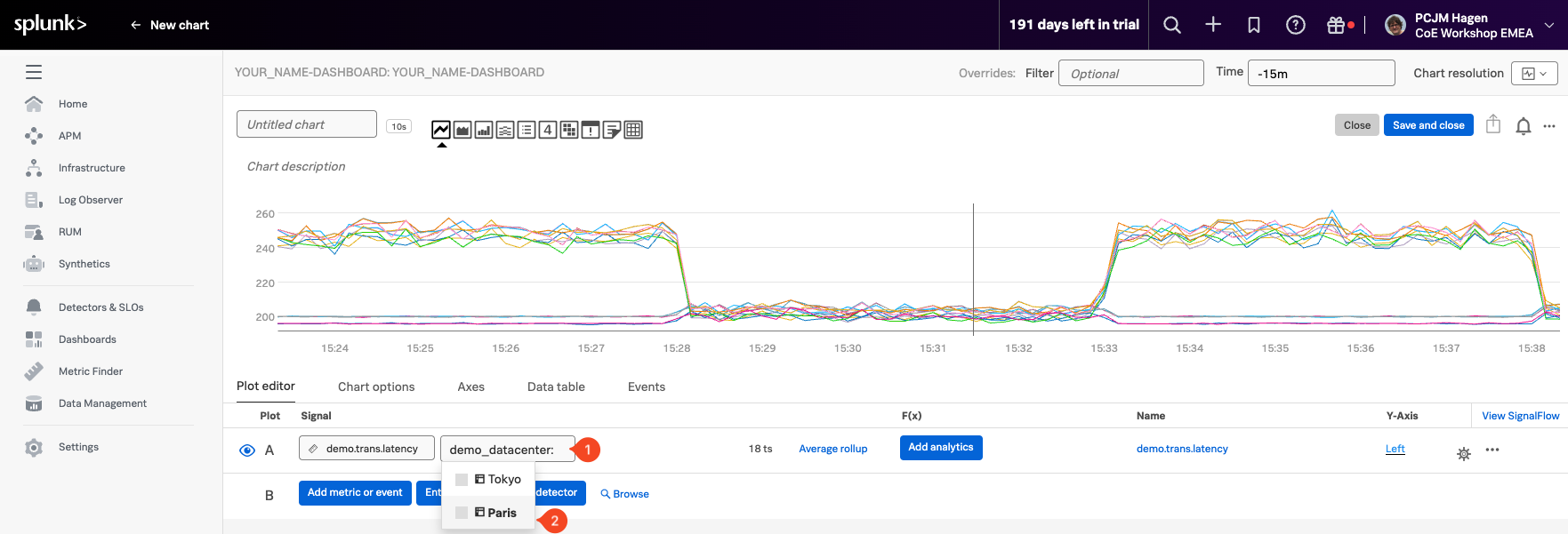
Now let’s narrow down our data to focus on the Paris data center, which will allow us to apply more targeted analytics. We’ll do this by using a Filter.
Start by returning to the Plot Editor tab. Click the button (2) as shown in the screenshot below.
Wait a moment for the available dimensions to populate. Then:
- Select demo_datacenter (1) as the filter dimension.
- Choose Paris (2) as the value to filter on.
This filter will limit the chart to show only the time series coming from the Paris data center, making your analysis more focused and meaningful.
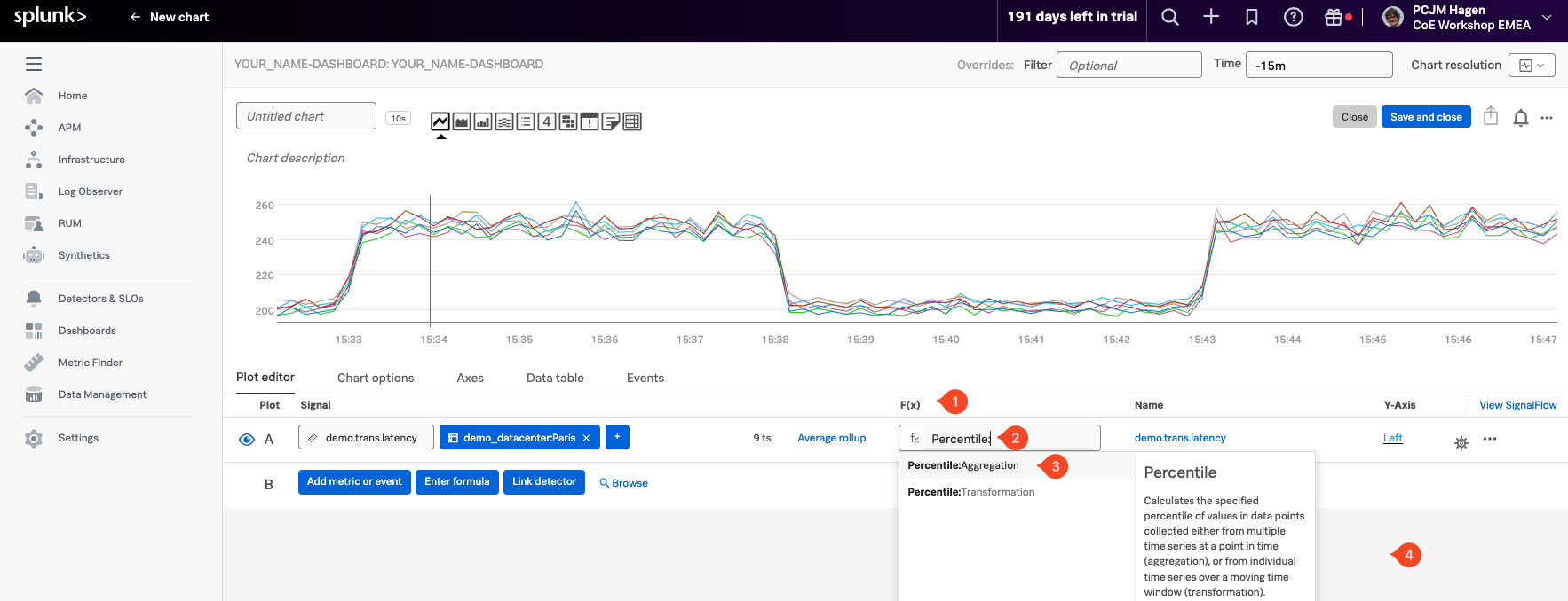
In the F(x) (1) column of the chart editor, click the button o apply an analytic function.
From the dropdown list, select Percentile (2), and then choose the Percentile:Aggregation (3) option.
In the follow-up panel, leave the percentile value set to 90, which tells the chart to display the 90th percentile of the selected time series.
In this context, the 90th percentile represents the value below which 90% of the latency measurements fall, in other words, only the highest 10% of values exceed this point. This is a useful way to understand “worst-case normal” performance—filtering out occasional spikes while still showing when latency is approaching unacceptable levels.
To apply the function, simply click anywhere outside the panel to confirm your selection (4).
For info on the Percentile function and the other functions see Chart Analytics.