Demo — Investigating a DNS Issue with Isovalent and Splunk
What This Demo Shows
This demo tells a story that every ops or platform team has lived through: something is broken, users are complaining, and you have no idea where to start. The investigation takes you through the usual first stops — APM looks fine, infrastructure looks fine — and then pivots to the network layer, where Isovalent’s Hubble observability, flowing into Splunk, reveals the real problem: a DNS overload that was completely invisible to every other tool.
The application is jobs-app, a simulated multi-service hiring platform running in the tenant-jobs namespace. It has a frontend (recruiter, jobposting), a central API (coreapi), a background data pipeline (Kafka + resumes + loader), and a crawler service that periodically makes HTTP calls out to the internet. The crawler is going to be the villain in this story.
Key Takeaway
APM and infrastructure metrics look healthy. The root cause — a DNS overload — is only visible through the Isovalent Hubble dashboards in Splunk, because it lives below the application layer.
Before You Start
Do this before anyone is in the room. You want to be sitting at a clean, healthy dashboard when the demo begins — not fiddling with kubectl while people watch.
Deploy the Jobs App
If you haven’t already, deploy the jobs-app Helm chart from the isovalent-demo-jobs-app repository:
Make Sure Everything Is Running
Run through these checks so you’re not surprised mid-demo:
Important
All pods must be in Running state before proceeding. If the OTel Collector isn’t up, no metrics will appear in Splunk and the demo won’t land.
Reset the App to a Healthy Baseline
Make sure the crawler is running at a calm, normal pace — 1 replica, crawling every 0.5 to 5 seconds:
Then wait at least 5 minutes. Splunk needs time to ingest a clean baseline so the spike you’re about to create is visually obvious. Skip this and the charts won’t tell a clear story.
Inject the Problem
About 5–10 minutes before the demo starts (or live during the demo for effect), run:
This scales the crawler from 1 pod up to 5, and cranks the crawl interval down to 0.2–0.3 seconds. Each crawler pod makes an HTTP request to api.github.com and every one of those requests needs a DNS lookup first. Five pods hammering DNS multiple times per second generates around 15–25 DNS queries per second sustained — enough to saturate the DNS proxy and cause response latency to back up. Other services in the namespace that depend on DNS start experiencing intermittent failures, which is exactly what’s in our ticket.
Act 1 — A Ticket Shows Up
Start by painting the picture. You don’t need to click anything yet — just set the scene.
“So it’s a normal afternoon and an ITSM ticket comes in. The jobs application team is saying that end users are reporting intermittent 500 errors on the recruiter and job posting pages, and load times have gotten noticeably worse over the last 15 minutes or so. It’s been escalated to P2. Let’s dig in.”
| Ticket | INC-4072 |
| Priority | P2 — High |
| Summary | Intermittent failures and slow response times on jobs-app |
| Description | Recruiter and job posting pages are returning 500 errors intermittently. Users report page loads have slowed significantly over the last 15 minutes. Engineering has not made any recent deployments. |
| Reported by | Application Support Team |
| Affected namespace | tenant-jobs |
“No recent deployments — that’s actually the interesting part. There’s no obvious change event to blame. So we need to figure out what changed on our own. Where do we start? APM.”
Act 2 — Check APM (Dead End)
This is where most people would go first, and that’s the point. Show APM, find it unhelpful, and use that to build the case for needing something deeper.
Navigate to: Splunk Observability Cloud → APM → Service Map
The service map for the tenant-jobs environment shows the topology: recruiter and jobposting both call coreapi, which connects to Elasticsearch. The resumes and loader services communicate over Kafka in the background.
“Here’s our service map. Every service is lit up — they’re all responding, all connected. Let’s look at what the numbers are actually saying.
Request rates look normal. Latency is slightly elevated, maybe, but nothing that would explain user-facing errors. Now look at the error rate on coreapi — it’s sitting around 10%. You might think that’s the problem, but it’s not. This app has a configurable error rate baked in as part of the setup. Ten percent is baseline, not a regression.
So APM is telling us: services are alive, traffic is flowing, and the error rate hasn’t changed. There’s nothing in the application traces that points to a root cause. Let’s try infrastructure.”
Why APM Can’t See This
APM instruments application code — it observes what happens inside your services. It has no visibility into what happens at the network layer before a connection is even established. DNS resolution, connection drops, and packet-level events are invisible to it by design.
Act 3 — Check Infrastructure (Dead End)
Show infra, find it clean, and let the audience feel the frustration of not having answers yet.
Navigate to: Splunk Observability Cloud → Infrastructure → Kubernetes → Cluster: isovalent-demo
“Let’s look at the cluster itself. Maybe something is resource-constrained — a node running hot, pods getting OOMKilled, something like that.
Both nodes look healthy. CPU and memory are well within normal bounds. Drilling into the pods — all of them are in Running state, no restarts, nothing being evicted. The containers themselves aren’t hitting their resource limits.
So now we’re in a bit of an uncomfortable spot. The ticket says users are seeing errors. APM says the app is running. Infrastructure says the cluster is healthy. Where does that leave us?
This is actually a really common situation. There’s a whole class of problems that live below the application layer and below the infrastructure layer — things happening at the network level that traditional monitoring tools simply can’t see. DNS failures, connection drops, policy denials, traffic asymmetry. These things don’t show up in traces or pod metrics. You need something that can observe the network itself. That’s where Isovalent comes in.”
Act 4 — The Network Tells the Truth
This is the heart of the demo. Take your time here.
Navigate to: Splunk Observability Cloud → Dashboards → Hubble by Isovalent
“Cilium — our CNI, the networking layer running on every node — has a built-in observability component called Hubble. Hubble uses eBPF to watch every single network flow in the cluster in real time. Not sampled, not approximated — every connection, every DNS request, every packet drop. And because we’ve set up the OpenTelemetry Collector to scrape those Hubble metrics and forward them to Splunk, we can see all of that right here in the same platform we were just looking at for APM and infrastructure.
Let’s pull up the Hubble dashboard.”
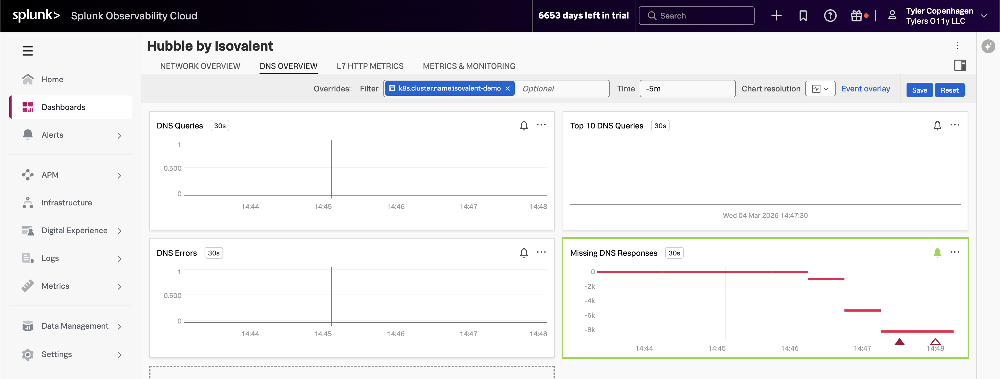
DNS Queries Are Out of Control
Point to the DNS Queries chart, then navigate to the DNS Overview tab.
“There it is. Look at the DNS query volume — it spiked sharply about 15 minutes ago. That timestamp lines up exactly with when the ticket was opened.
What you’re looking at is
hubble_dns_queries_total, broken down by source namespace. The spike is entirely coming fromtenant-jobs— our application namespace. Something in the application started generating a massive amount of DNS traffic, and the DNS proxy started struggling to keep up.But look at the bottom right — the Missing DNS Responses chart. This is the one with the alert firing. The value is going deeply negative, which means DNS queries are being sent out but responses are never coming back. The DNS proxy is overwhelmed and connections are just timing out in silence. That’s the ripple effect showing up as 500 errors for our users.”
Top DNS Queries Reveal the Culprit
Point to the Top 10 DNS Queries chart.
“Now let’s figure out what’s making all these DNS requests. The Top 10 DNS Queries chart breaks down the most frequently queried domains, and one name is standing out by a mile:
api.github.com.That’s not a cluster-internal service — it’s an external endpoint. And the only thing in our app that talks to external endpoints is the crawler service. The crawler makes HTTP calls to an external URL as part of its job simulation. Every time it makes that HTTP call, it needs to resolve
api.github.comthrough DNS first.Normally this is fine. One crawler pod making a request every few seconds is totally manageable. But something has clearly changed about how aggressively it’s running.”
Dropped Flows Show the Blast Radius
Point to the Dropped Flows chart.
“The Dropped Flows chart is showing something else worth calling out. Hubble doesn’t just track successful connections — it captures every connection that gets rejected or dropped, along with a reason code for why. We’re seeing an uptick in drops starting at the exact same time as the DNS spike.
These drops are the downstream consequence of DNS overload. When services in the namespace try to make connections and DNS is too slow or failing, those connection attempts time out and get dropped. This is what APM was seeing as elevated latency — but APM had no idea it was a DNS problem underneath.”
Network Flow Volume Confirms the Pattern
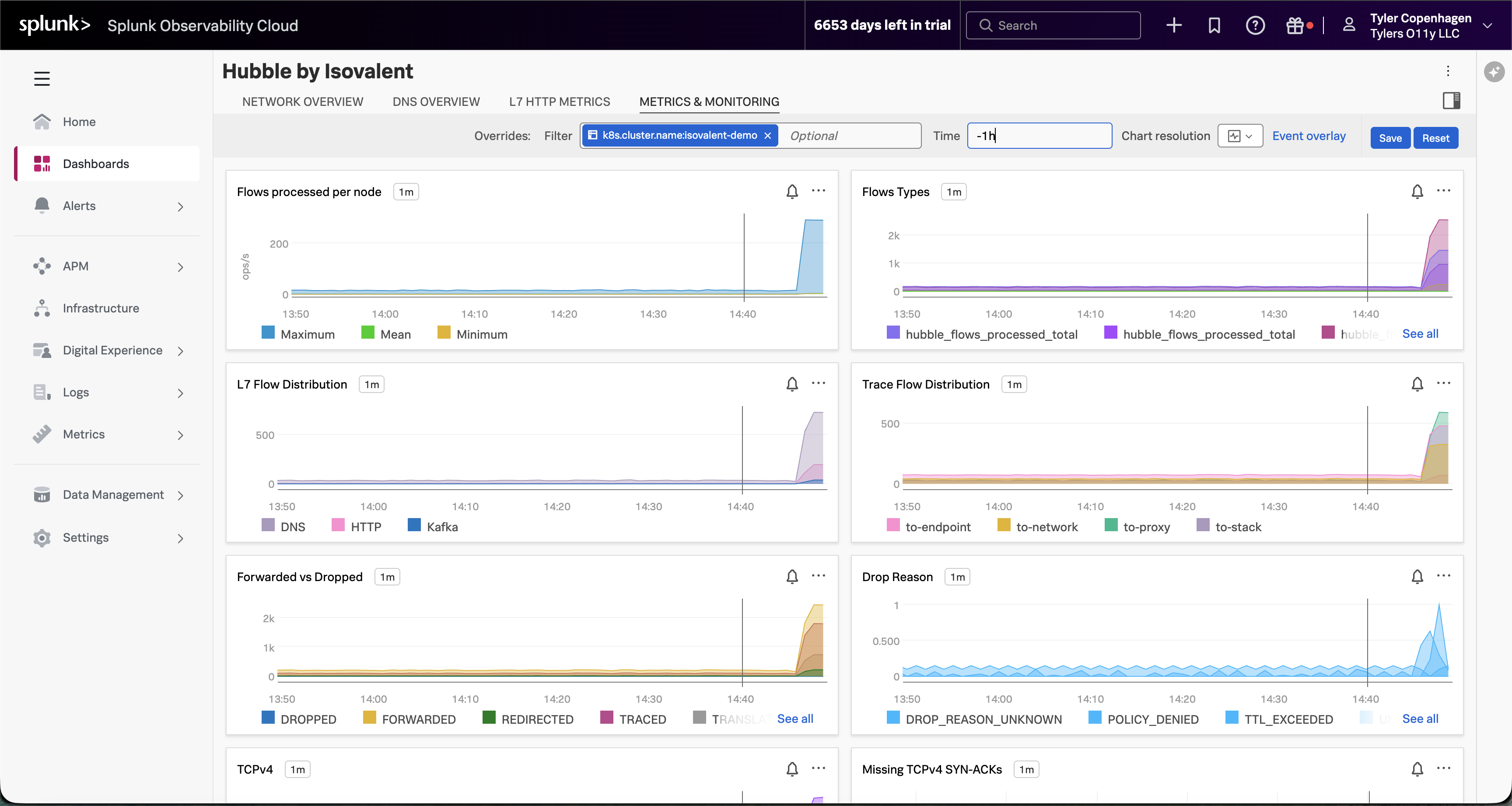
Navigate to the Metrics & Monitoring tab.
“And if you look at the Metrics & Monitoring tab, the full picture becomes even clearer. Flows processed per node has gone vertical — that’s raw network traffic volume. The Forwarded vs Dropped chart is showing a meaningful proportion of those flows being dropped rather than forwarded. And the Drop Reason breakdown tells us it’s a mix of TTL_EXCEEDED and DROP_REASON_UNKNOWN — exactly what you’d expect when DNS timeouts start cascading. Something changed at a specific moment in time, and everything after that point looks different from the baseline.”
L7 HTTP Traffic Tells an Interesting Story
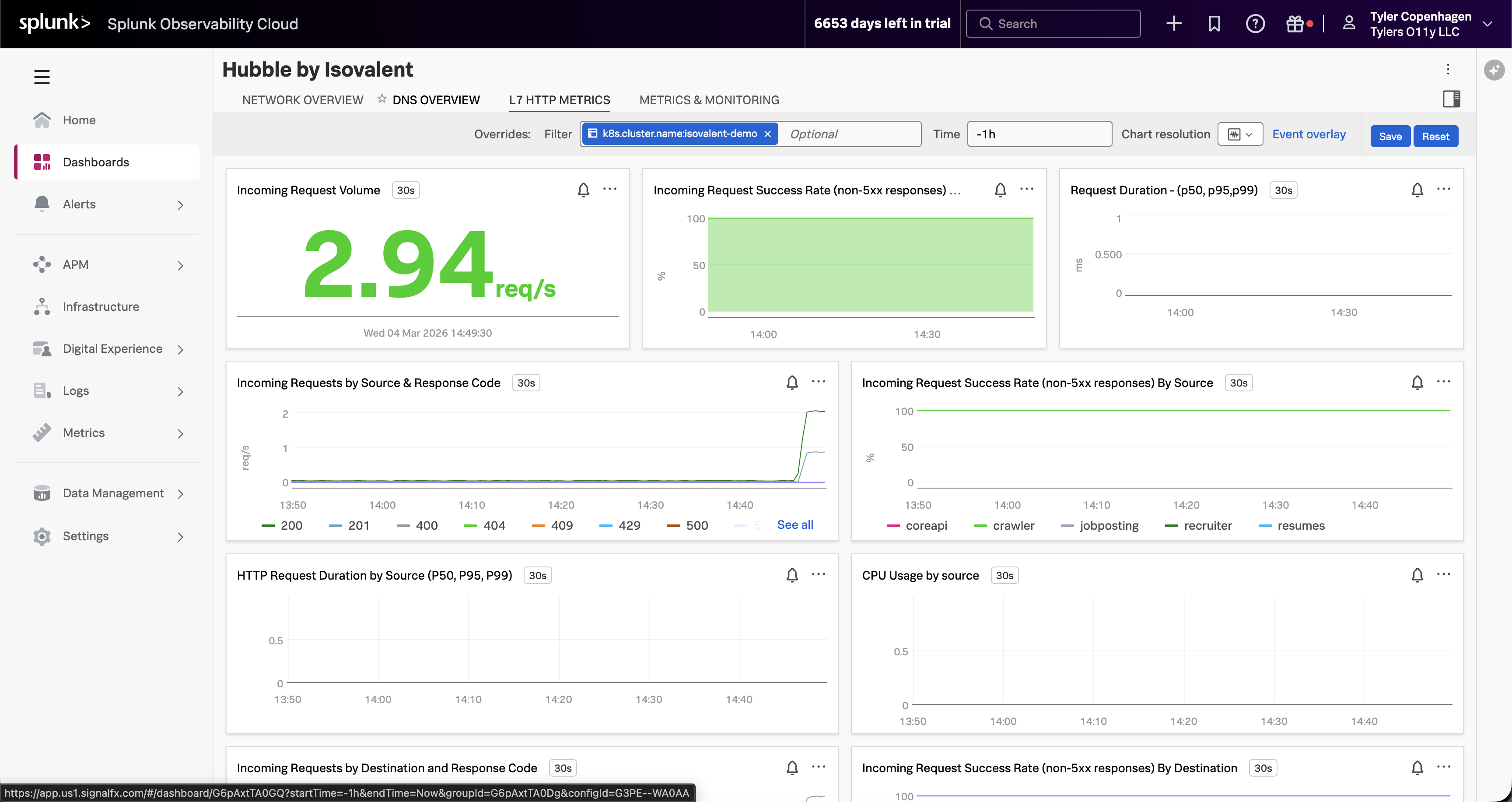
Navigate to the L7 HTTP Metrics tab.
“Here’s something worth pointing out on the L7 HTTP Metrics tab, because it actually reinforces why APM wasn’t helpful. The incoming request volume is non-zero — traffic is still flowing. The success rate chart looks mostly green. If you were only looking at HTTP-level visibility, you might conclude the app is fine.
But look at the Incoming Requests by Source chart. The crawler is generating a disproportionate share of traffic — you can see it separating out from the other services. It’s making HTTP calls successfully, which is why APM doesn’t flag it. The problem is happening one layer down, in DNS, before the HTTP connections even establish.”
Act 5 — Confirming the Root Cause
Now connect the dots and prove it.
“So here’s the full picture: at some point, the crawler service got scaled up from 1 replica to 5, and its crawl interval got set to something extremely aggressive — every 0.2 to 0.3 seconds. That’s 5 pods, each firing off a DNS lookup to resolve
api.github.commultiple times per second. Combined, that’s 15 to 25 DNS queries per second, sustained. The DNS proxy wasn’t built to handle that kind of load from a single workload, so it starts queuing, slowing down, and eventually dropping requests. Every other service in the namespace that needs DNS resolution gets caught in the crossfire.Let’s confirm that’s what we’re looking at.”
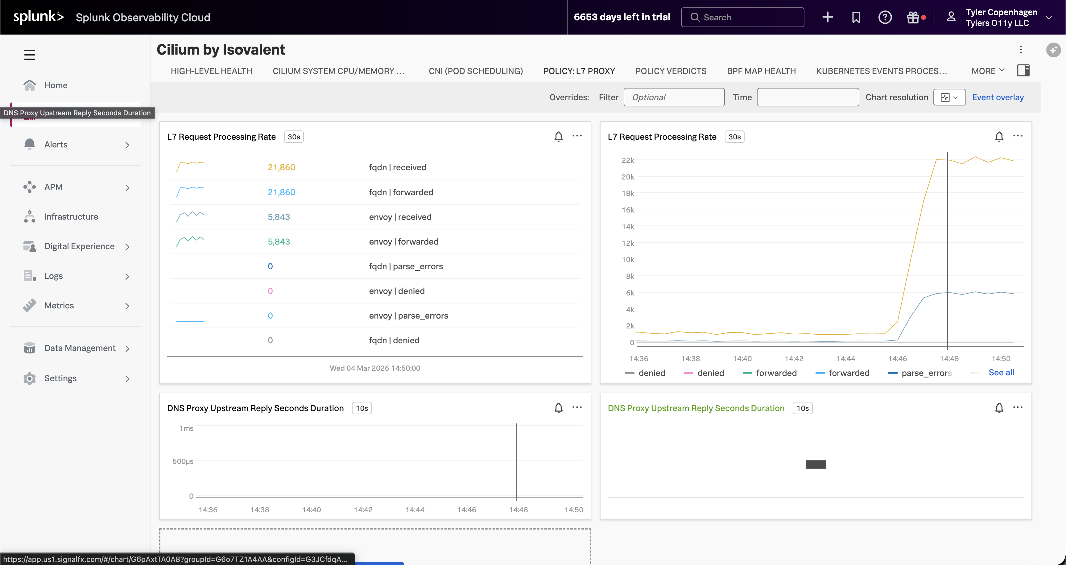
Optionally, switch over to the Cilium by Isovalent dashboard → Policy: L7 Proxy tab.
“If you want to see this from the Cilium side rather than the Hubble side, switch to the Cilium by Isovalent dashboard and look at the Policy: L7 Proxy tab. The L7 Request Processing Rate for FQDN — that’s DNS — is sitting at over 21,000 requests. That’s not per minute. The DNS proxy has been processing an extraordinary volume of FQDN lookups, all of them being received and forwarded, which is why it started backing up. This view also shows the DNS Proxy Upstream Reply latency, which confirms the proxy is under pressure.”
*“There it is. Five replicas, crawling every 0.2 to 0.3 seconds.
APM can’t see this because it instruments code, not DNS. Infrastructure monitoring can’t see this because the pods are healthy — they’re doing exactly what they were configured to do. The only tool that could catch this is something operating at the eBPF level, watching every packet, every DNS request, every connection attempt in real time. That’s Hubble. And because we’ve wired it into Splunk, we caught it in the same dashboard we use for everything else.”
Act 6 — Fix It Live
This part is satisfying because you can watch the charts recover in real time.
“The fix is straightforward — scale the crawlers back down and restore the normal crawl interval.”
Go back to the Hubble by Isovalent dashboard and let it sit for a minute.
“Watch the DNS Queries chart — you can see it coming back down almost immediately. Within a minute or two it’ll be back at baseline. Dropped flows will go to zero. Network flow volume will return to normal.
And if we went back to APM right now, we’d see latency normalizing and the error rate settling back to its expected 10% baseline.
We can close the ticket. Root cause: crawler misconfiguration causing DNS saturation. Resolution: reverted crawler replica count and crawl interval via Helm. Time to resolution: about 15 minutes from when the ticket was opened.”
Remediation Complete
DNS query rate returns to baseline, dropped flows clear, and application health is restored — all visible live in the Hubble dashboard.
Act 7 — What This Actually Means
End by zooming out and making the value statement feel concrete.
“Let’s think about what just happened here. We had a real production-style problem — something breaking for end users — and we went through the standard playbook. APM said nothing was wrong. Infrastructure said nothing was wrong. And without Hubble, the next step probably would have been a war room call, people staring at logs, maybe a full restart of the namespace hoping it would go away.
Instead, we found it in under three minutes from the moment we opened the Hubble dashboard. Not because we’re smarter, but because we had visibility into the right layer.
The reason this works is eBPF. Cilium’s Hubble component hooks into the Linux kernel and observes network events at the source — before they ever reach application code, before they show up in a pod log, before they become a trace in APM. And by shipping those metrics through the OpenTelemetry Collector into Splunk, they sit right alongside your APM data and your infrastructure data in the same platform. You’re not switching tools or context-switching between five different dashboards. You add a layer of visibility that wasn’t there before, and you keep it in the workflow your team already knows.
That’s the story. Network observability isn’t a niche need — it’s the gap that APM and infrastructure monitoring leave behind. Isovalent fills that gap, and Splunk is where you see it.”
Quick Reference
Inject the problem (run ~10 min before demo):
Remediate (run live in Act 6):
Confirm the misconfiguration:
Splunk navigation path: APM → Service Map → (show it’s clean) → Infrastructure → Kubernetes → (show it’s clean) → Dashboards → Hubble by Isovalent → (show the DNS spike)
Timing Guide
| Section | Approx. Time |
|---|---|
| Act 1 — The Ticket | ~1 min |
| Act 2 — APM (dead end) | ~2–3 min |
| Act 3 — Infrastructure (dead end) | ~1–2 min |
| Act 4 — Hubble Dashboards | ~4–5 min |
| Act 5 — Root Cause Confirmation | ~2 min |
| Act 6 — Fix It Live | ~2 min |
| Act 7 — Value Wrap-Up | ~2 min |
| Total | ~14–17 min |