This is Part 2, of the Infrastructure Monitoring exercise, you should now have a single cluster visible.
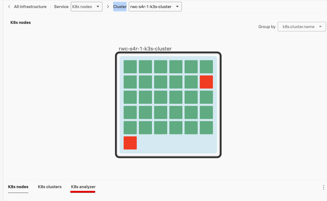
In the Kubernetes Navigator, the cluster is represented by the square with the black line around it.
It will contain one or more blue squares representing the node(s) or compute engines.
Each of them containing one or more colored boxes that represent Pods. (this is where your services run in).
And as you can guess, green means healthy and red means that there is a problem.
Given there are two red boxes or tiles, let’s see what is going on and if this will affect our Online Boutique site.
Exercise
First, set the time window we are working with to the last 15 minutes. You do this by changing the the Time picker in the filter pane from -4h to Last 15 minutes.
Hover with your mouse over the Cluster, Node and pods, both green and red ones.
The resulting information pane that appears will tell you the state of the object. Note, That the red Pods show that they are in Pod Phase: Failed. This means they have crashed and are not working.
Examine the Cluster Metric charts that provide information on your cluster. (The charts below the cluster image). They provide general information about the health of your cluster like Memory consumption and the number of pods per node.
Nothing flags for the red pods, as crashed pods do not affect the performance of Kubernetes.
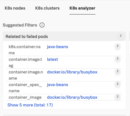
Let’s check if the Spunk Kubernetes Analyzer can tell us something more useful, so click on K8s Analyzer.
Spunk Kubernetes Analyzer
The Splunk Kubernetes Analyzer is a smart process that runs in the background in Splunk Observability Cloud and is designed to detect relations between anomalies.
The K8s Analyzer should have detected that the two red pods are similar, indicated by the 2 after each line, and running in the same Namespace.
In the K8s analyzer view can you find what namespace? (hint, look for k8s.namespace.name).
Next, we want to check this on the node level as well, so drill down to the node, first by hovering your mouse over the cluster until you see a blue line appear around the node with a
in the left top, inside the black Cluster Line.
Click on the triangle . Your view should now show little boxes in each pod, these represent the containers that run the actual code. The K8s Analyzer should confirm that this issue is also occurring on the node level.
Click on K8s node. This will show the node metrics, and if you examine the charts, you can see that there are only two pods in the development namespace.
It is easier to see if you filter on the k8s.namespace.name=development in the Filter Pane. The # Total Pods chart shows only two pods and in the Node Workload chart there is only the test-job and it has failed.
Spunk Kubernetes Analyzer
The above scenario is common in a shared Kubernetes environment, where teams deploy applications in different stages. Kubernetes is designed to keep these environments completely separate.
None of the Pods that make up our Online Boutique site run in the development namespace and all the other pods are green, we can safely assume these pods do not affect us, so let’s move on to look at a few more things.