
Digital Experience (RUM)
2. Application View
- You will now see a dashboard view breaking down the metrics by UX Metrics, Front-end Health, Back-end Health, Custom Workflows, Network Requests, Pages and a Map View comparing them to historic metrics (1 day by default).
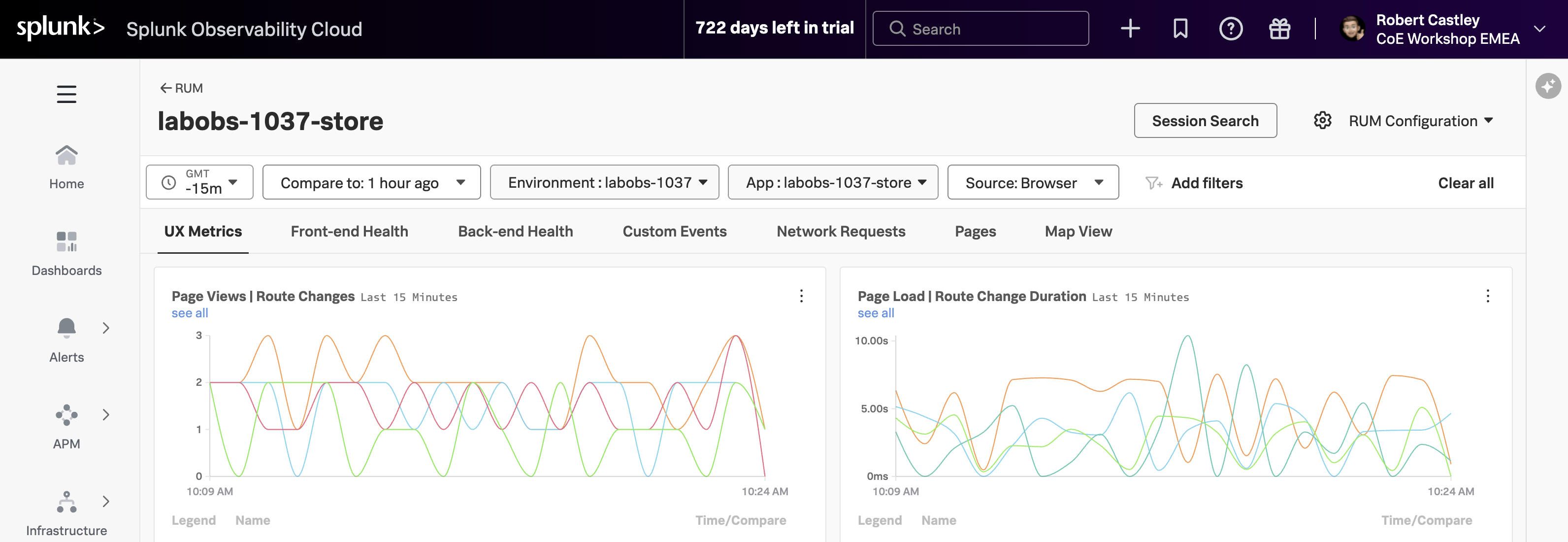
The tabs available on this page include:
- UX Metrics Page Views, Page Load and Web Vitals metrics
- Front-end Health Breakdown of JavaScript Errors and Long Task duration and count
- Back-end Health Network Errors and Requests and Time to First Byte
- Custom Workflows RED metrics (Rate, Error & Duration) for custom workflows
- Network Requests Network URL grouping and key metrics
- Pages URL grouping and key metrics and web vitals
- Map View Geographical requests by location
Click through each of the tabs and examine the data.
- If you examine the charts in the Custom Workflows tab, what chart shows clearly the latency spikes?
- In the Map View tab, where is the largest request volume coming from?
- Custom Workflow Duration P75
- Ireland
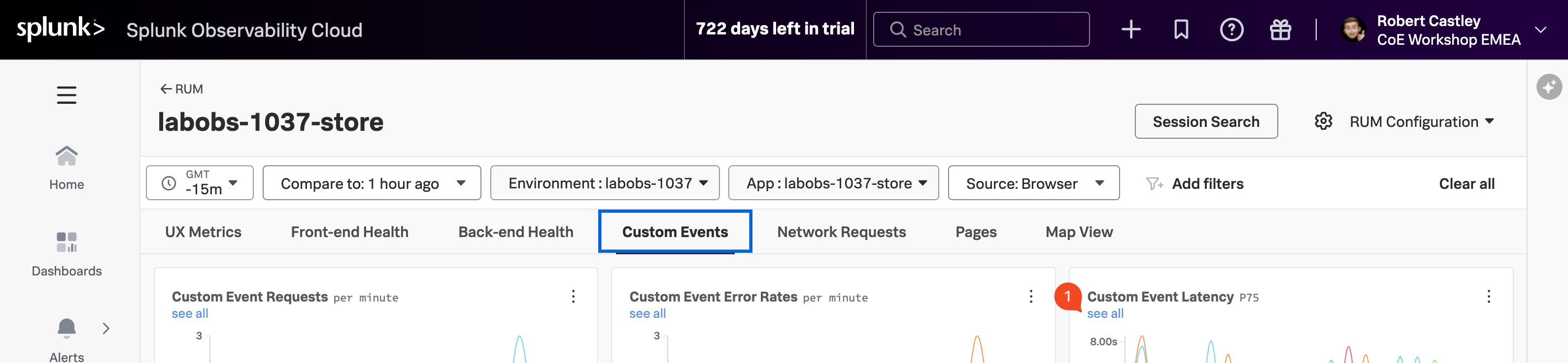
- Make sure you are on the Custom Workflows tab (1).
- To identify problematic user sessions, we will use the latency spikes in the Custom Workflow Duration P75 chart.
- In the Custom Workflows Duration chart click on the see all (2) link under the chart title.