

Splunk Log Observer
3. Log Timeline Chart
Once you have a specific view in Log Observer, it is very useful to be able to use that view in a dashboard, to help in the future with reducing the time to detect or resolve issues. As part of the workshop, we will create an example custom dashboard that will use these charts.
Let’s look at creating a Log Timeline chart. The Log Timeline chart is used for visualizing log messages over time. It is a great way to see the frequency of log messages and to identify patterns. It is also a great way to see the distribution of log messages across your environment. These charts can be saved to a custom dashboard.
Exercise
First, we will reduce the amount of information to only the columns we are interested in:
- Click on the Configure Table icon above the Logs table to open the Table Settings, untick
_rawand ensure the following fields are selectedk8s.pod.name,messageandversion.
- Remove the fixed time from the time picker, and set it to the Last 15 minutes.
- To make this work for all traces, remove the
trace_idfrom the filter and add the fieldsservice.name=paymentserviceandsf_environment=[WORKSHOPNAME]. - Click Save and select Save to Dashboard.

- In the chart creation dialog box that appears, for the Chart name use
Log Timeline. - Click and then click in the Dashboard Selection dialog box.
- In the New dashboard dialog box, enter a name for the new dashboard (no need to enter a description). Use the following format:
Initials - Service Health Dashboardand click . Make a note of your dashboard name, we will need it in a short while. - Ensure the new dashboard is highlighted in the list (1) and click (2).
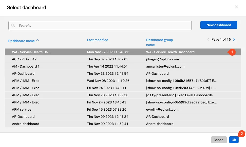
- Ensure that Log Timeline is selected as the Chart Type.

- Click the button (do not click Save and goto dashboard at this time).
Next, we will create a Log View chart.