3.3 Using Filters & Formulas
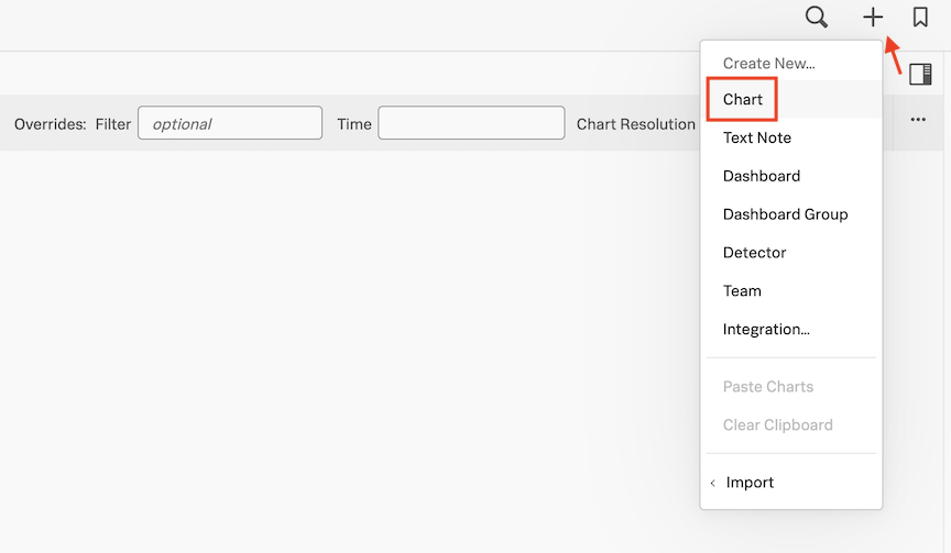
1 Creating a new chart
Let’s now create a new chart and save it in our dashboard!
Select the plus icon (top right of the UI) and from the drop down, choose the option Chart. Or click on the + New Chart Button to create a new chart.
You will now see a chart template like the following.
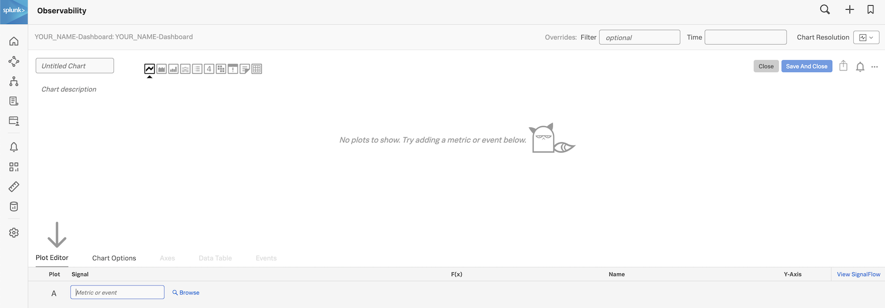
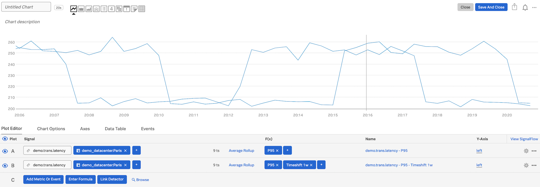
Let’s enter a metric to plot. We are still going to use the metric demo.trans.latency.
In the Plot Editor tab under Signal enter demo.trans.latency.
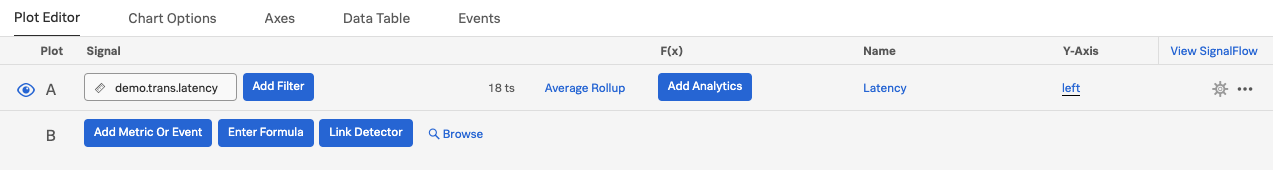
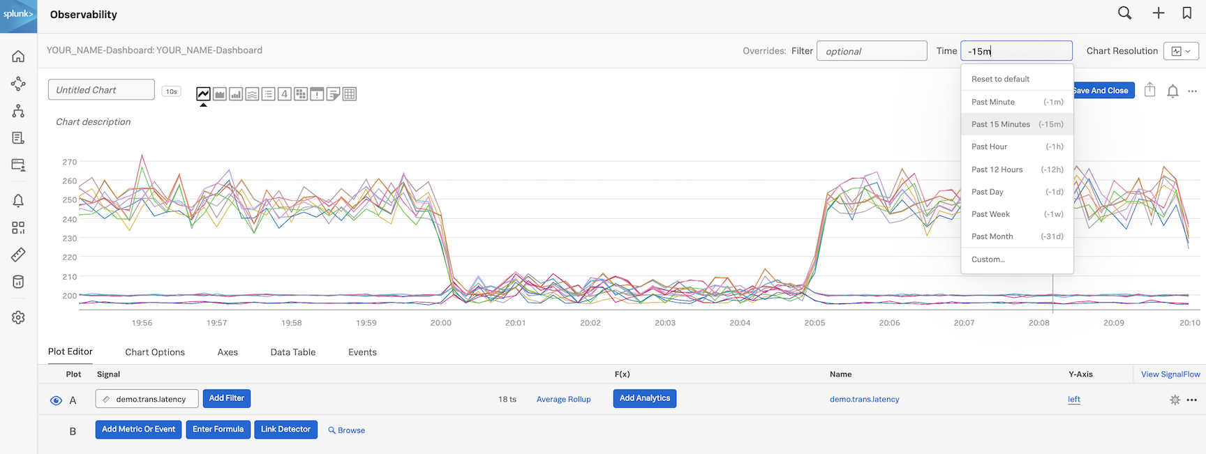
You should now have a familiar line chart. Please switch the time to 15 mins.
2. Filtering and Analytics
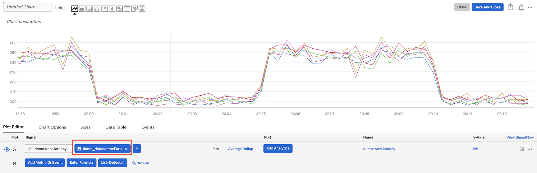
Let’s now select the Paris datacenter to do some analytics - for that we will use a filter.
Let’s go back to the Plot Editor tab and click on Add Filter
, wait until it automatically populates, choose demo_datacenter, and then Paris.
In the F(x) column, add the analytic function Percentile:Aggregation, and leave the value to 95 (click outside to confirm).
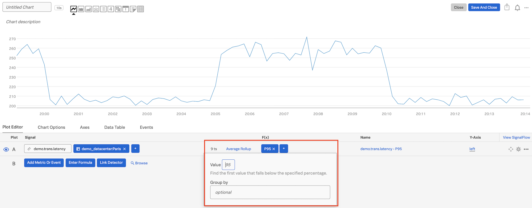
For info on the Percentile function and the other functions see Chart Analytics.
3. Using Timeshift analytical function
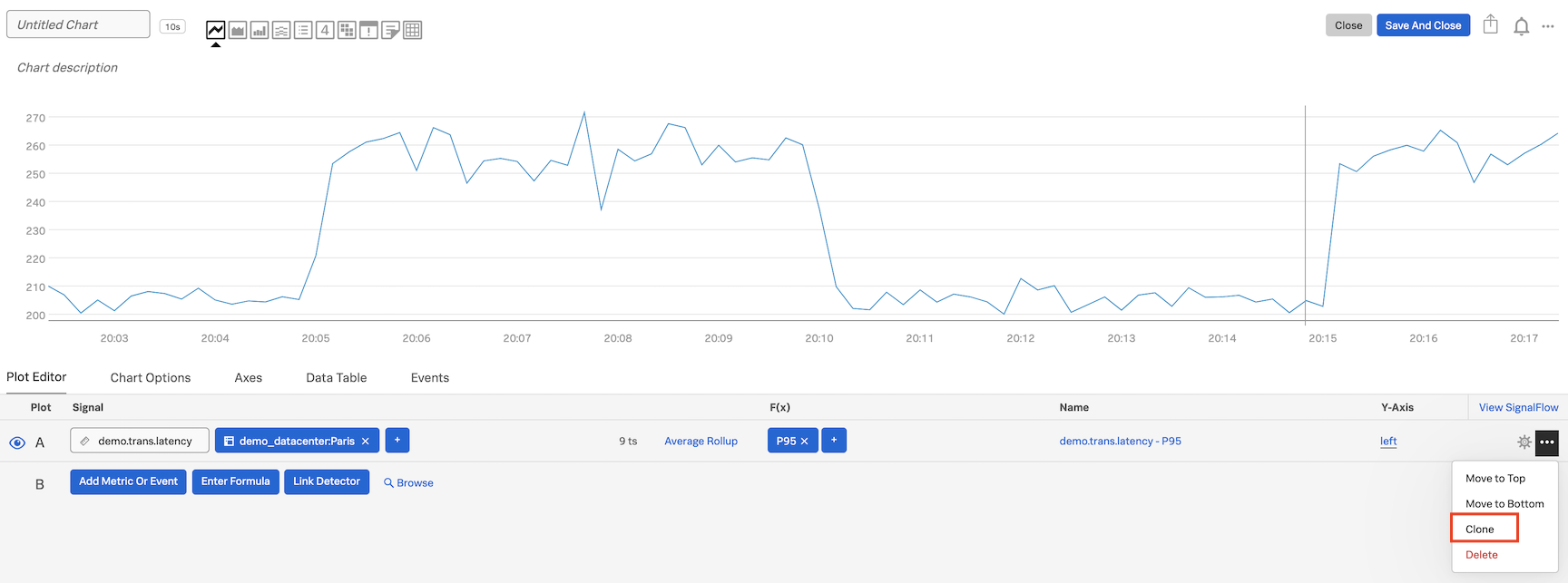
Let’s now compare with older metrics. Click on ... and then on Clone in the dropdown to clone Signal A.
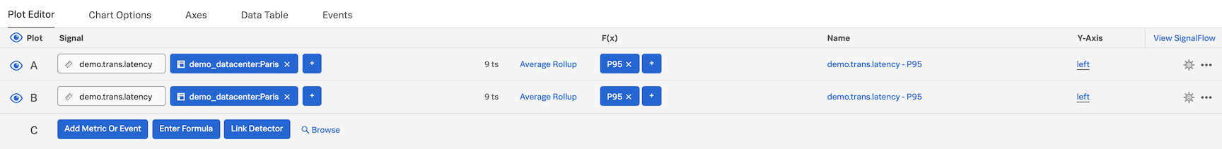
You will see a new row identical to A, called B, both visible and plotted.
For Signal B, in the F(x) column add the analytic function Timeshift and enter 1w (or 7d for 7 days), and click outside to confirm.
Click on the cog on the far right, and choose a Plot Color e.g. pink, to change color for the plot of B.
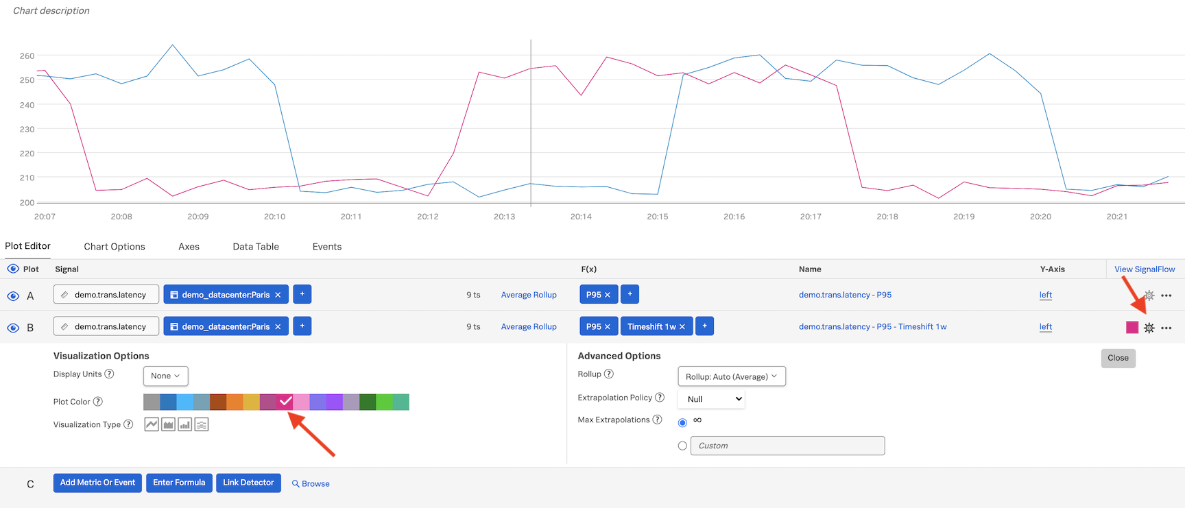
Click on Close.
We now see plots for Signal A (the past 15 minutes) as a blue plot, and the plots from a week ago in pink.
In order to make this clearer we can click on the Area chart icon to change the visualization.
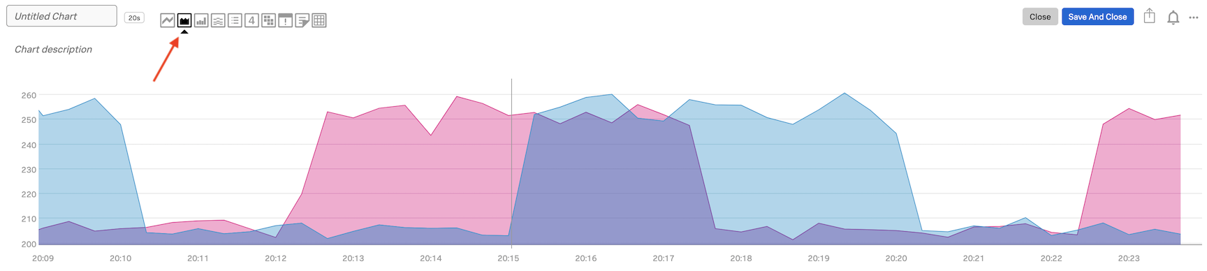
We now can see when last weeks latency was higher!
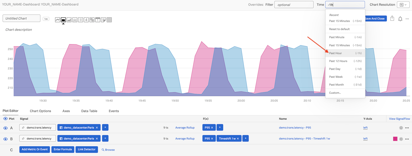
Next, click into the field next to Time on the Override bar and choose Past Hour from the dropdown.
4. Using Formulas
Let’s now plot the difference of all metric values for a day with 7 days in between.
Click on Enter Formula
then enter A-B (A minus B) and hide (deselect) all Signals using the eye, except C.
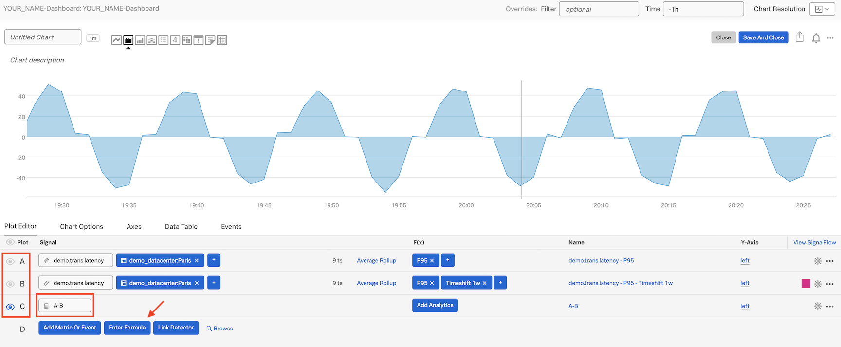
We now see only the difference of all metric values of A and B being plotted. We see that we have some negative values on the plot because a metric value of B has some times larger value than the metric value of A at that time.
Lets look at the Signalflow that drives our Charts and Detectors!