3.4 SignalFlow
1. Introduction
Let’s take a look at SignalFlow - the analytics language of Observability Cloud that can be used to setup monitoring as code.
The heart of Splunk Infrastructure Monitoring is the SignalFlow analytics engine that runs computations written in a Python-like language. SignalFlow programs accept streaming input and produce output in real time. SignalFlow provides built-in analytical functions that take metric time series (MTS) as input, perform computations, and output a resulting MTS.
- Comparisons with historical norms, e.g. on a week-over-week basis
- Population overviews using a distributed percentile chart
- Detecting if the rate of change (or other metric expressed as a ratio, such as a service level objective) has exceeded a critical threshold
- Finding correlated dimensions, e.g. to determine which service is most correlated with alerts for low disk space
Infrastructure Monitoring creates these computations in the Chart Builder user interface, which lets you specify the input MTS to use and the analytical functions you want to apply to them. You can also run SignalFlow programs directly by using the SignalFlow API.
SignalFlow includes a large library of built-in analytical functions that take a metric time series as an input, performs computations on its datapoints, and outputs time series that are the result of the computation.
For more information on SignalFlow see Analyze incoming data using SignalFlow.
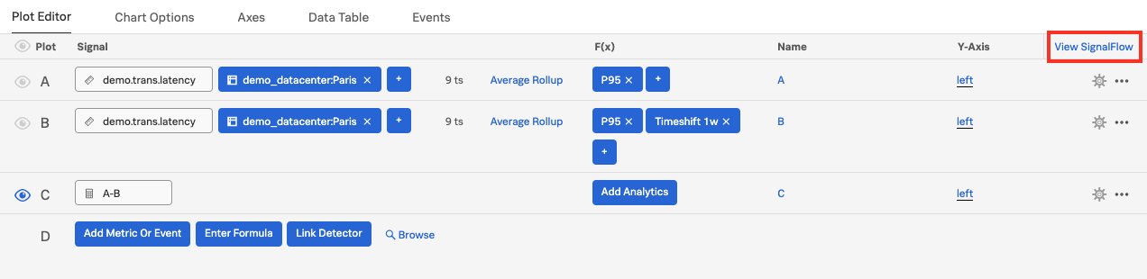
2. View SignalFlow
In the chart builder, click on View SignalFlow.
You will see the SignalFlow code that composes the chart we were working on. You can now edit the SignalFlow directly within the UI. Our documentation has the full list of SignalFlow functions and methods.
Also, you can copy the SignalFlow and use it when interacting with the API or with Terraform to enable Monitoring as Code.
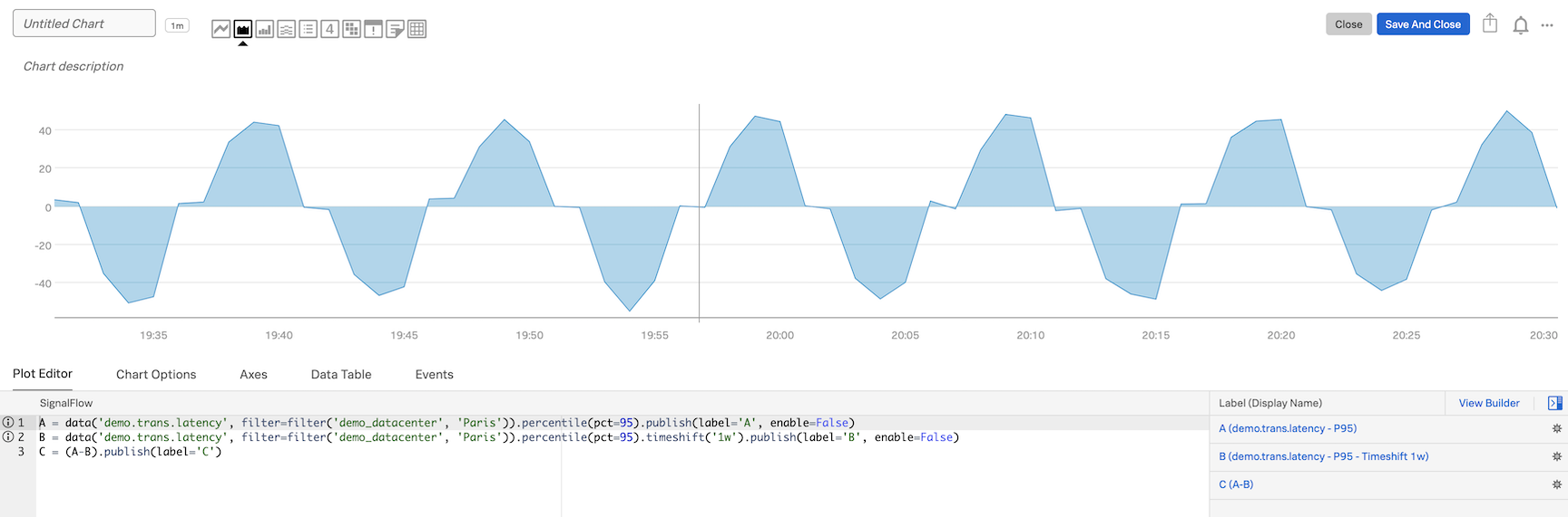
A = data('demo.trans.latency', filter=filter('demo_datacenter', 'Paris')).percentile(pct=95).publish(label='A', enable=False)
B = data('demo.trans.latency', filter=filter('demo_datacenter', 'Paris')).percentile(pct=95).timeshift('1w').publish(label='B', enable=False)
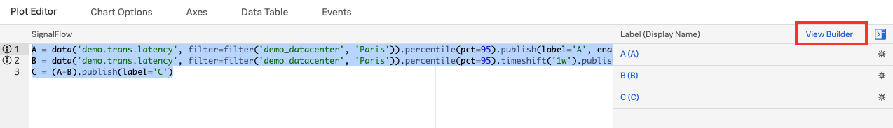
C = (A-B).publish(label='C')Click on View Builder to go back to the Chart Builder UI.
Let’s save this new chart to our Dashboard!