2. APM Service Dashboard
Service Dashboard
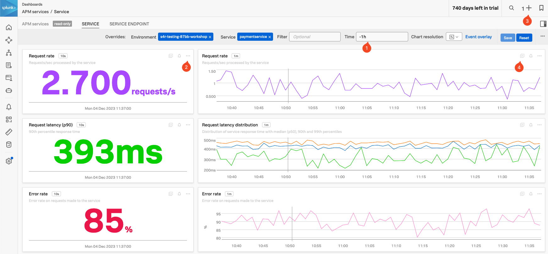
APM Service Dashboards provide request, error, and duration (RED) metrics based on Monitoring MetricSets created from endpoint spans for your services, endpoints, and Business Workflows. If you scroll down the dashboard you will also see the host and Kubernetes-related metrics which help you determine whether there are problems with the underlying infrastructure.
Exercise
- Check the Time box (1), you can see that the dashboards only show data relevant to the time it took for the APM trace we selected to complete (note that the charts are static).
- In the time box change enter -1h and hit enter.
- The Single Value charts, Request rate, Request latency (p90) and Error rate will start updating every 10 seconds showing that we still have a large number of errors occurring.
- These charts are very useful to quickly identify performance issues. You can use this dashboard to keep an eye on the health of your service or use it as a base for a custom one.
- We want to use some of these charts in a later exercise:
- In the Request rate Single Value chart (2), click the … and select Copy. Note that you now have a 1 before the + at the top right of the page (3), indicating you have a copied chart to the clipboard.
- In the Request rate line chart (4), either click on the Add to clipboard indicator that appeared (just at the (4) in the screenshot) to add it to the clipboard or use the … and select Add to clipboard.
- Note that you now have 2 before the + on the top right of the page. (3)
- Now let’s go back to the explore view, you can hit the back button in your Browser
Exercise
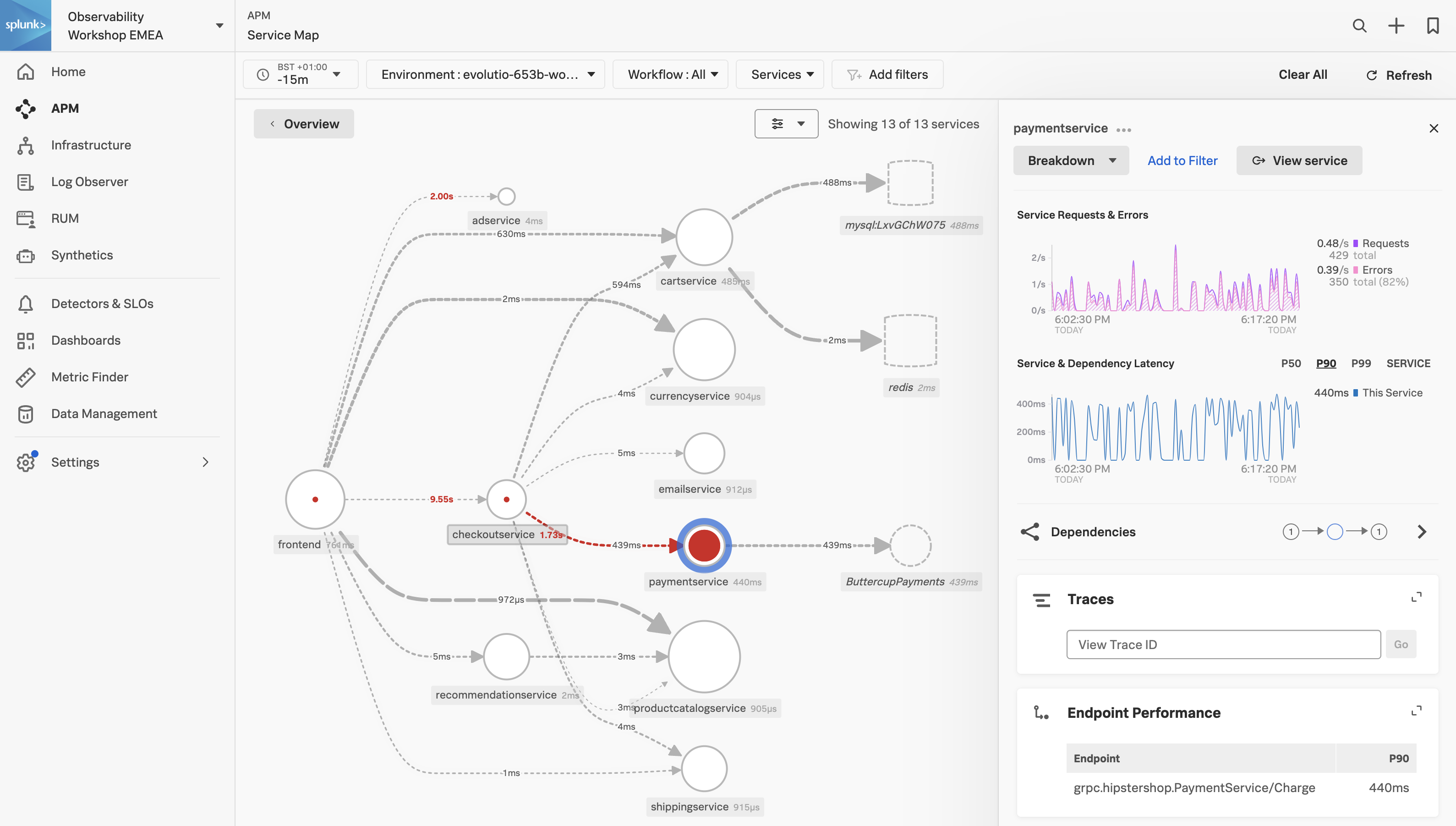
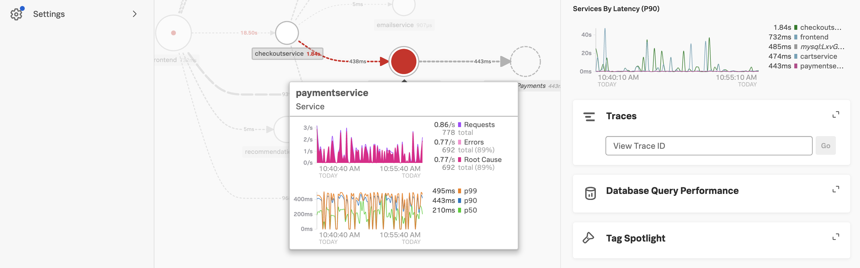
In the Service Map hover over the paymentservice. What can you conclude from the popup service chart?
The error percentage is very high.
We need to understand if there is a pattern to this error rate. We have a handy tool for that, Tag Spotlight.