Enhancing the Dashboard
As we already saved some useful log charts in a dashboard in the Log Observer exercise, we are going to extend that dashboard.
Exercise
- To get back to your dashboard with the two log charts, click on Dashboards from the main menu and you will be taken to your Team Dashboard view. Under Dashboards click in Search dashboards to search for your Service Health Dashboard group.
- Click on the name and this will bring up your previously saved dashboard.
- Even if the log information is useful, it will need more information to have it make sense for our team so let’s add a bit more information
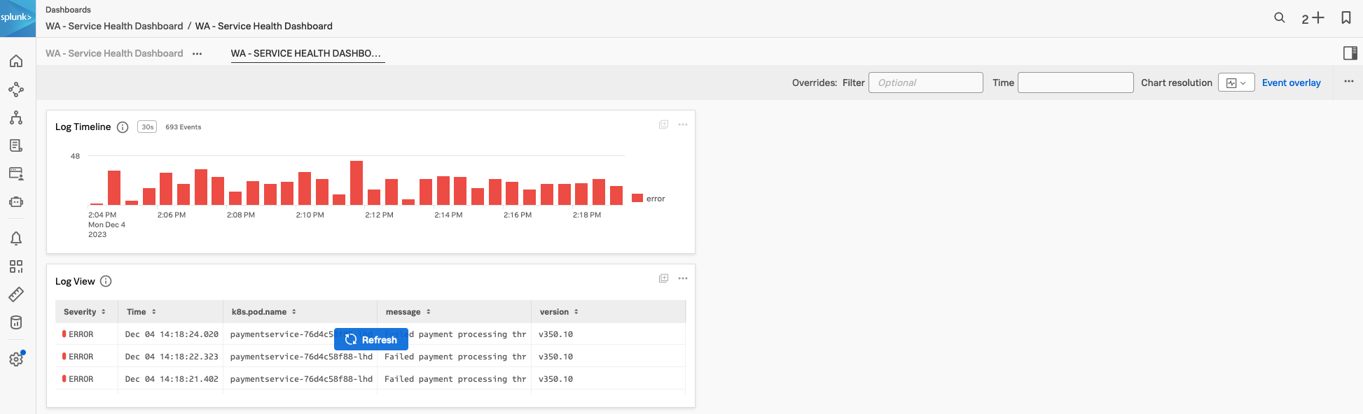
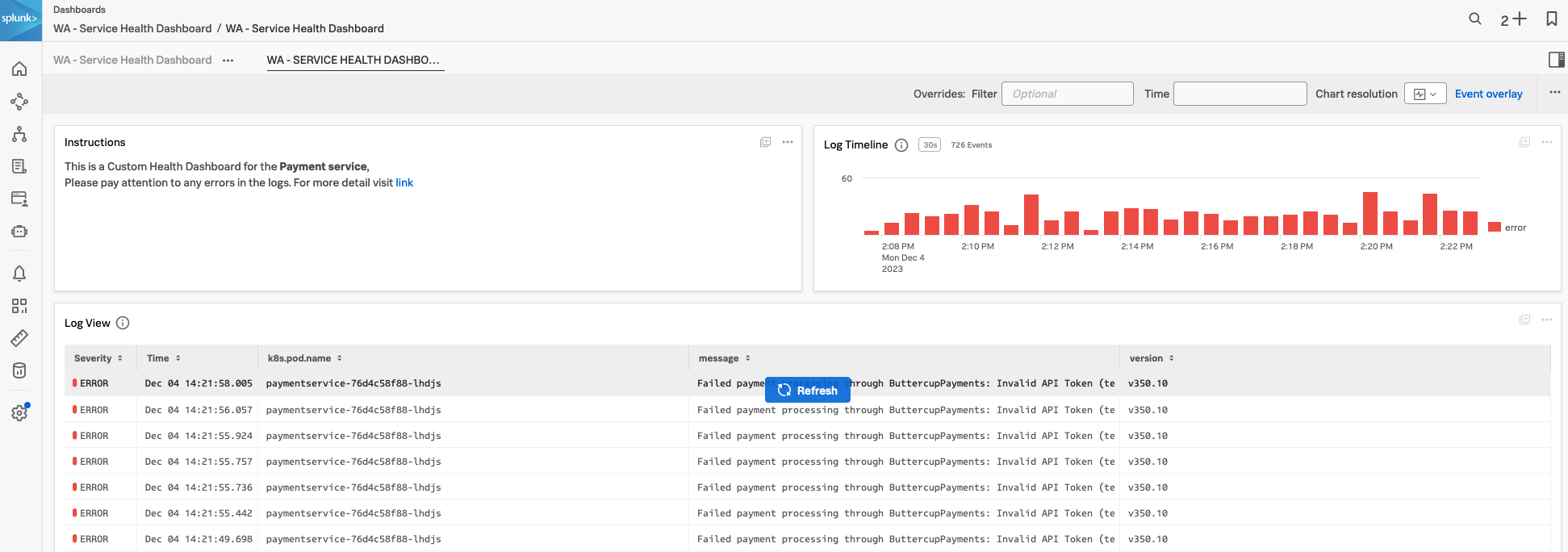
- The first step is adding a description chart to the dashboard. Click on the New text note and replace the text in the note with the following text and then click the Save and close button and name the chart Instructions
Information to use with text note
This is a Custom Health Dashboard for the **Payment service**,
Please pay attention to any errors in the logs.
For more detail visit [link](https://https://www.splunk.com/en_us/products/observability.html)- The charts are not in a nice order, let’s correct that and rearrange the charts so that they are useful.
- Move your mouse over the top edge of the Instructions chart, your mouse pointer will change to a ☩. This will allow you to drag the chart in the dashboard. Drag the Instructions chart to the top left location and resize it to a 1/3rd of the page by dragging the right-hand edge.
- Drag and add the Log Timeline view chart next to the Instruction chart, resize it so it fills the other 2/3rd of the page to be the error rate chart next to the two the chart and resize it so it fills the page
- Next, resize the Log lines chart to be the width of the page and resize it the make it at least twice as long.
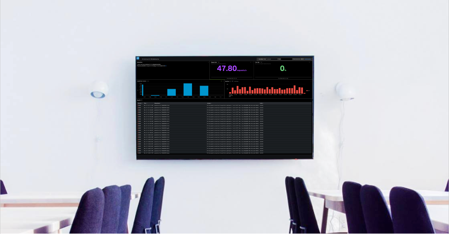
- You should have something similar to the dashboard below:
This looks great, let’s continue and add more meaningful charts.