Adding Copied Charts
In this section, we are going to use the Copy and Paste functionality to extend our dashboard. Remember we copied some charts during the APM Service Dashboard section, we will now add those charts to our dashboard.
Exercise
- Select the 2+ at the top of the page and select Paste charts, this will create the charts in your custom dashboard.
- The chart currently shows data for all Environments and Services, so let’s add a filter for our environment and the paymentservice.
- Click on the 3 dots … at the top right side of the Request Rate single value chart. This will open the chart in edit mode.
- In the new screen, click on the x in the sf_environment:* x button (1) in the middle of the screen to close it.
- Click on the + to add a new filter and select sf_environment then pick the [WORKSHOPNAME] from the drop-down and hit Apply. The button will change to sf_environment:[WORKSHOPNAME]
- Do the same with for the sf_service. button (2), close it and create a new filter for sf_service. Only this time change it to
paymentservice.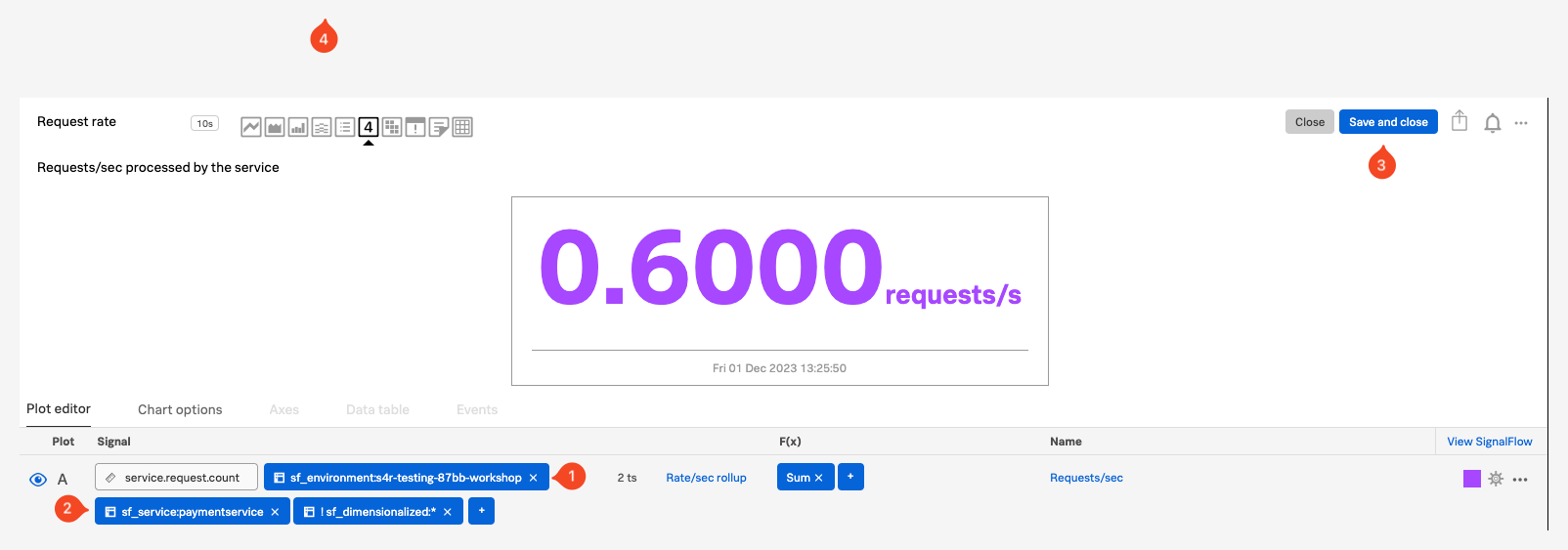
- Click the Save and close button (3).
- Repeat the previous 4 steps for the Request Rate text chart
- Click Save after you have update the two charts.
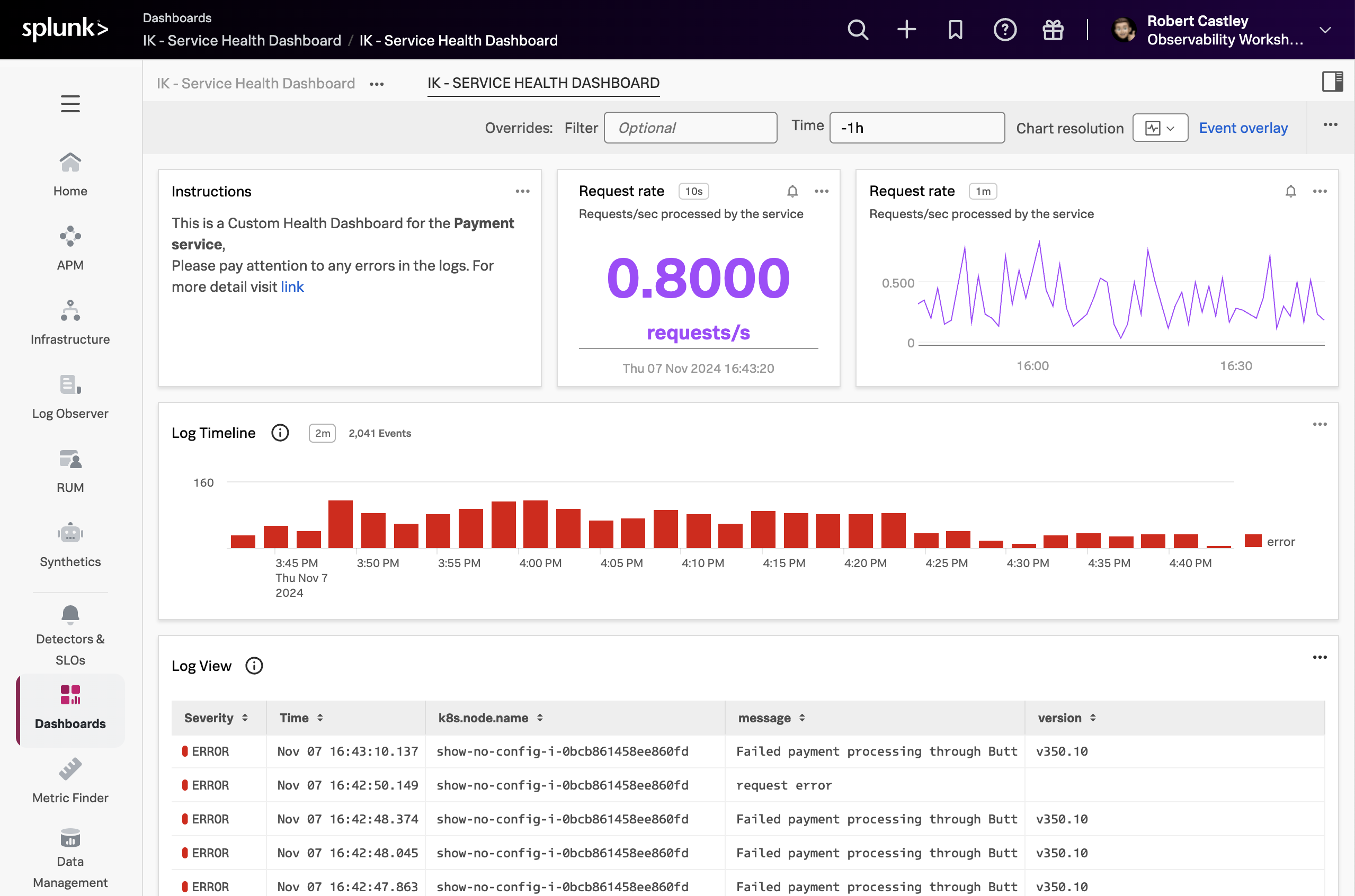
- As the new pasted charts appeared at the bottom of our dashboard, we need to re-organize our dashboard again.
- Using the drag and drop and resizing skills you learned earlier, make your dashboard look like the image below.
Next, we are going to create a custom chart based on our Synthetic test that is running.