Adding a Custom Chart
In this part of the workshop we are going to create a chart that we will add to our dashboard, we will also link it to the detector we previously built. This will allow us to see the behavior of our test and get alerted if one or more of our test runs breach its SLA.
Exercise
- At the top of the dashboard click on the + and select Chart.
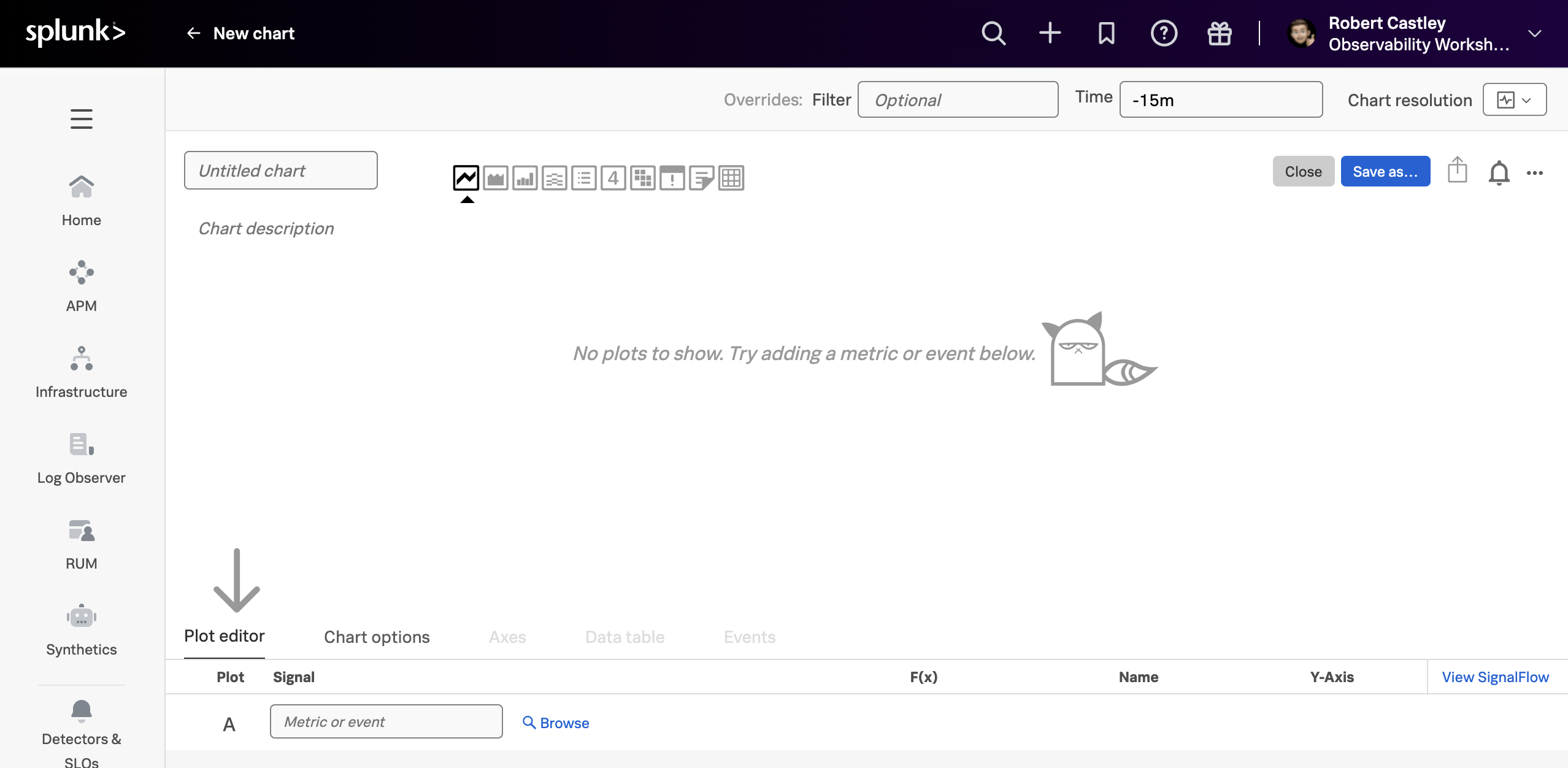
- First, use the Untitled chart input field and name the chart Overall Test Duration.
- For this exercise we want a bar or column chart, so click on the 3rd icon in the chart option box.
- In the Plot editor enter
synthetics.run.duration.time.ms(this is runtime in duration for our test) in the Signal box and hit enter. - Right now we see different colored bars, a different color for each region the test runs from. As this is not needed we can change that behavior by adding some analytics.
- Click the Add analytics button.
- From the drop-down choose the Mean option, then pick
mean:aggregationand click outside the dialog box. Notice how the chart changes to a single color as the metrics are now aggregated. - The x-axis does not currently represent time to change this click on the settings icon at the end of the plot line. The following following dialog will open:
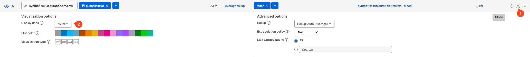
- Change the Display units (2) in the drop-down box from None to Time (autoscaling)/Milliseconds(ms). The drop-down changes to Millisecond and the x-axis of the chart now represents the test duration time.
- Close the dialog, either by clicking on the settings icon or the close button.
- Add our detector by clicking the Link Detector button and start typing the name of the detector you created earlier.
- Click on the detector name to select it.
- Notice that a colored border appears around the chart, indicating the status of the alert, along with a bell icon at the top of the dashboard as shown below:
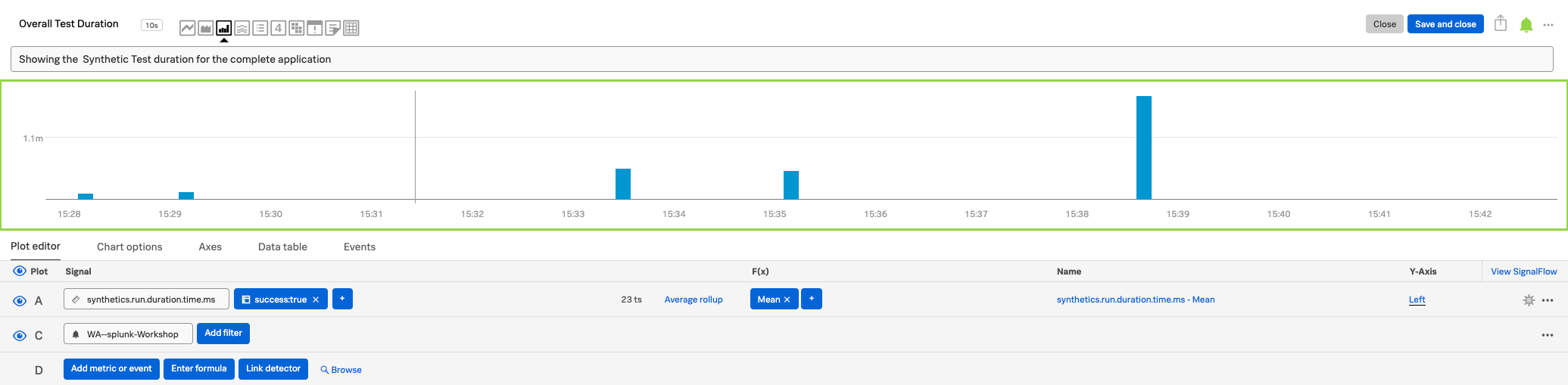
- Click the Save and close button.
- In the dashboard, move the charts so they look like the screenshot below:
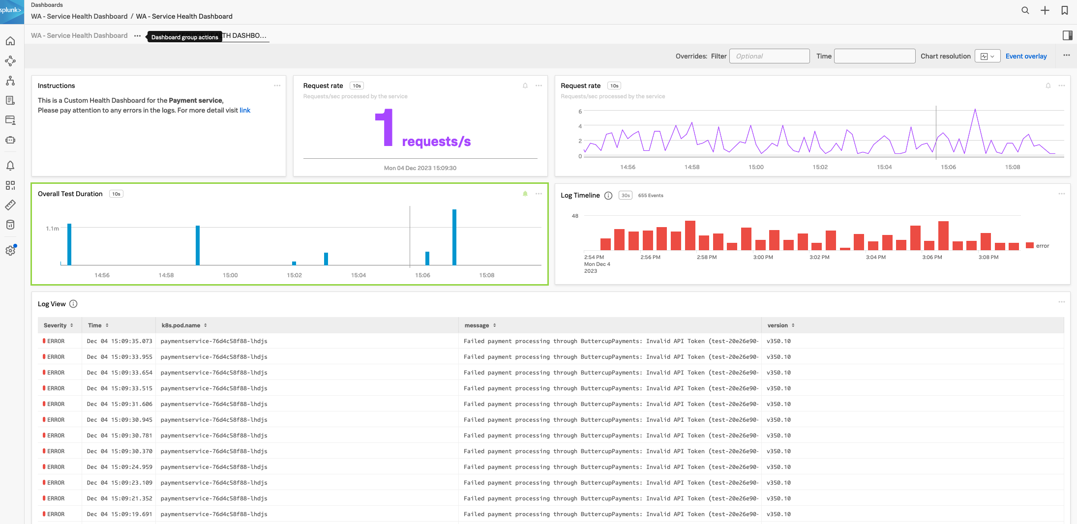
- For the final task, click three dots … at the top of the page (next to Event Overlay) and click on View fullscreen. This will be the view you would use on the TV monitor on the wall (press Esc to go back).
Tip
In your spare time have a try at adding another custom chart to the dashboard using RUM metrics. You could copy a chart from the out-of-the-box RUM applications dashboard group. Or you could use the RUM metric rum.client_error.count to create a chart that shows the number of client errors in the application.
Finally, we will run through a workshop wrap-up.