Splunk APM
20 minutes
Persona
You are a back-end developer and you have been called in to help investigate an issue found by the SRE. The SRE has identified a poor user experience and has asked you to investigate the issue.
Discover the power of full end-to-end visibility by jumping from a RUM trace (front-end) to an APM trace (back-end). All the services are sending telemetry (traces and spans) that Splunk Observability Cloud can visualize, analyze and use to detect anomalies and errors.
RUM and APM are two sides of the same coin. RUM is the client-side view of the application and APM is the server-side view. In this section, we will use APM to drill down and identify where the problem is.
Subsections of Splunk APM
1. APM Explore
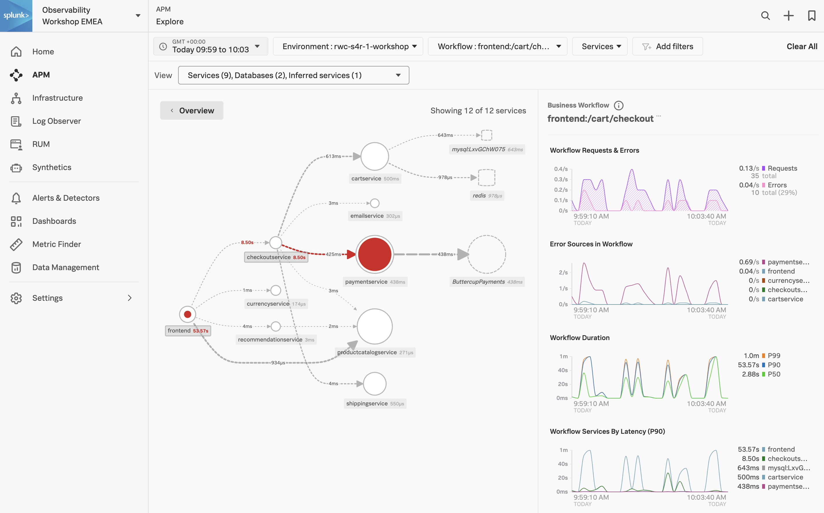
The APM Service Map displays the dependencies and connections among your instrumented and inferred services in APM. The map is dynamically generated based on your selections in the time range, environment, workflow, service, and tag filters.
When we clicked on the APM link in the RUM waterfall, filters were automatically added to the service map view to show the services that were involved in that WorkFlow Name (frontend:/cart/checkout).
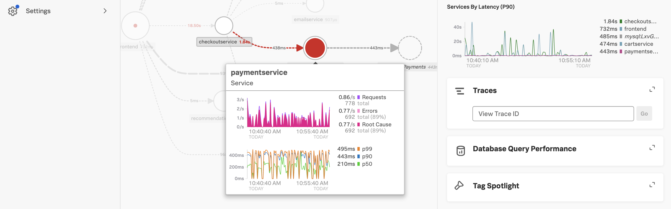
You can see the services involved in the workflow in the Service Map. In the side pane, under Business Workflow, charts for the selected workflow are displayed. The Service Map and Business Workflow charts are synchronized. When you select a service in the Service Map, the charts in the Business Workflow pane are updated to show metrics for the selected service.
Exercise
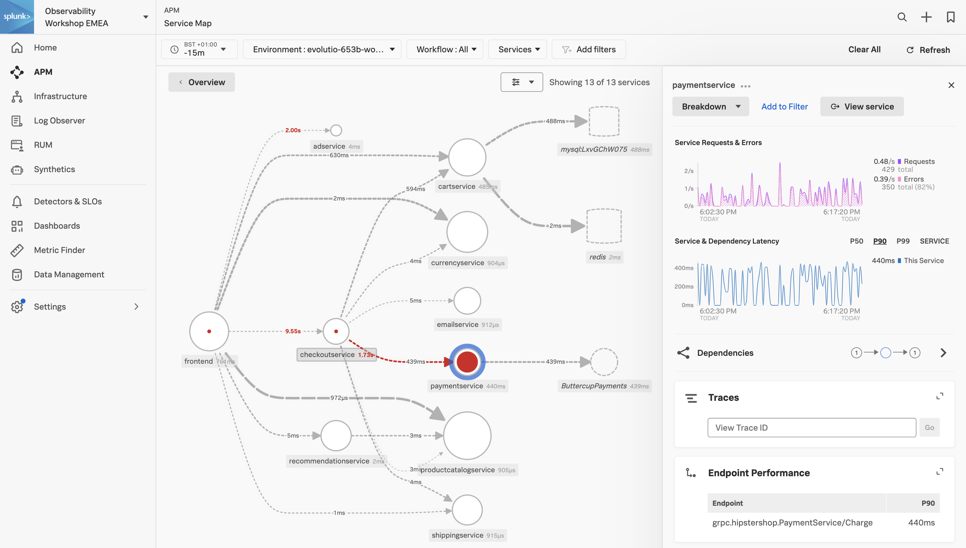
- Click on the paymentservice in the Service Map.
Splunk APM also provides a set of built-in dashboards that present charts and visualized metrics to help you see problems occurring in real time and quickly determine whether the problem is associated with a service, a specific endpoint, or the underlying infrastructure. Let’s have a closer look.
Exercise
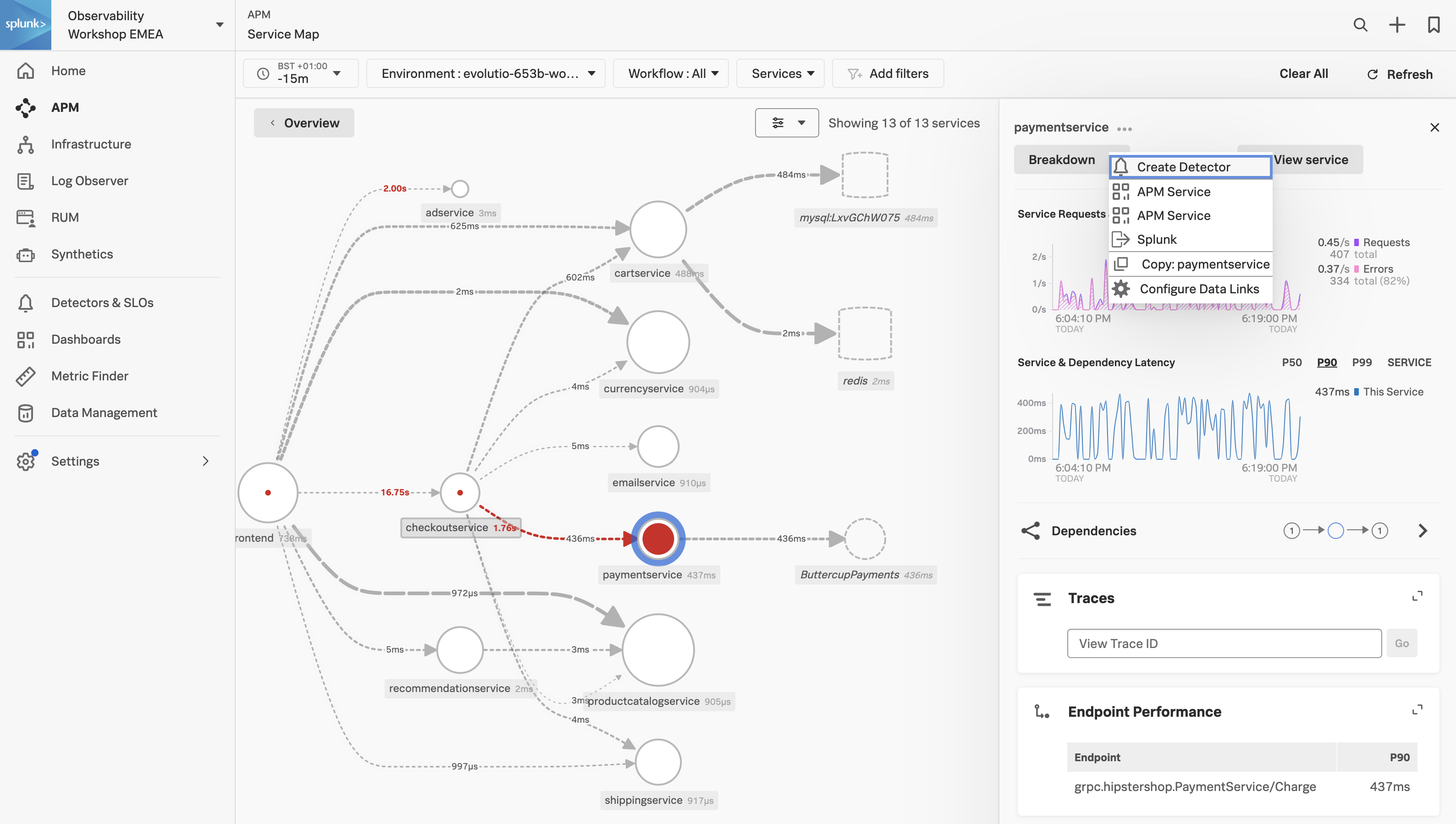
- Click on the three dots next to paymentservice and select APM Service
2. APM Service Dashboard
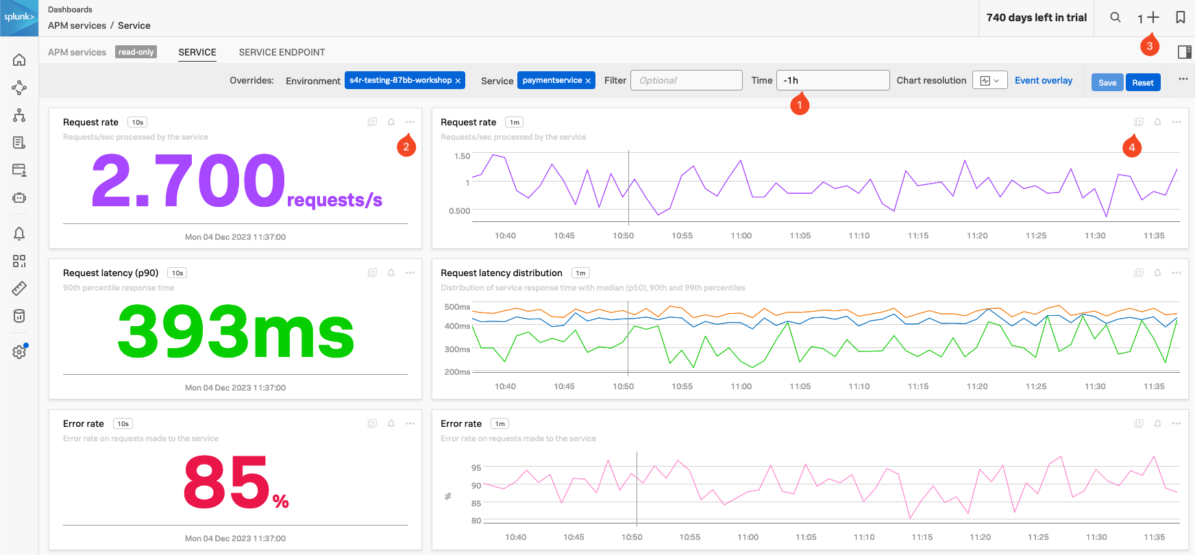
Service Dashboard
APM Service Dashboards provide request, error, and duration (RED) metrics based on Monitoring MetricSets created from endpoint spans for your services, endpoints, and Business Workflows. If you scroll down the dashboard you will also see the host and Kubernetes-related metrics which help you determine whether there are problems with the underlying infrastructure.
Exercise
- Check the Time box (1), you can see that the dashboards only show data relevant to the time it took for the APM trace we selected to complete (note that the charts are static).
- In the time box change enter -1h and hit enter.
- The Single Value charts, Request rate, Request latency (p90) and Error rate will start updating every 10 seconds showing that we still have a large number of errors occurring.
- These charts are very useful to quickly identify performance issues. You can use this dashboard to keep an eye on the health of your service or use it as a base for a custom one.
- We want to use some of these charts in a later exercise:
- In the Request rate Single Value chart (2), click the … and select Copy. Note that you now have a 1 before the + at the top right of the page (3), indicating you have a copied chart to the clipboard.
- In the Request rate line chart (4), either click on the Add to clipboard indicator that appeared (just at the (4) in the screenshot) to add it to the clipboard or use the … and select Add to clipboard.
- Note that you now have 2 before the + on the top right of the page. (3)
- Now let’s go back to the explore view, you can hit the back button in your Browser

Exercise
In the Service Map hover over the paymentservice. What can you conclude from the popup service chart?
The error percentage is very high.
We need to understand if there is a pattern to this error rate. We have a handy tool for that, Tag Spotlight.
3. APM Tag Spotlight
Exercise
- To view the tags for the paymentservice click on the paymentservice and then click on Tag Spotlight in the right-hand side functions pane (you may need to scroll down depending upon your screen resolution).
- Once in Tag Spotlight ensure the toggle Show tags with no values is off.

There are two views available in Tag Spotlight. The default is Request/Errors and the other is Latency.
Request/Error charts display the total number of requests, errors, and root cause errors. The Latency charts display p50, p90, and p99 latency. These values are based on Troubleshooting MetricSets (TMS), which Splunk APM generates for every indexed span tag. These are known as RED metrics (request, error, and duration).
Exercise
Which chart exposes the tag that identifies what the problem is?
The version chart. The number of requests against v350.10 matches the number of errors.
- Now that we have identified the version of the paymentservice that is causing the issue, let’s see if we can find out more information about the error. Click on ← Tag Spotlight at the top of the page to get back to the Service Map.
4. APM Service Breakdown
Exercise
- In the right-hand pane click on the Breakdown.
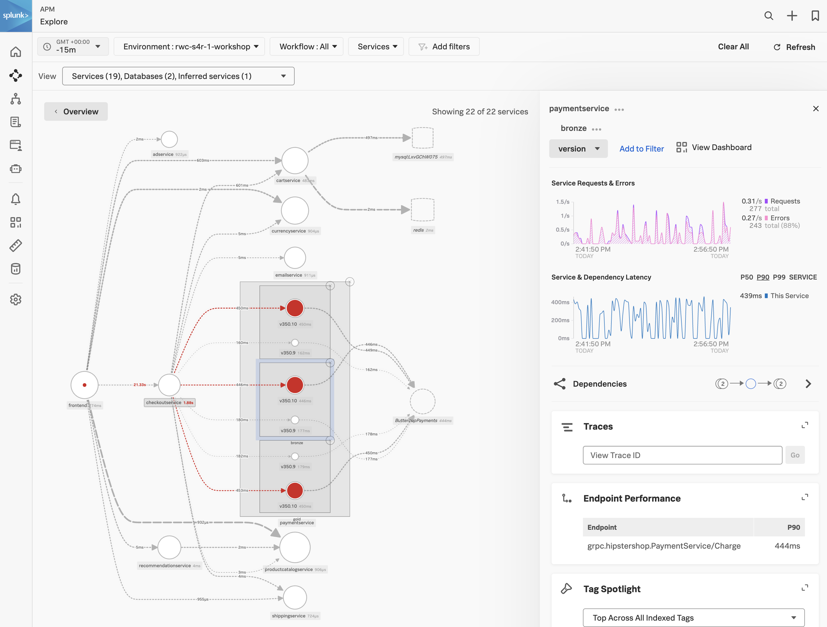
- Select
tenant.level in the list. This is a tag that exposes the customers’ status and can be useful to see trends related to customer status. - Back in the Service Map Click on gold to select it.
- Click on Breakdown and select
version, this is the tag that exposes the service version. - Repeat this for silver and bronze.
What can you conclude from what you are seeing?
Every tenant is being impacted by v350.10
You will now see the paymentservice broken down into three services, gold, silver and bronze. Each tenant is broken down into two services, one for each version (v350.10 and v350.9).
Exercise
- Click on the outer main box that surrounds the 3 red circles, the box will become highlighted.
Span Tags
Using span tags to break down services is a very powerful feature. It allows you to see how your services are performing for different customers, different versions, different regions, etc. In this exercise, we have determined that v350.10 of the paymentservice is causing problems for all our customers.
Next, we need to drill down into a trace to see what is going on.
5. APM Trace Analyzer
As Splunk APM provides a NoSample™ end-to-end visibility of every service Splunk APM captures every trace. For this workshop, the Order Confirmation ID is available as a tag. This means that we can use this to search for the exact trace of the poor user experience you encountered earlier in the workshop.
Trace Analyzer
Splunk Observability Cloud provides several tools for exploring application monitoring data. Trace Analyzer is suited to scenarios where you have high-cardinality, high-granularity searches and explorations to research unknown or new issues.
Exercise
- With the outer box of the paymentservice selected, in the right-hand pane, click on Traces.
- To ensure we are using Trace Analyzer make sure the button Switch to Classic View is showing. If it is not, click on Switch to Trace Analyzer.
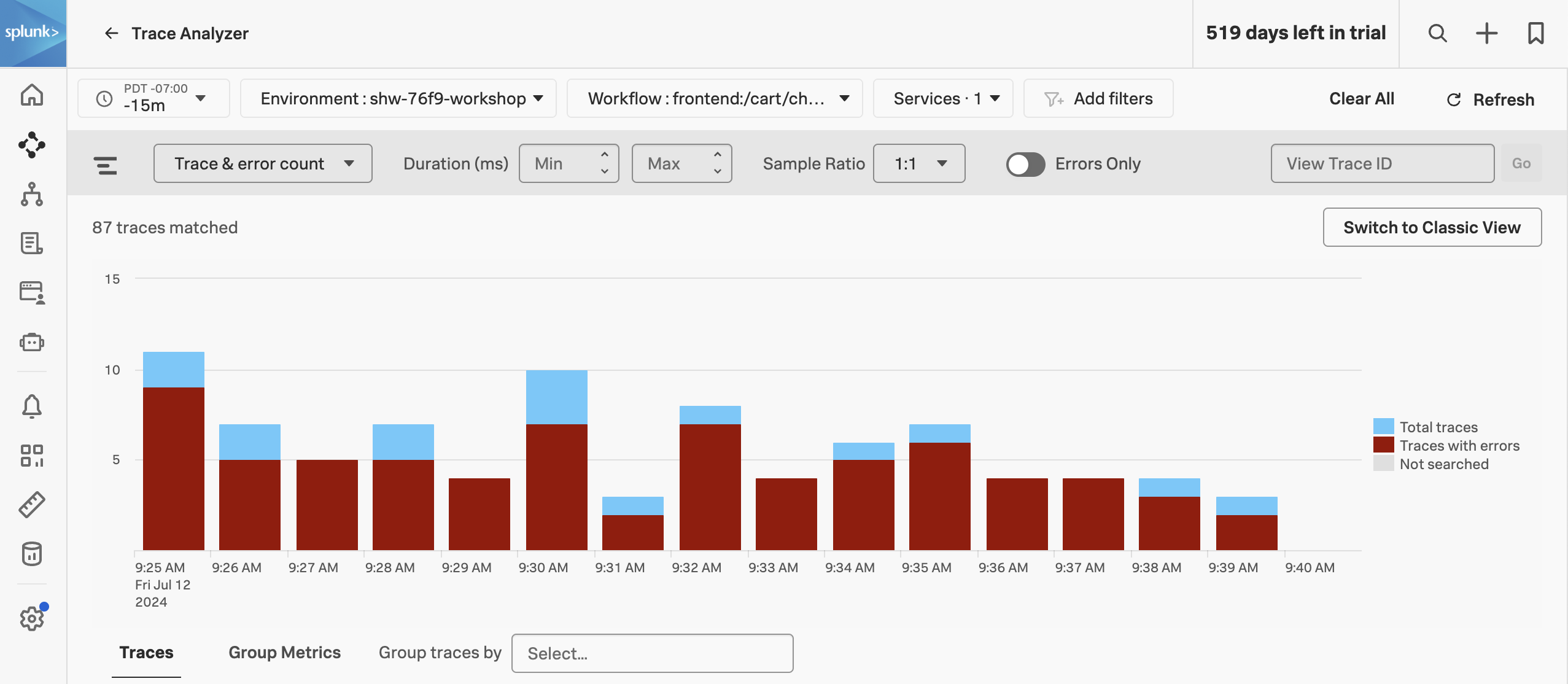
The Trace & error count view shows the total traces and traces with errors in a stacked bar chart. You can use your mouse to select a specific period within the available time frame.
Exercise
- Click on the dropdown menu that says Trace & error count, and change it to Trace duration
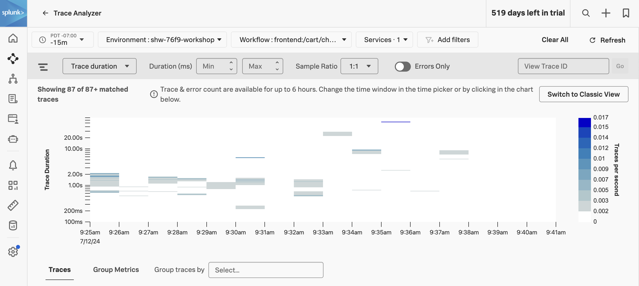
The Trace Duration view shows a heatmap of traces by duration. The heatmap represents 3 dimensions of data:
- Time on the x-axis
- Trace duration on the y-axis
- The traces (or requests) per second are represented by the heatmap shades
You can use your mouse to select an area on the heatmap, to focus on a specific time period and trace duration range.
Exercise
- Switch from Trace duration back to Trace & Error count.
- In the time picker select Last 1 hour.
- Note, that most of our traces have errors (red) and there are only a limited amount of traces that are error-free (blue).
- Make sure the Sample Ratio is set to
1:1 and not 1:10. - Click on Add filters, type in
orderId and select orderId from the list. - Paste in your Order Confirmation ID from when you went shopping earlier in the workshop and hit enter. If you didn’t capture one, please ask your instructor for one.
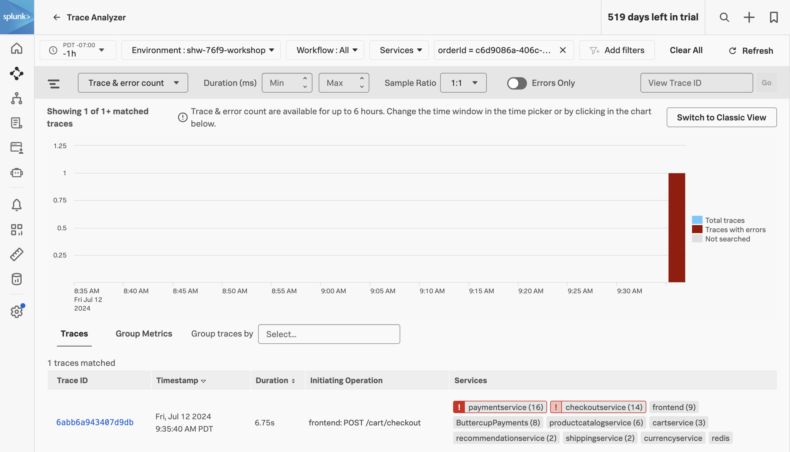
We have now filtered down to the exact trace where you encountered a poor user experience with a very long checkout wait. A secondary benefit to viewing this trace is that the trace will be accessible for up to 13 months. This will allow developers to come back to this issue at a later stage and still view this trace for example.
Exercise
- Click on the trace in the list.
Next, we will walk through the trace waterfall.
6. APM Waterfall
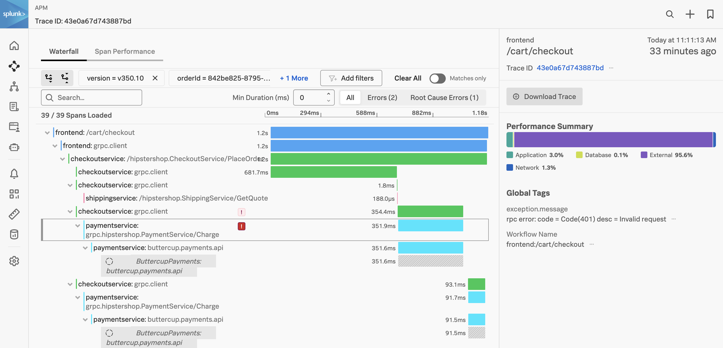
We have arrived at the Trace Waterfall from the Trace Analyzer. A trace is a collection of spans that share the same trace ID, representing a unique transaction handled by your application and its constituent services.
Each span in Splunk APM captures a single operation. Splunk APM considers a span to be an error span if the operation that the span captures results in an error.
Exercise
- Click on the ! next to any of the
paymentservice:grpc.hipstershop.PaymentService/Charge spans in the waterfall.
What is the error message and version being reported in the span metadata?
Invalid request and v350.10.
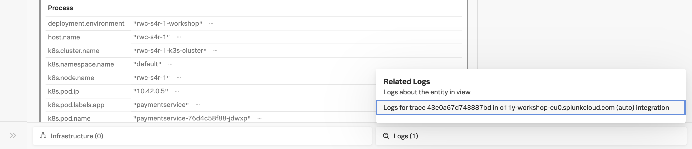
Related Content relies on specific metadata that allow APM, Infrastructure Monitoring, and Log Observer to pass filters around Observability Cloud. For related logs to work, you need to have the following metadata in your logs:
service.namedeployment.environmenthost.nametrace_idspan_id
Exercise
- At the very bottom of the Trace Waterfall click on the word Logs (1). This highlights that there are Related Logs for this trace.
- Click on the Logs for trace XXX entry in the pop-up, this will open the logs for the complete trace in Log Observer.