Splunk4Rookies - Observability Cloud
2 minutes
Authors
Robert Castley
Pieter HagenIn this workshop, we will be showing how Splunk Observability Cloud provides instant visibility of the user experience – from the perspective of the front-end application to its back-end services – Letting you experience some of the most compelling product features and differentiators of Splunk Observability Cloud:
- Infrastructure Monitoring
- Full-fidelity Real User Monitoring (RUM)
- Complete end-to-end NoSample™ Full-fidelity trace visibility with Application Performance Monitoring (APM)
- No code log querying
- Synthetic Monitoring
- Finding root causes with tag analytics and error stacks
- Related content
A key factor in building the Splunk Observability Cloud is to unify telemetry data to create a complete picture of an end-user experience and your application stack.
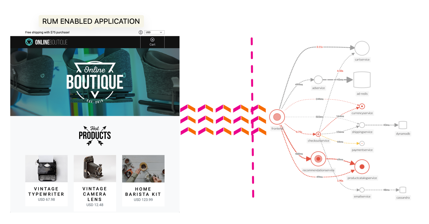
The workshop uses a microservices-based application that is deployed on AWS EC2 instances. The application is a simple e-commerce application that allows users to browse products, add them to a cart, and checkout. The application is instrumented with OpenTelemetry.
OpenTelemetry is a collection of tools, APIs, and software development kits (SDKs), used to instrument, generate, collect, and export telemetry data (metrics, traces, and logs) to help you analyze your software’s performance and behavior.
The OpenTelemetry community is growing. As a joint project between Splunk, Google, Microsoft, Amazon, and many other organizations, it currently has the second-largest number of contributors in the Cloud Native Computing Foundation after Kubernetes.
Subsections of Splunk4Rookies - Observability Cloud
Workshop Overview
2 minutes
Introduction
The goal of this workshop is to experience an issue and use Splunk Observability Cloud to troubleshoot and identify the root cause. For this, we have provided a complete microservices-based application running in Kubernetes that has been instrumented to send metrics, traces, and logs to Splunk Observability Cloud.
Who should attend?
Those wanting to gain an understanding of Splunk Observability in a hands-on environment. This workshop is designed for people with little or no experience with Splunk Observability.
What you’ll need
Just you, your laptop, and a browser that can access external websites. We run these workshops in person or on Zoom, if you don’t have the Zoom client on your device you will be able to access them via a web browser.
What’s covered in this workshop?
This 3-hour session will take you through the basics of Splunk Observability, the only observability platform with streaming analytics, NoSample™ Full Fidelity distributed tracing in a hands-on environment.
OpenTelemetry
A Quick introduction to why OpenTelemetry and why is it important for Observability.
Tour of the Splunk Observability User Interface
A walkthrough of the various components of Splunk Observability Cloud showing you how to easily navigate the 5 main components:- APM, RUM, Log Observer, Synthetics and Infrastructure.
Generate Real User Data
Enjoy some retail therapy using the Online Boutique Website. Use your browser, mobile or tablet to spend some hard-earned virtual money to send metrics (do we have a problem?), traces (where is the problem?) and logs (what is the problem?).
Splunk Real User Monitoring (RUM)
Examine the real user data that has been provided by the telemetry received from all participants’ browser sessions. The goal is to find a browser, mobile or tablet session that performed poorly and begin the troubleshooting process.
Discover the power of full end-to-end visibility by jumping from a RUM trace (front-end) to an APM trace (back-end). All the services are sending telemetry (traces and spans) that Splunk Observability Cloud can visualize, analyze and use to detect anomalies and errors.
Splunk Log Observer (LO)
Related Content is a powerful feature that allows you to jump from one component to another. In this case, we will jump from the APM trace to the logs to the related logs.
Splunk Synthetics
Wouldn’t it be great if we could have 24/7 monitoring of our application, and be alerted when there is a problem? This is where Synthetics comes in. We will show you a simple test that runs every 1 minute and checks the performance and availability of a typical user journey through the Online Boutique.
What is OpenTelemetry & why should you care?
2 minutes
OpenTelemetry
With the rise of cloud computing, microservices architectures, and ever-more complex business requirements, the need for Observability has never been greater. Observability is the ability to understand the internal state of a system by examining its outputs. In the context of software, this means being able to understand the internal state of a system by examining its telemetry data, which includes metrics, traces, and logs.
To make a system observable, it must be instrumented. That is, the code must emit traces, metrics, and logs. The instrumented data must then be sent to an Observability back-end such as Splunk Observability Cloud.
| Metrics | Traces | Logs |
|---|
| Do I have a problem? | Where is the problem? | What is the problem? |
OpenTelemetry does two important things:
- Allows you to own the data that you generate rather than be stuck with a proprietary data format or tool.
- Allows you to learn a single set of APIs and conventions
These two things combined enable teams and organizations the flexibility they need in today’s modern computing world.
There are a lot of variables to consider when getting started with Observability, including the all-important question: “How do I get my data into an Observability tool?”. The industry-wide adoption of OpenTelemetry makes this question easier to answer than ever.
Why Should You Care?
OpenTelemetry is completely open-source and free to use. In the past, monitoring and Observability tools relied heavily on proprietary agents meaning that the effort required to change or set up additional tooling required a large amount of changes across systems, from the infrastructure level to the application level.
Since OpenTelemetry is vendor-neutral and supported by many industry leaders in the Observability space, adopters can switch between supported Observability tools at any time with minor changes to their instrumentation. This is true regardless of which distribution of OpenTelemetry is used – like with Linux, the various distributions bundle settings and add-ons but are all fundamentally based on the community-driven OpenTelemetry project.
Splunk has fully committed to OpenTelemetry so that our customers can collect and use ALL their data, in any type, any structure, from any source, on any scale, and all in real-time. OpenTelemetry is fundamentally changing the monitoring landscape, enabling IT and DevOps teams to bring data to every question and every action. You will experience this during these workshops.

UI - Quick Tour 🚌
We are going to start with a short walkthrough of the various components of Splunk Observability Cloud. The aim of this is to get you familiar with the UI.
- Signing in to Splunk Observability Cloud
- Real User Monitoring (RUM)
- Application Performance Monitoring (APM)
- Log Observer
- Synthetics
- Infrastructure Monitoring
Tip
The easiest way to navigate through this workshop is by using:
- the left/right arrows (< | >) on the top right of this page
- the left (◀️) and right (▶️) cursor keys on your keyboard
Subsections of UI - Quick Tour 🚌
Getting Started
2 minutes
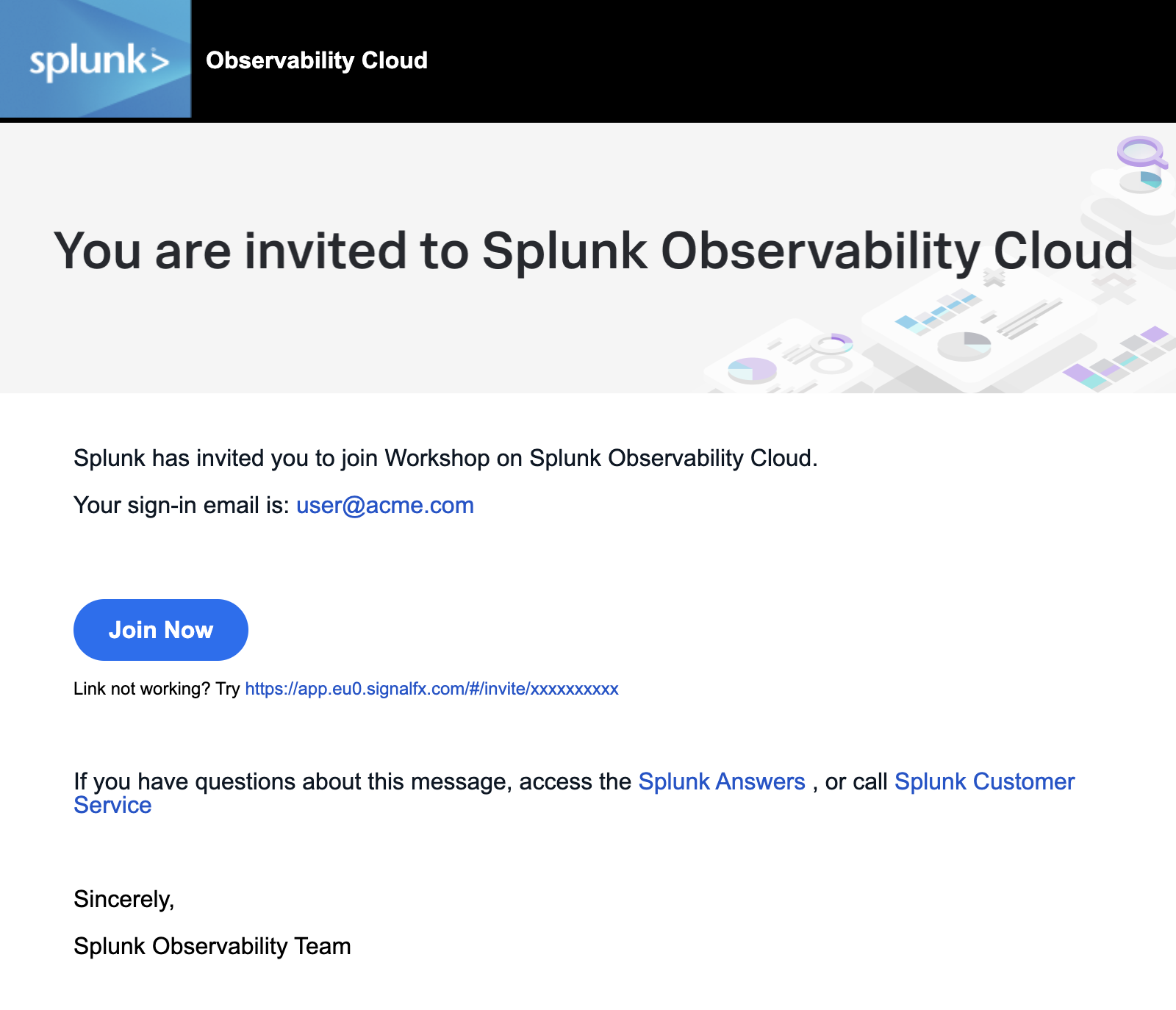
1. Sign in to Splunk Observability Cloud
You should have received an e-mail from Splunk inviting you to the Workshop Org. This e-mail will look like the screenshot below, if you cannot find it, please check your Spam/Junk folders or inform your Instructor. You can also check for other solutions in our login F.A.Q..
To proceed click the Join Now button or click on the link provided in the e-mail.
If you have already completed the registration process you can skip the rest and proceed directly to Splunk Observability Cloud and log in:
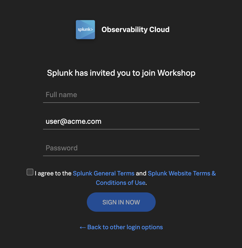
If this is your first time using Splunk Observability Cloud, you will be presented with the registration form. Enter your full name, and desired password. Please note that the password requirements are:
- Must be between 8 and 32 characters
- Must contain at least one capital letter
- Must have at least one number
- Must have at least one symbol (e.g. !@#$%^&*()_+)
Click the checkbox to agree to the terms and conditions and click the SIGN IN NOW button.
Subsections of Getting Started
Home Page
5 minutes
After you have registered and logged into Splunk Observability Cloud you will be taken to the home or landing page. Here, you will find several useful features to help you get started.
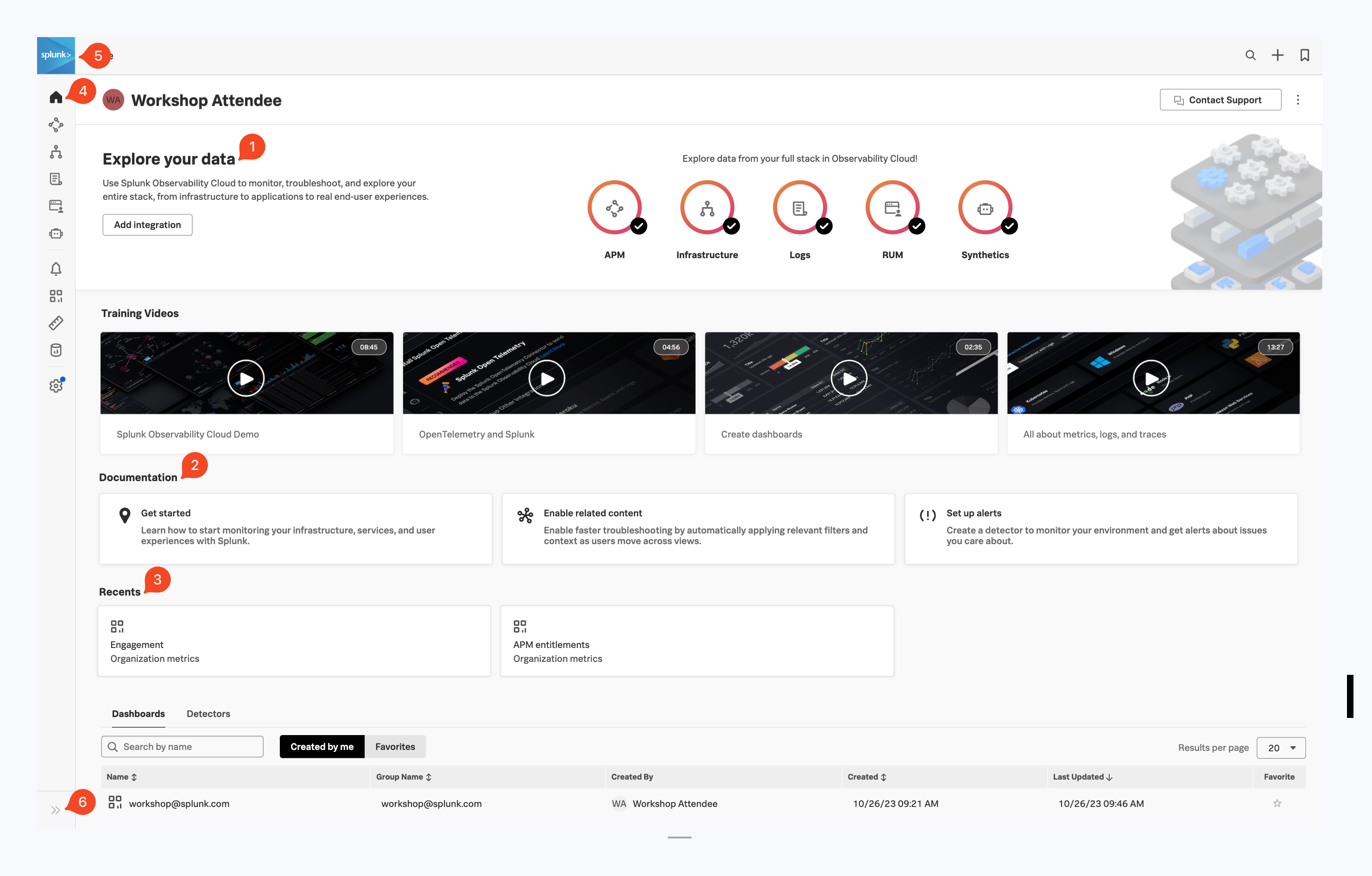
- Explore your data pane: Displays which integrations are enabled and allows you to add additional integrations if you are an Administrator.
- Documentation pane: Training videos and links to documentation to get you started with Splunk Observability Cloud.
- Recents pane: Recently created/visited dashboards and/or detectors for quick access.
- Main Menu pane: Navigate the components of Splunk Observability Cloud.
- Org Switcher: Easily switch between Organizations (if you are a member of more than one Organization).
- Expand/Contract Main Menu: Expand » / Collapse « the main menu if space is at a premium.
Let’s start with our first exercise:
Exercise
- Expand the Main Menu and click on Settings.
- Check in the Org Switcher if you have access to more than one Organization.
Tip
If you have used Splunk Observability before, you may be placed in an Organization you have used previously. Make sure you are in the correct workshop organization. Verify this with your instructor if you have access to multiple Organizations.
Exercise
- Click Onboarding Guidance (Here you can toggle the visibility of the onboarding panes. This is useful if you know the product well enough, and can use the space to show more information).
- Hide the Onboarding Content for the Home Page.
- At the bottom of the menu, select your preferred appearance: Light, Dark or Auto mode.
- Did you also notice this is where the Sign Out option is? Please don’t 😊 !
- Click < to get back to the main menu.
Next, let’s check out Splunk Real User Monitoring (RUM).
Real User Monitoring Overview
5 minutes
Splunk RUM is the industry’s only end-to-end, NoSample™ RUM solution - providing visibility into the full user experience of every web and mobile session to uniquely combine all front-end traces with back-end metrics, traces, and logs as they happen. IT Operations and Engineering teams can quickly scope, prioritize and isolate errors, measure how performance impacts real users and optimize end-user experiences by correlating performance metrics alongside video reconstructions of all user interactions.
Full user session analysis: Streaming analytics capture full user sessions from single and multi-page apps, measuring the customer impact of every resource, image, route change and API call.
Correlate issues faster: Infinite cardinality and full transaction analysis help you pinpoint and correlate issues faster across complex distributed systems.
Isolate latency and errors: Easily identify latency, errors and poor performance for each code change and deployment. Measure how content, images and third-party dependencies impact your customers.
Benchmark and improve page performance: Leverage core web vitals to measure and improve your page load experience, interactivity and visual stability. Find and fix impactful JavaScript errors, and easily understand which pages to improve first.
Explore meaningful metrics: Instantly visualize the customer impact with metrics on specific workflows, custom tags and auto-suggest un-indexed tags to quickly find the root cause of issues.
Optimize end-user experience: Correlate performance metrics alongside video reconstructions of all user interactions to optimize end-user experiences.
Subsections of Real User Monitoring Overview
Real User Monitoring Home Page
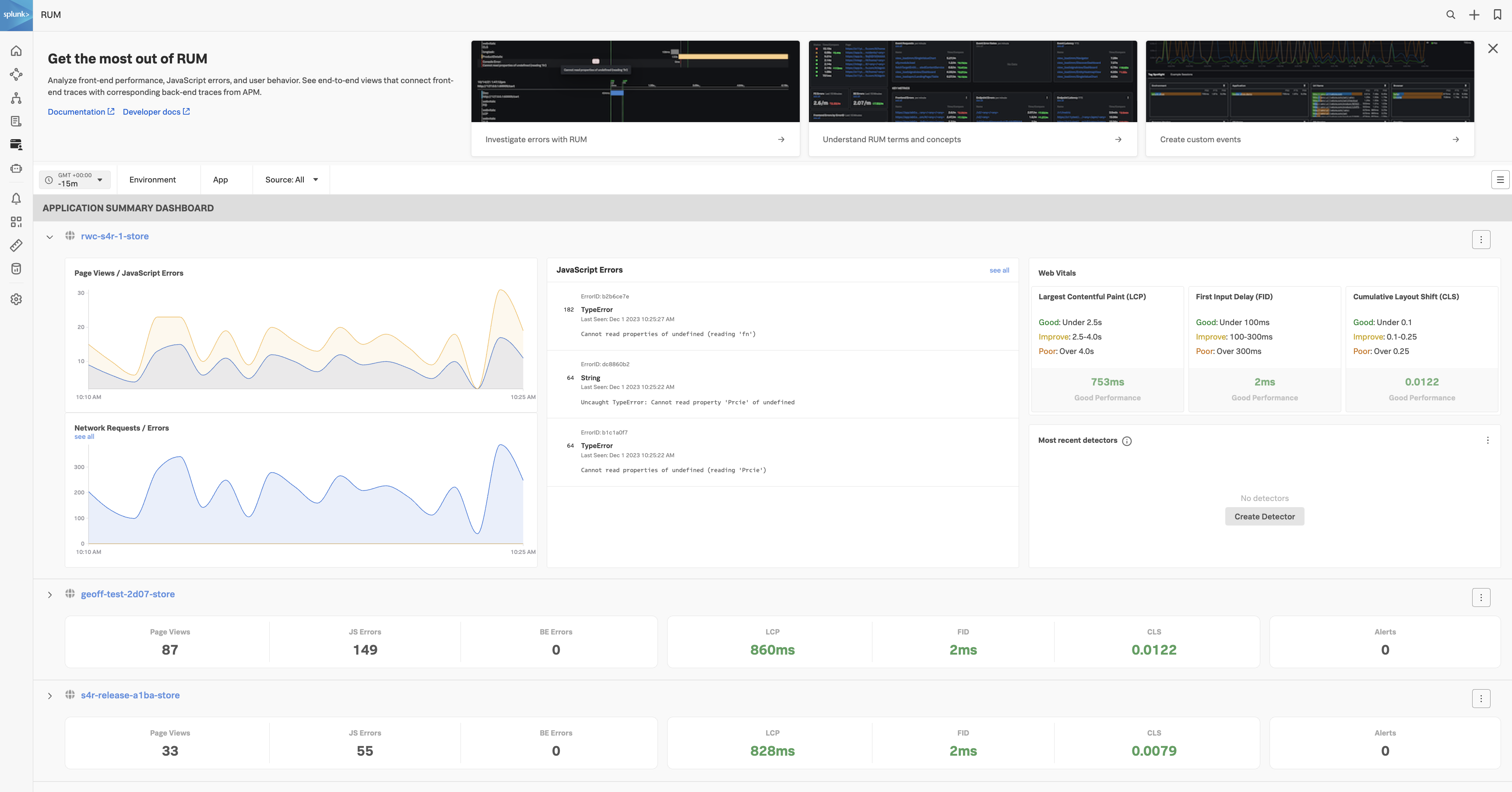
Click RUM in the main menu, this will bring you to the main RUM Home or Landing page. The main concept of this page is to provide you at a glance, the overall status of all selected RUM applications, either in a full dashboard or the compact view.
Independent of the type of Status Dashboard used, the RUM Home Page is made up of 3 distinct sections:
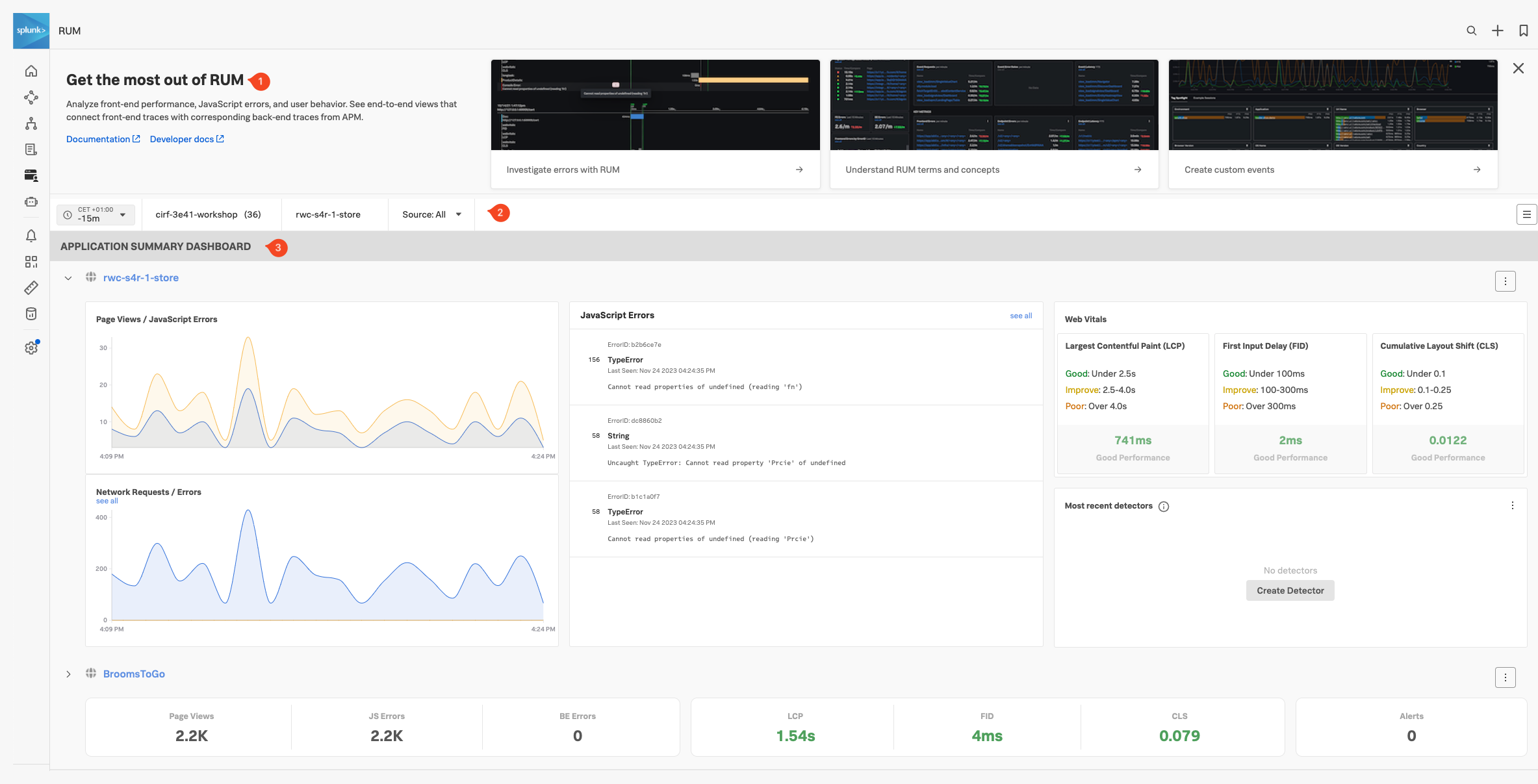
- Onboarding Pane: Training videos and links to documentation to get you started with Splunk RUM. (You can hide this pane in case you need the screen real estate).
- Filter Pane: Filter on the time frame, environment, application and source type.
- Application Summary Pane: Summary of all your applications that send RUM data.
RUM Environments & Application and Source Type
- Splunk Observability uses the environments Tag that is sent as part of the RUM trace, (created with every interaction with your website or Mobile App), to separate data coming from different environments like “Production” or “Development”.
- A further separation can be made by the Applications Tag. This allows you to distinguish between separate browser/mobile applications running in the same environment.
- Splunk RUM is available for both browser and mobile applications, you could use Source Type to distinguish between them, however for this workshop, we will only use browser-based RUM.
Exercise
- Ensure the time window is set to -15m
- Select the environment for your workshop from the drop-down box. The naming convention is [NAME OF WORKSHOP]-workshop (Selecting this will make sure the workshop RUM application is visible)
- Select the App name. There the naming convention is [NAME OF WORKSHOP]-store and leave Source set to All
- In the JavaScript Errors tile click on the TypeError entry that says: Cannot read properties of undefined (reading ‘Prcie’) to see more details. Note that you are given a quick indication of what part of the website the error occurred, allowing you to fix this quickly.
- Close the pane.
- The 3rd tile reports Web Vitals, a metric that focuses on three important aspects of the user experience: loading, interactivity, and visual stability.
Based on the Web Vitals metrics, how do you rate the current web performance of the site?
According to the Web Vitals Metrics, the initial load of the site is OK and is rated Good
- The last tile, Most recent detectors tile, will show if any alerts have been triggered for the application.
- Click on the down ⌵ arrow in front of the Application name to toggle the view to the compact style. Note that you have all the main information available in this view as well. Click anywhere in the compact view to go back to the full view.
Next, let’s check out Splunk Application Performance Monitoring (APM).
5 minutes
Splunk APM provides a NoSample™ end-to-end visibility of every service and its dependency to solve problems quicker across monoliths and microservices. Teams can immediately detect problems from new deployments, confidently troubleshoot by scoping and isolating the source of an issue, and optimize service performance by understanding how back-end services impact end users and business workflows.
Real-time monitoring and alerting: Splunk provides out-of-the-box service dashboards and automatically detects and alerts on RED metrics (rate, error and duration) when there is a sudden change.
Dynamic telemetry maps: Easily visualize service performance in modern production environments in real-time. End-to-end visibility of service performance from infrastructure, applications, end users, and all dependencies helps quickly scope new issues and troubleshoot more effectively.
Intelligent tagging and analysis: View all tags from your business, infrastructure and applications in one place to easily compare new trends in latency or errors to their specific tag values.
AI-directed troubleshooting identifies the most impactful issues: Instead of manually digging through individual dashboards, isolate problems more efficiently. Automatically identify anomalies and the sources of errors that impact services and customers the most.
Complete distributed tracing analyses every transaction: Identify problems in your cloud-native environment more effectively. Splunk distributed tracing visualizes and correlates every transaction from the back-end and front-end in context with your infrastructure, business workflows and applications.
Full stack correlation: Within Splunk Observability, APM links traces, metrics, logs and profiling together to easily understand the performance of every component and its dependency across your stack.
Monitor database query performance: Easily identify how slow and high execution queries from SQL and NoSQL databases impact your services, endpoints and business workflows — no instrumentation required.
Subsections of Application Performance Monitoring Overview
Application Performance Monitoring Home page
Click APM in the main menu, the APM Home Page is made up of 3 distinct sections:
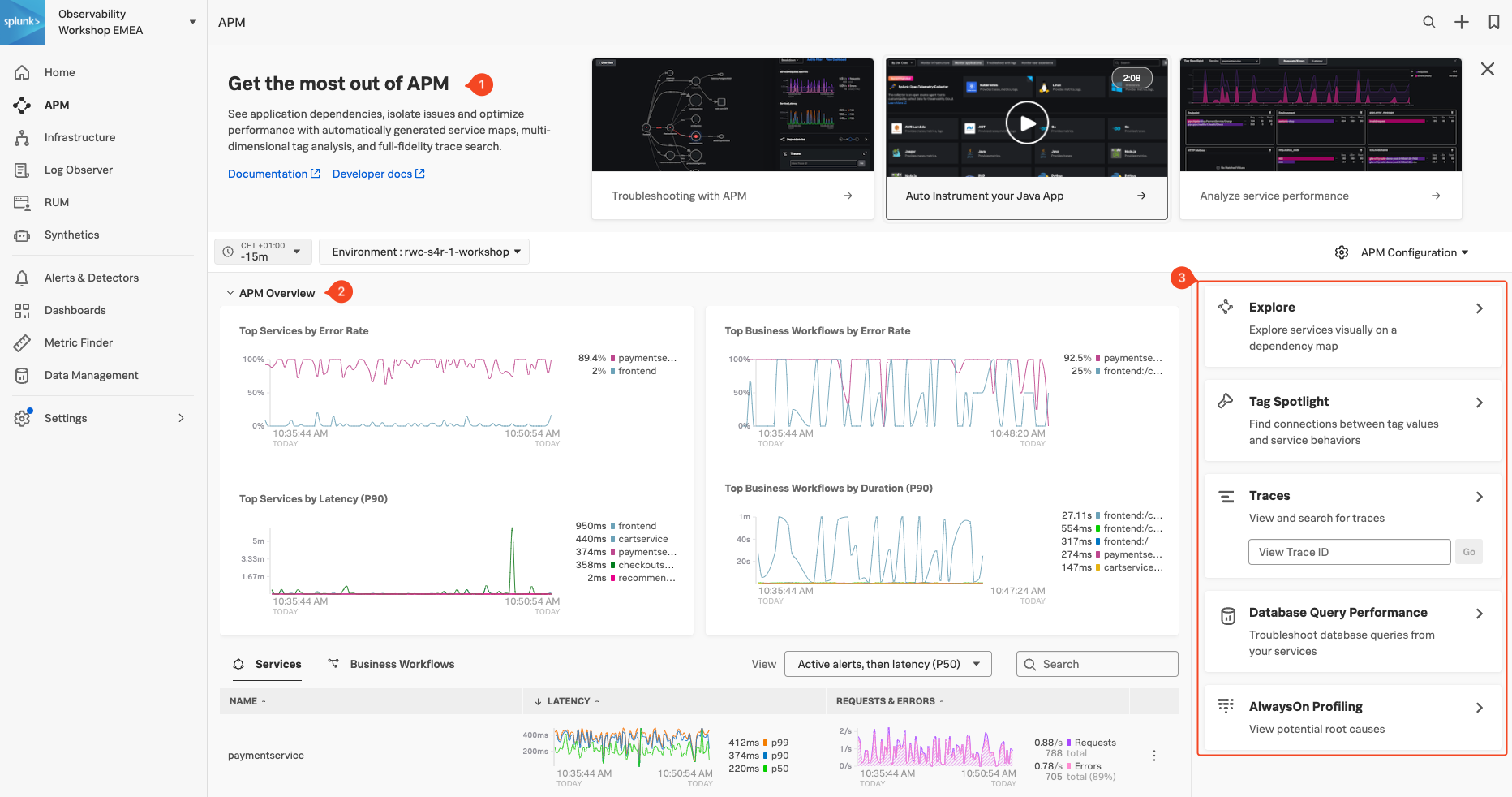
- Onboarding Pane Pane: Training videos and links to documentation to get you started with Splunk APM.
- APM Overview Pane: Real-time metrics for the Top Services and Top Business Workflows.
- Functions Pane: Links for deeper analysis of your services, tags, traces, database query performance and code profiling.
The APM Overview pan provides a high-level view of the health of your application. It includes a summary of the services, latency and errors in your application. It also includes a list of the top services by error rate and the top business workflows by error rate (a business workflow is the start-to-finish journey of the collection of traces associated with a given activity or transaction and enables monitoring of end-to-end KPIs and identifying root causes and bottlenecks).
About Environments
To easily differentiate between multiple applications, Splunk uses environments. The naming convention for workshop environments is [NAME OF WORKSHOP]-workshop. Your instructor will provide you with the correct one to select.
Exercise
- Verify that the time window we are working with is set to the last 15 minutes (-15m).
- Change the environment to the workshop one by selecting its name from the drop-down box and make sure that is the only one selected.
What can you conclude from the Top Services by Error Rate chart?
The paymentservice has a high error rate
If you scroll down the Overview Page you will notice some services listed have Inferred Service next to them.
Splunk APM can infer the presence of the remote service, or inferred service if the span calling the remote service has the necessary information. Examples of possible inferred services include databases, HTTP endpoints, and message queues. Inferred services are not instrumented, but they are displayed on the service map and the service list.
Next, let’s check out Splunk Log Observer (LO).
Log Observer Overview
5 minutes
Log Observer Connect allows you to seamlessly bring in the same log data from your Splunk Platform into an intuitive and no-code interface designed to help you find and fix problems quickly. You can easily perform log-based analysis and seamlessly correlate your logs with Splunk Infrastructure Monitoring’s real-time metrics and Splunk APM traces in one place.
End-to-end visibility: By combining the powerful logging capabilities of Splunk Platform with Splunk Observability Cloud’s traces and real-time metrics for deeper insights and more context of your hybrid environment.
Perform quick and easy log-based investigations: By reusing logs that are already ingested in Splunk Cloud Platform or Enterprise in a simplified and intuitive interface (no need to know SPL!) with customizable and out-of-the-box dashboards
Achieve higher economies of scale and operational efficiency: By centralizing log management across teams, breaking down data and team silos, and getting better overall support
Subsections of Log Observer Overview
Log Observer Home Page
Click Log Observer in the main menu, the Log Observer Home Page is made up of 4 distinct sections:
- Onboarding Pane: Training videos and links to documentation to get you started with Splunk Log Observer.
- Filter Bar: Filter on time, indexes, and fields and also Save Queries.
- Logs Table Pane: List of log entries that match the current filter criteria.
- Fields Pane: List of fields available in the currently selected index.
Splunk indexes
Generally, in Splunk, an “index” refers to a designated place where your data is stored. It’s like a folder or container for your data. Data within a Splunk index is organized and structured in a way that makes it easy to search and analyze. Different indexes can be created to store specific types of data. For example, you might have one index for web server logs, another for application logs, and so on.
Tip
If you have used Splunk Enterprise or Splunk Cloud before, you are probably used to starting investigations with logs. As you will see in the following exercise, you can do that with Splunk Observability Cloud as well. This workshop, however, will use all the OpenTelemetry signals for investigations.
Let’s run a little search exercise:
Exercise
Set the time frame to -15m.
Click on Add Filter in the filter bar then click on Fields in the dialog.
Type in cardType and select it.
Under Top values click on visa, then click on = to add it to the filter.

Click on one of the log entries in the Logs table to validate that the entry contains cardType: "visa".
Let’s find all the orders that have been shipped. Click on Clear All in the filter bar to remove the previous filter.
Click again on Add Filter in the filter bar, then select Keyword. Next just type order: in the Enter Keyword… box and press enter.
You should now only have log lines that contain the word “order:”. There are still a lot of log lines, so let’s filter some more.
Add another filter, this time select the Fields box, then type severity in the Find a field… search box and select it.

Make sure you click the Exclude all logs with this fields at the bottom of the dialog box, as the order log line does not have a severity assigned. This will remove the others.
You may need to scroll down the page if you still have the onboarding content displayed at the top to see the Exclude all logs with this fields button.
You should now have a list of orders sold for the last 15 minutes.
Next, let’s check out Splunk Synthetics.
Synthetics Overview
5 minutes
Splunk Synthetic Monitoring provides visibility across URLs, APIs and critical web services to solve problems faster. IT Operations and engineering teams can easily detect, alert and prioritize issues, simulate multi-step user journeys, measure business impact from new code deployments and optimize web performance with guided step-by-step recommendations to ensure better digital experiences.
Ensure Availability: Proactively monitor and alert on the health and availability of critical services, URLs and APIs with customizable browser tests to simulate multi-step workflows that make up the user experience.
Improve Metrics: Core Web Vitals and modern performance metrics allow users to view all their performance defects in one place, measure and improve page load, interactivity and visual stability, and find and fix JavaScript errors to improve page performance.
front-end to back-end: Integrations with Splunk APM, Infrastructure Monitoring, On-Call and ITSI help teams view endpoint uptime against back-end services, the underlying infrastructure and within their incident response coordination so they can troubleshoot across their entire environment, in a single UI.
Detect and Alert: Monitor and simulate end-user experiences to detect, communicate and resolve issues for APIs, service endpoints and critical business transactions before they impact customers.
Business Performance: Easily define multi-step user flows for key business transactions and start recording and testing your critical user journeys in minutes. Track and report SLAs and SLOs for uptime and performance.
Filmstrips and Video Playback: View screen recordings, film strips, and screenshots alongside modern performance scores, competitive benchmarking, and metrics to visualize artificial end-user experiences. Optimize how fast you deliver visual content, and improve page stability and interactivity to deploy better digital experiences.
Subsections of Synthetics Overview
Synthetics Home Page
Click on Synthetics in the main menu. This will bring us to the Synthetics Home Page. It has 3 distinct sections that provide either useful information or allow you to pick or create a Synthetic Test.
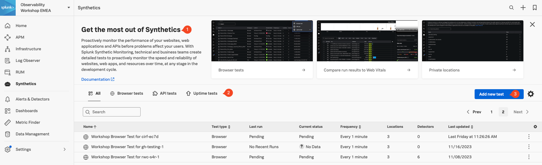
- Onboarding Pane: Training videos and links to documentation to get you started with Splunk Synthetics.
- Test Pane: List of all the tests that are configured (Browser, API and Uptime)
- Create Test Pane: Drop-down for creating new Synthetic tests.
Info
As part of the workshop we have created a default browser test against the application we are running. You find it in the Test Pane (2). It will have the following name Workshop Browser Test for, followed by the name of your Workshop (your instructor should have provided that to you).
Exercise
- In the Test Pane, click on the line that contains the name of your workshop. The result should look like this:
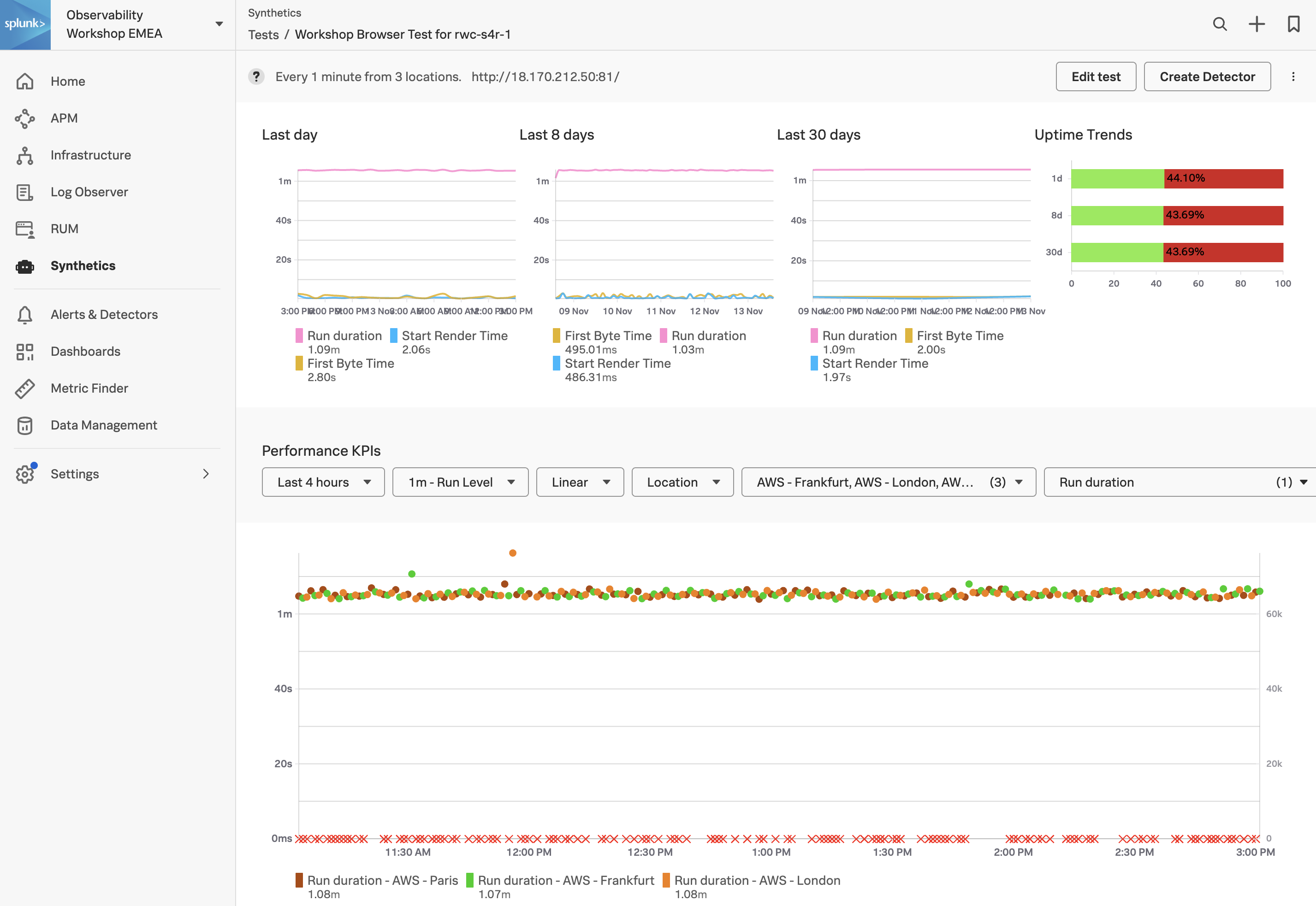
- Note, On the Synthetic Tests Page, the first pane will show the performance of your site for the last day, 8 days and 30 days. As shown in the screenshot above, only if a test started far enough in the past, the corresponding chart will contain valid data. For the workshop, this depends on when it was created.
- In the Performance KPI drop-down, change the time from the default 4 hours to the 1 last hour.
How often is the test run, and from where?
The test runs at a 1-minute round-robin interval from Frankfurt, London and Paris
Next, let’s examine the infrastructure our application is running on using Splunk Infrastructure Monitoring (IM).
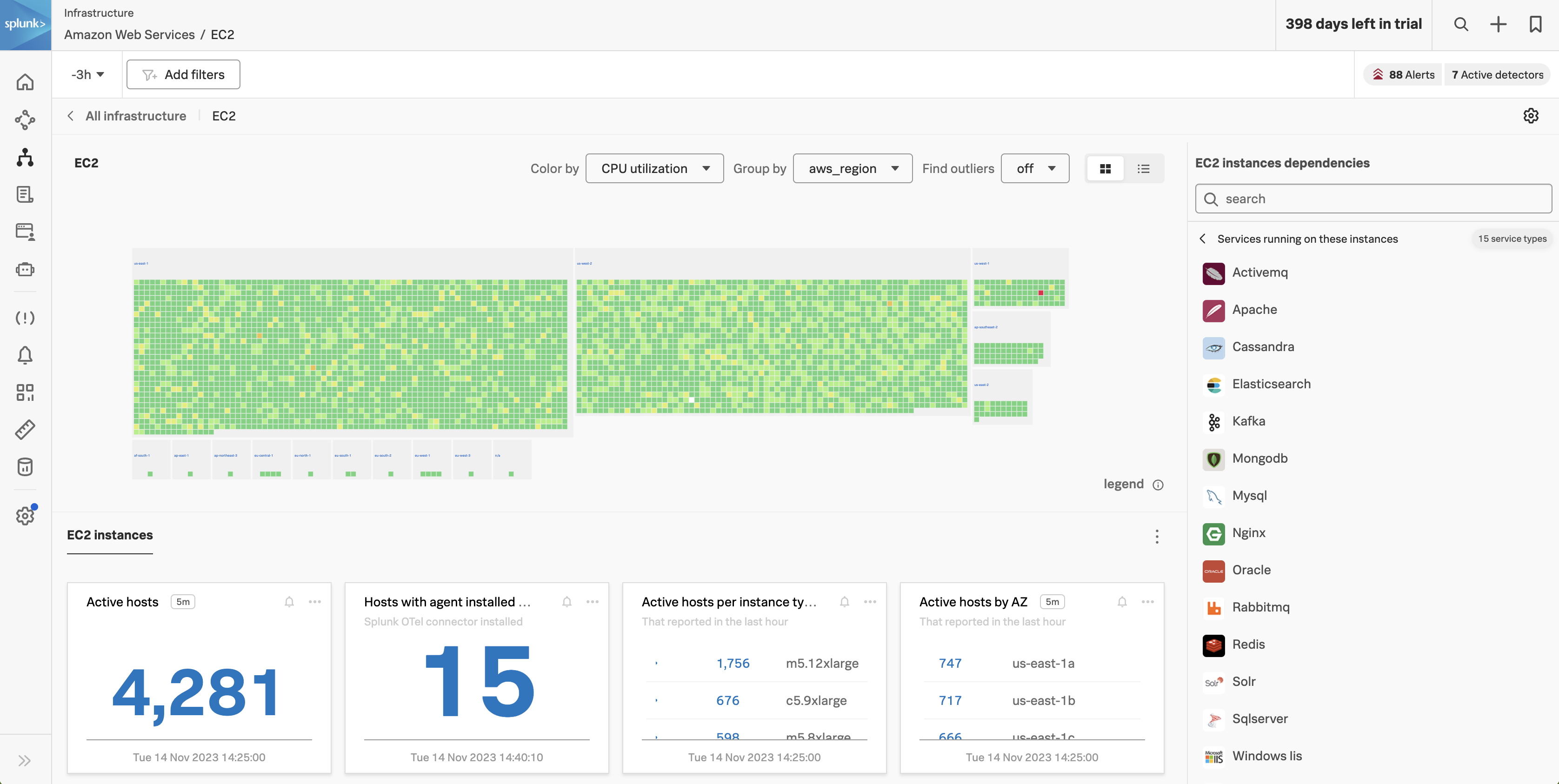
Infrastructure Overview
5 minutes
Splunk Infrastructure Monitoring (IM) is a market-leading monitoring and observability service for hybrid cloud environments. Built on a patented streaming architecture, it provides a real-time solution for engineering teams to visualize and analyze performance across infrastructure, services, and applications in a fraction of the time and with greater accuracy than traditional solutions.
OpenTelemetry standardization: Gives you full control over your data — freeing you from vendor lock-in and implementing proprietary agents.
Splunk’s OTel Collector: Seamless installation and dynamic configuration, auto-discovers your entire stack in seconds for visibility across clouds, services, and systems.
300+ Easy-to-use OOTB content: Pre-built navigators and dashboards, deliver immediate visualizations of your entire environment so that you can interact with all your data in real time.
Kubernetes navigator: Provides an instant, comprehensive out-of-the-box hierarchical view of nodes, pods, and containers. Ramp up even the most novice Kubernetes user with easy-to-understand interactive cluster maps.
AutoDetect alerts and detectors: Automatically identify the most important metrics, out-of-the-box, to create alert conditions for detectors that accurately alert from the moment telemetry data is ingested and use real-time alerting capabilities for important notifications in seconds.
Log views in dashboards: Combine log messages and real-time metrics on one page with common filters and time controls for faster in-context troubleshooting.
Metrics pipeline management: Control metrics volume at the point of ingest without re-instrumentation with a set of aggregation and data-dropping rules to store and analyze only the needed data. Reduce metrics volume and optimize observability spend.
Subsections of Infrastructure Overview
5 minutes
Persona
You are a hip urban professional, longing to buy your next novelty items in the famous Online Boutique shop. You have heard that the Online Boutique is the place to go for all your hipster needs.
The purpose of this exercise is for you to interact with the Online Boutique web application. This is a sample application that is used to demonstrate the capabilities of Splunk Observability Cloud. The application is a simple e-commerce site that allows you to browse items, add them to your cart, and then checkout.
The application will already be deployed for you and your instructor will provide you with a link to the Online Boutique website.
Exercise - Let’s go shopping
- Once you have the link to the Online Boutique, have a browse through a few items, add them to your cart and then, finally, do a checkout.
- Repeat this exercise a few times and if possible use different browsers, mobile devices or tablets as this will generate more data for you to explore.
Tip
While you are waiting for pages to load, please move your mouse cursor around the page. This will generate more data for us to explore at a later date in this workshop.
Exercise (cont.)
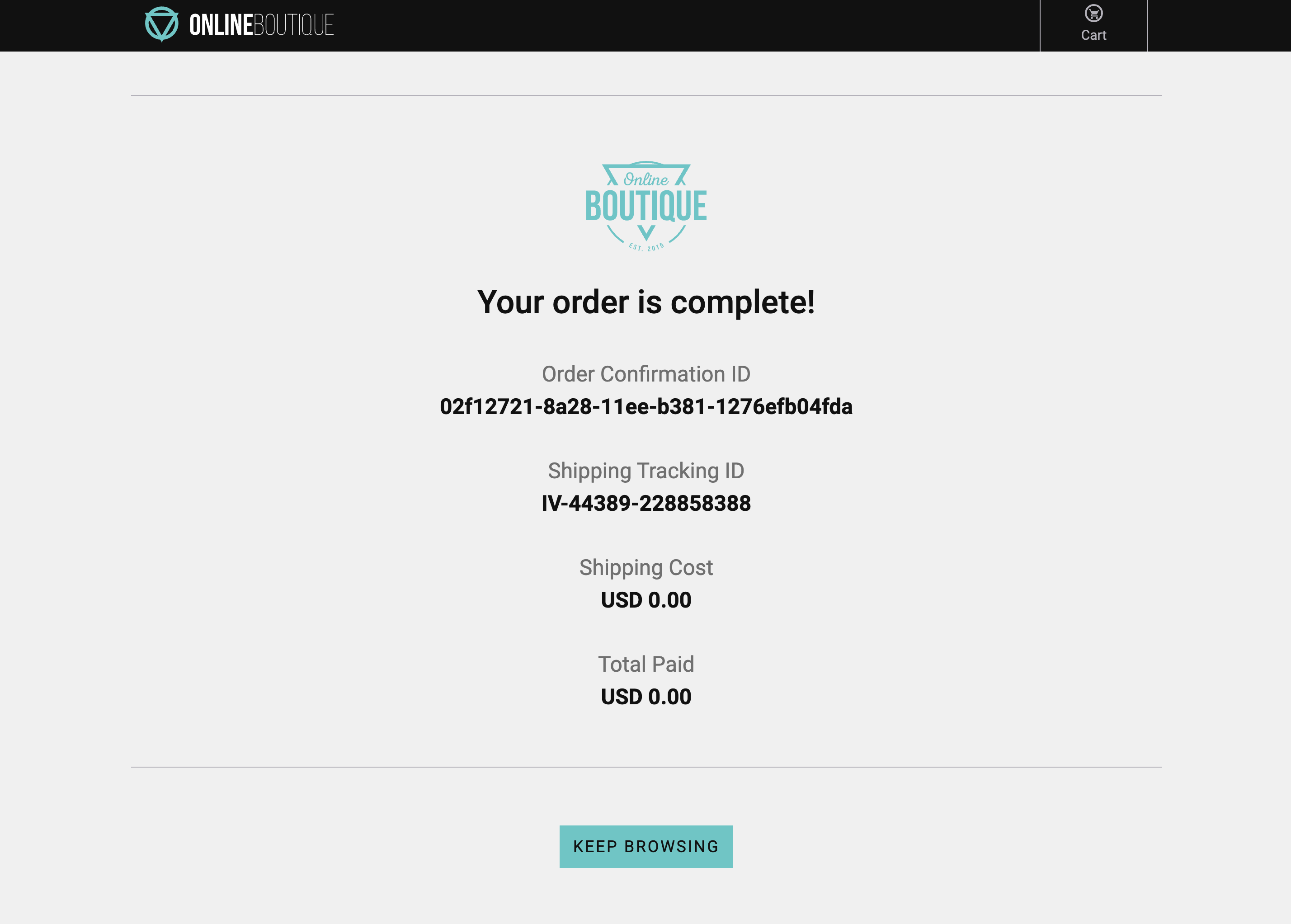
- Did you notice anything about the checkout process? Did it seem to take a while to complete, but it did ultimately complete? When this happens please copy the Order Confirmation ID and save it locally somewhere as we will need it later.
- Close the browser sessions you used to shop.
This is what a poor user experience can feel like and since this is a potential customer satisfaction issue we had better jump on this and troubleshoot.
Let’s go take a look at what the data looks like in Splunk RUM.
Splunk RUM
15 minutes
Persona
You are a frontend engineer, or an SRE tasked to do the first triage of a performance issue. You have been asked to investigate a potential customer satisfaction issue with the Online Boutique application.
We are going to examine the real user data that has been provided by the telemetry received from all participants’ browser sessions. The goal is to find a browser, mobile or tablet session that performed poorly and begin the troubleshooting process.
Subsections of Splunk RUM
1. RUM Dashboard
In Splunk Observability Cloud from the main menu, click on RUM. you arrive at the RUM Home page, this view has already been covered in the short introduction earlier.
Exercise
- Make sure you select your workshop by ensuring the drop-downs are set/selected as follows:
- The Time frame is set to -15m.
- The Environment selected is [NAME OF WORKSHOP]-workshop.
- The App selected is [NAME OF WORKSHOP]-store.
- The Source is set to All.
- Next, click on the [NAME OF WORKSHOP]-store above the Page Views / JavaScript Errors chart.
- This will bring up a new dashboard view breaking down the metrics by UX Metrics, Front-end Health, Back-end Health and Custom Events and comparing them to historic metrics (1 hour by default).
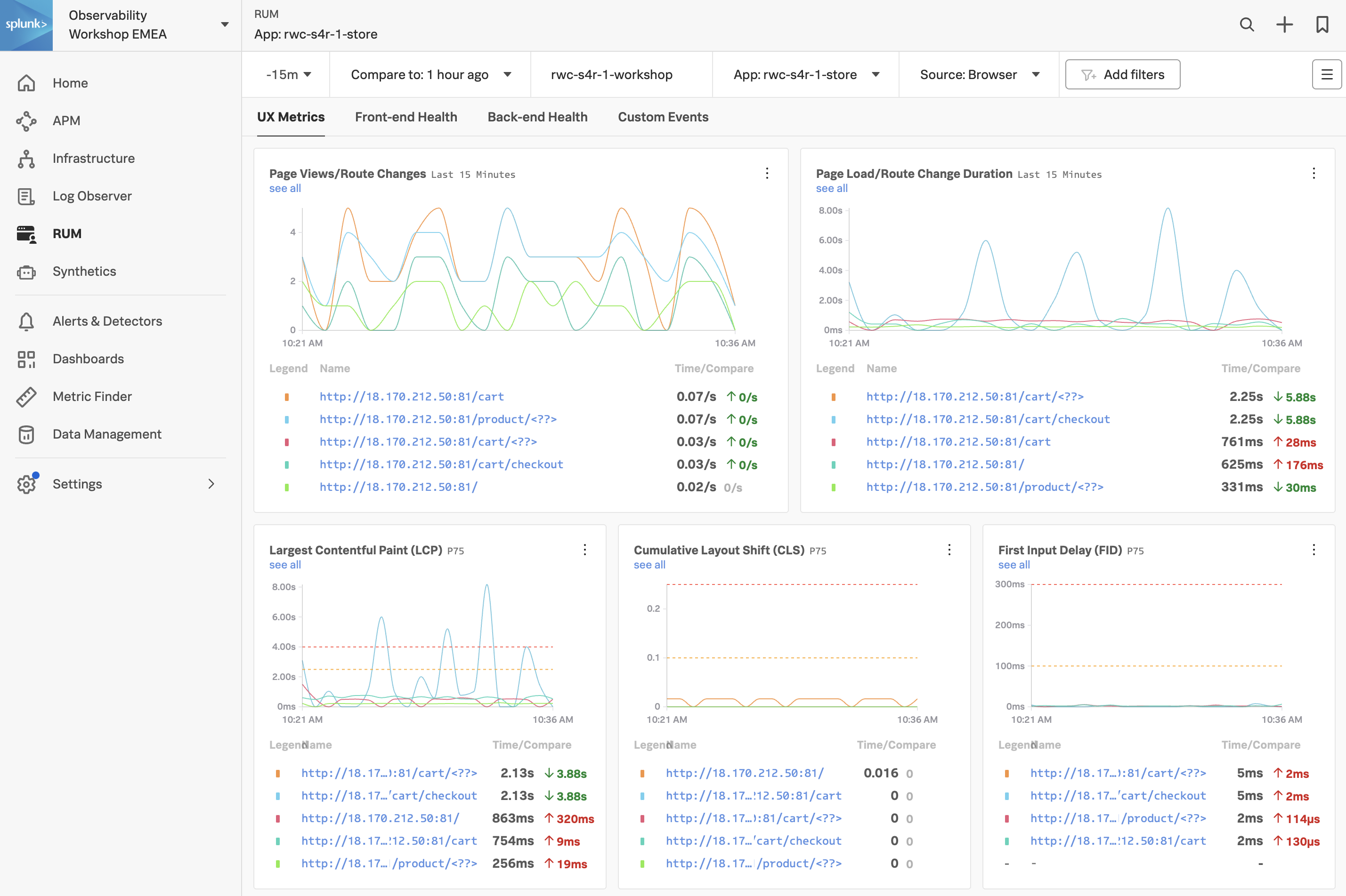
- UX Metrics: Page Views, Page Load and Web Vitals metrics.
- Front-end Health: Breakdown of Javascript Errors and Long Task duration and count.
- Back-end Health: Network Errors and Requests and Time to First Byte.
- Custom Events: RED metrics (Rate, Error & Duration) for custom events.
Exercise
- Click through each of the tabs (UX Metrics, Front-end Health, Back-end Health and Custom Events) and examine the data.
If you examine the charts in the Custom Events Tab, what chart shows clearly the latency Spikes?
It is the Custom Event Latency chart
2. Tag Spotlight
Exercise
Make sure you are on the Custom Events tab by selecting it.
Have a look at the Custom Event Latency chart. The metrics shown here show the application latency. The comparison metrics to the side show the latency compared to 1 hour ago (which is selected in the top filter bar).
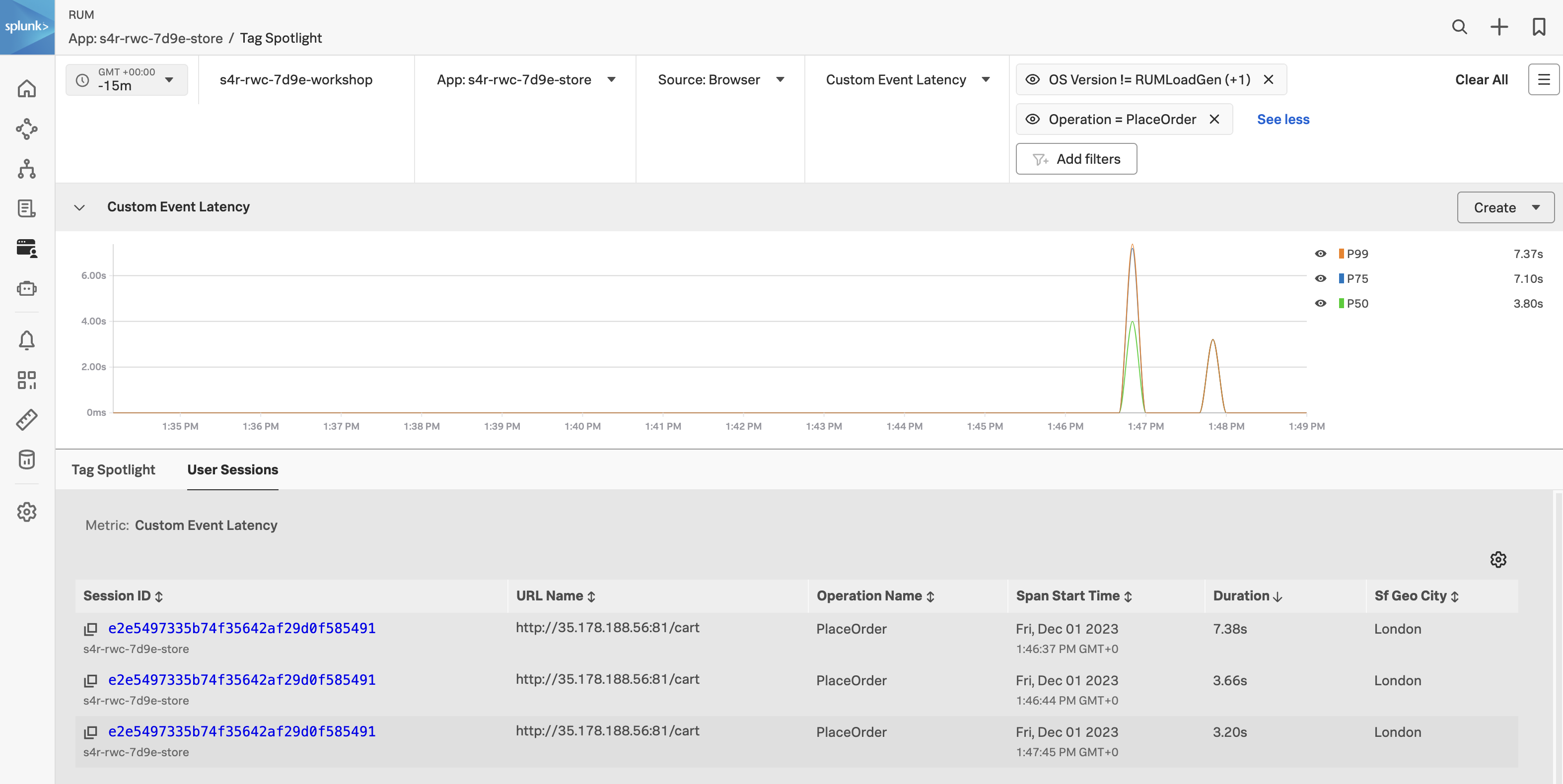
Click on the see all link under the chart title.

In this dashboard view, you are presented with all the tags associated with the RUM data. Tags are key-value pairs that are used to identify the data. In this case, the tags are automatically generated by the OpenTelemetry instrumentation. The tags are used to filter the data and to create the charts and tables. The Tag Spotlight view allows you to drill down into a user session.
Exercise
- Change the timeframe to Last 1 hour.
- Click Add Filters, select OS Version, click != and select Synthetics and RUMLoadGen then click the Apply Filter button.
- Find the Custom Event Name chart, locate PlaceOrder in the list, click on it and select Add to filter.
- Notice the large spikes in the graph across the top.
- Click on the User Sessions tab.
- Click on the Duration heading twice to sort the sessions by duration (longest at the top).
- Click on the above the table and select Sf Geo City from the list of additional columns and click Save
We now have a User Session table that is sorted by longest duration descending and includes the cities of all the users that have been shopping on the site. We could apply more filters to further narrow down the data e.g. OS version, browser version, etc.
3. Session Replay
Sessions
A session is a collection of traces that correspond to the actions a single user takes when interacting with an application. By default, a session lasts until 15 minutes have passed from the last event captured in the session. The maximum session duration is 4 hours.
Exercise
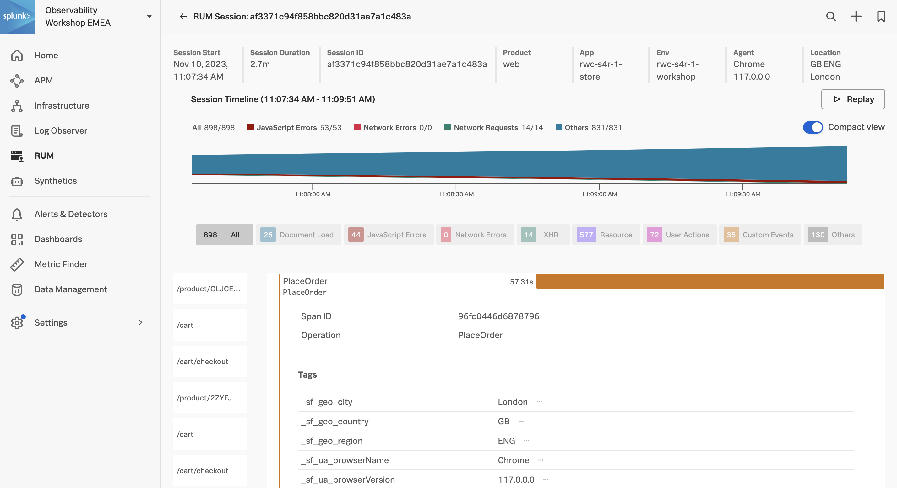
- In the User Sessions table, click on the top Session ID with the longest Duration (over 20 seconds or longer), this will take you to the RUM Session view.
Exercise
- Click the RUM Session Replay Replay button. RUM Session Replay allows you to replay and see the user session. This is a great way to see exactly what the user experienced.
- Click the button to start the replay.
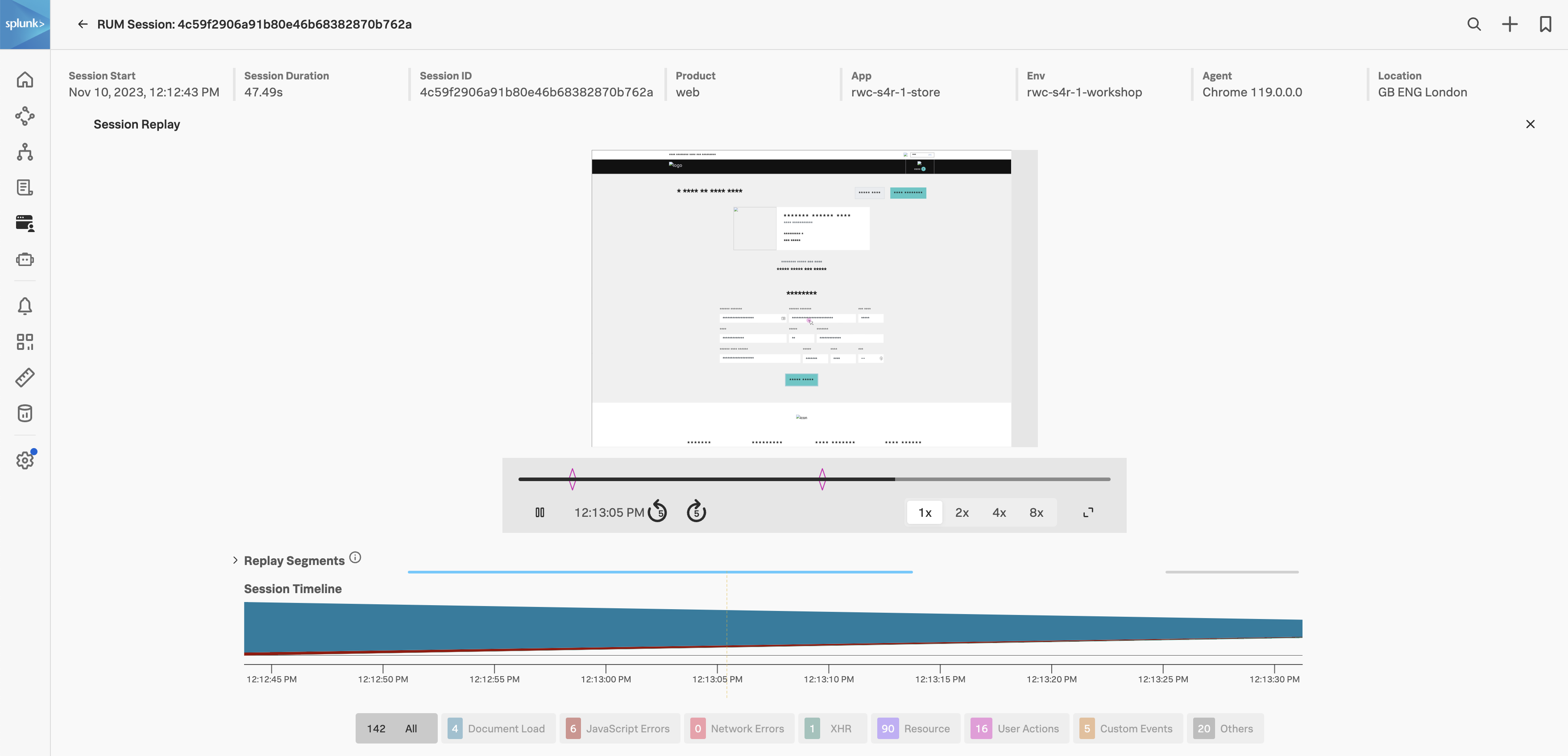
RUM Session Replay can redact information, by default text is redacted. You can also redact images (which has been done for this workshop example). This is useful if you are replaying a session that contains sensitive information. You can also change the playback speed and pause the replay.
Tip
When playing back the session, notice how the mouse movements are captured. This is useful to see where the user is focusing their attention.
4. User Sessions
Exercise
- Close the RUM Session Replay by clicking on the X in the top right corner. We had set a filter on PlaceOrder in the previous exercise. It should be selected here as well, as shown in the screenshot below (1).
- Note the length of the span, this is the time it took to complete the order, not good!
- Scroll down the page and you will see the Tags metadata (which is used in Tag Spotlight). After the tags, we come to the waterfall which shows the page objects that have been loaded (HTML, CSS, images, JavaScript etc.)
- Keep scrolling down the page until you come to a blue APM link (the one with
/cart/checkout at the end of the URL) and hover over it.
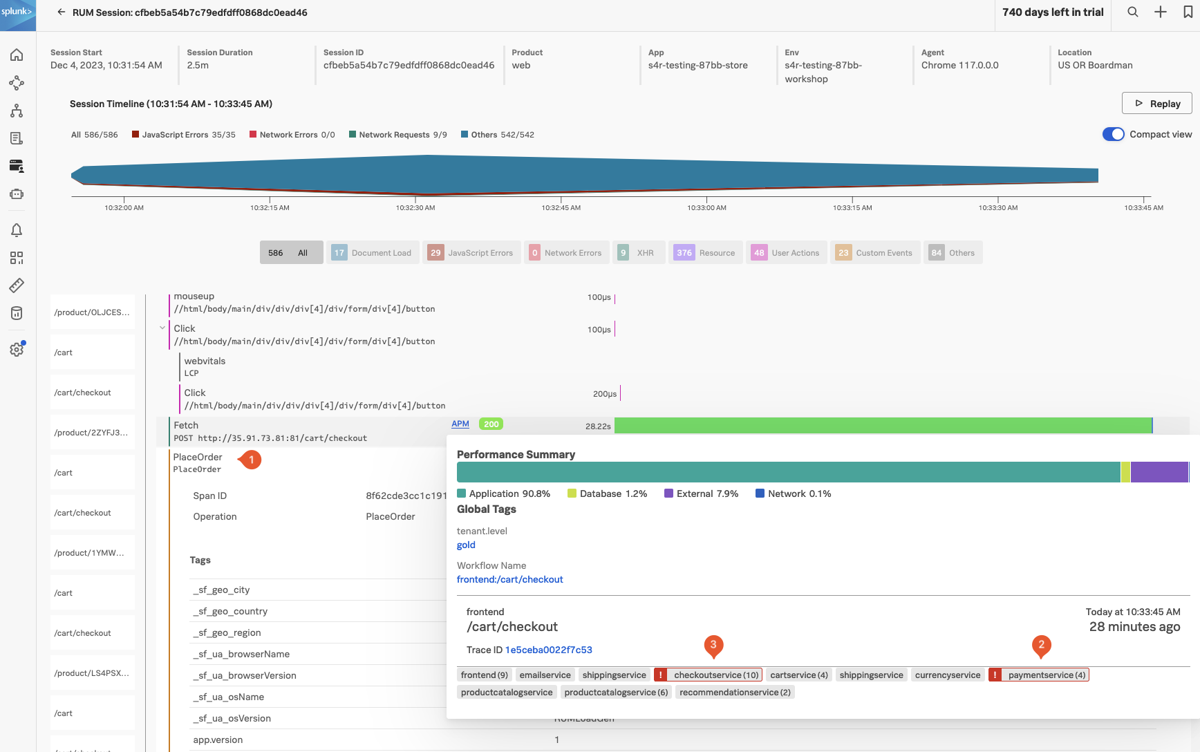
This brings up the APM Performance Summary. Having this end-to-end (RUM to APM) view is very useful when troubleshooting issues.
Exercise
- You will see paymentservice (2) and checkoutservice (3) are in an error state as per the screenshot above.
- Under Workflow Name click on
front-end:/cart/checkout, this will bring up the APM Service Map.
Splunk APM
20 minutes
Persona
You are a back-end developer and you have been called in to help investigate an issue found by the SRE. The SRE has identified a poor user experience and has asked you to investigate the issue.
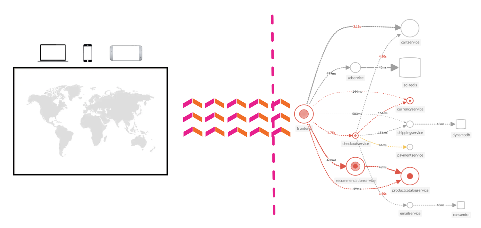
Discover the power of full end-to-end visibility by jumping from a RUM trace (front-end) to an APM trace (back-end). All the services are sending telemetry (traces and spans) that Splunk Observability Cloud can visualize, analyze and use to detect anomalies and errors.
RUM and APM are two sides of the same coin. RUM is the client-side view of the application and APM is the server-side view. In this section, we will use APM to drill down and identify where the problem is.
Subsections of Splunk APM
1. APM Explore
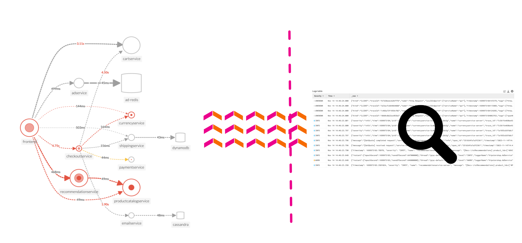
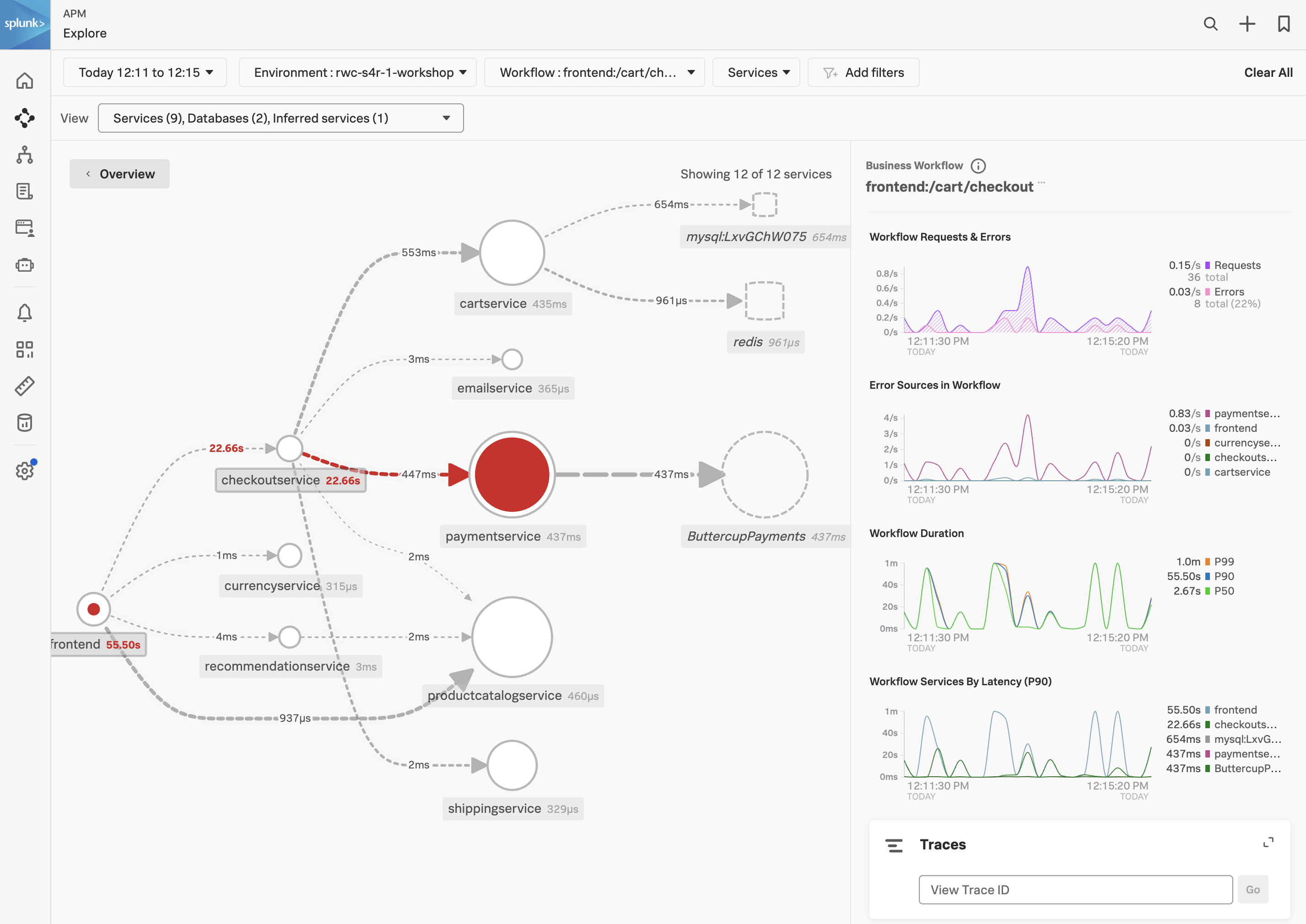
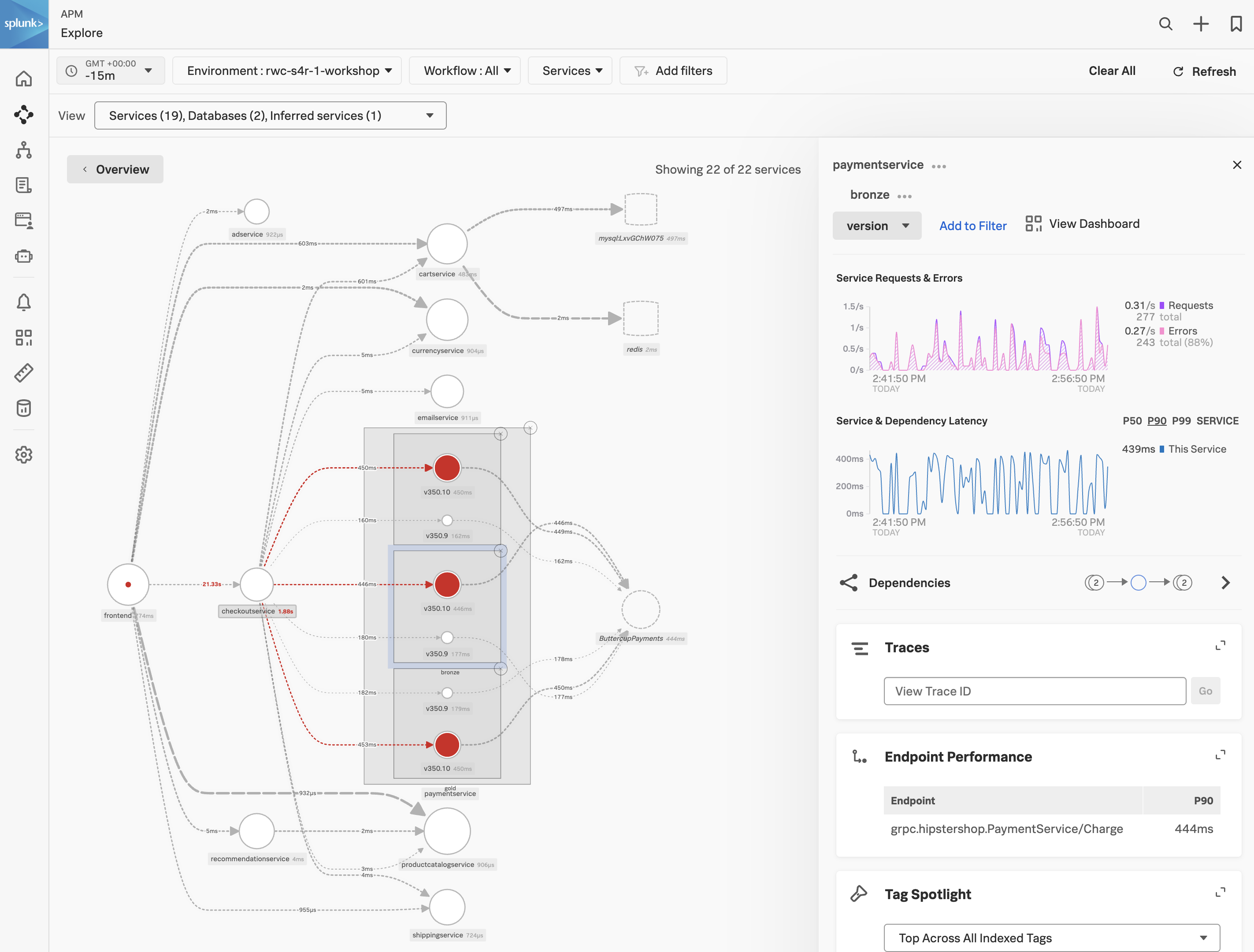
The APM Service Map displays the dependencies and connections among your instrumented and inferred services in APM. The map is dynamically generated based on your selections in the time range, environment, workflow, service, and tag filters.
When we clicked on the APM link in the RUM waterfall, filters were automatically added to the service map view to show the services that were involved in that WorkFlow Name (frontend:/cart/checkout).
You can see the services involved in the workflow in the Service Map. In the side pane, under Business Workflow, charts for the selected workflow are displayed. The Service Map and Business Workflow charts are synchronized. When you select a service in the Service Map, the charts in the Business Workflow pane are updated to show metrics for the selected service.
Exercise
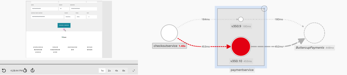
- Click on the paymentservice in the Service Map.
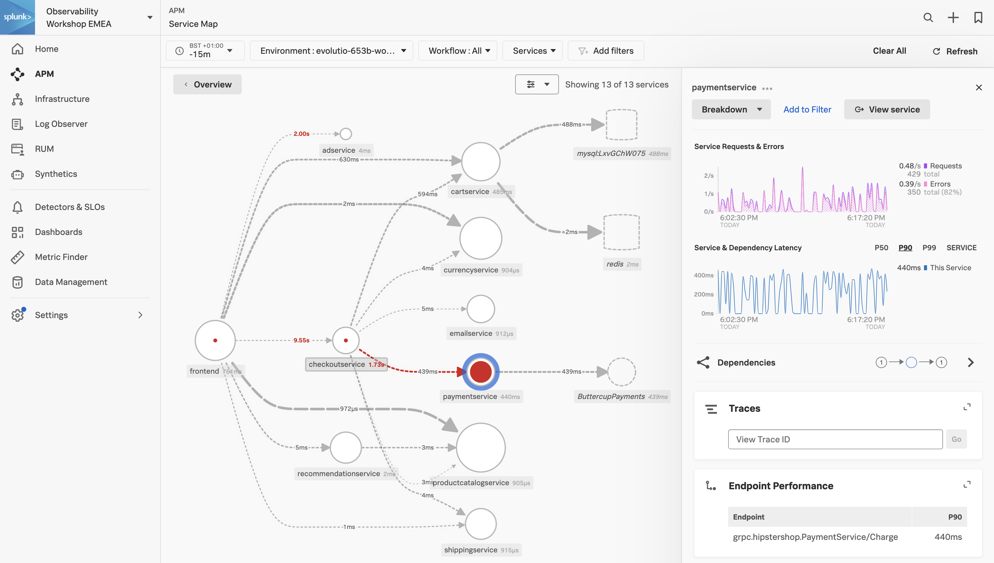
Splunk APM also provides a set of built-in dashboards that present charts and visualized metrics to help you see problems occurring in real time and quickly determine whether the problem is associated with a service, a specific endpoint, or the underlying infrastructure. Let’s have a closer look.
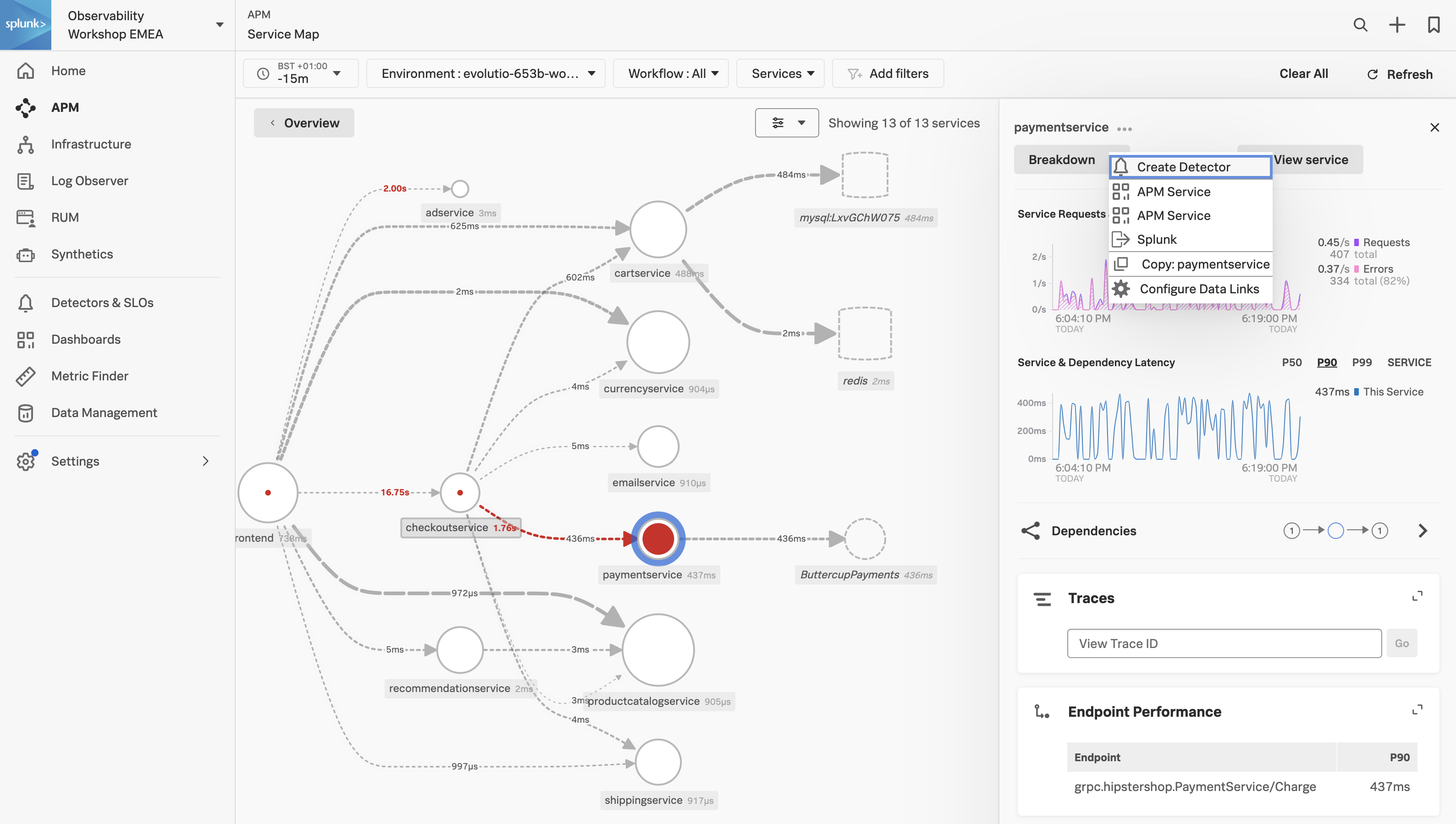
Exercise
- Click on the three dots next to paymentservice and select APM Service
2. APM Service Dashboard
Service Dashboard
APM Service Dashboards provide request, error, and duration (RED) metrics based on Monitoring MetricSets created from endpoint spans for your services, endpoints, and Business Workflows. If you scroll down the dashboard you will also see the host and Kubernetes-related metrics which help you determine whether there are problems with the underlying infrastructure.
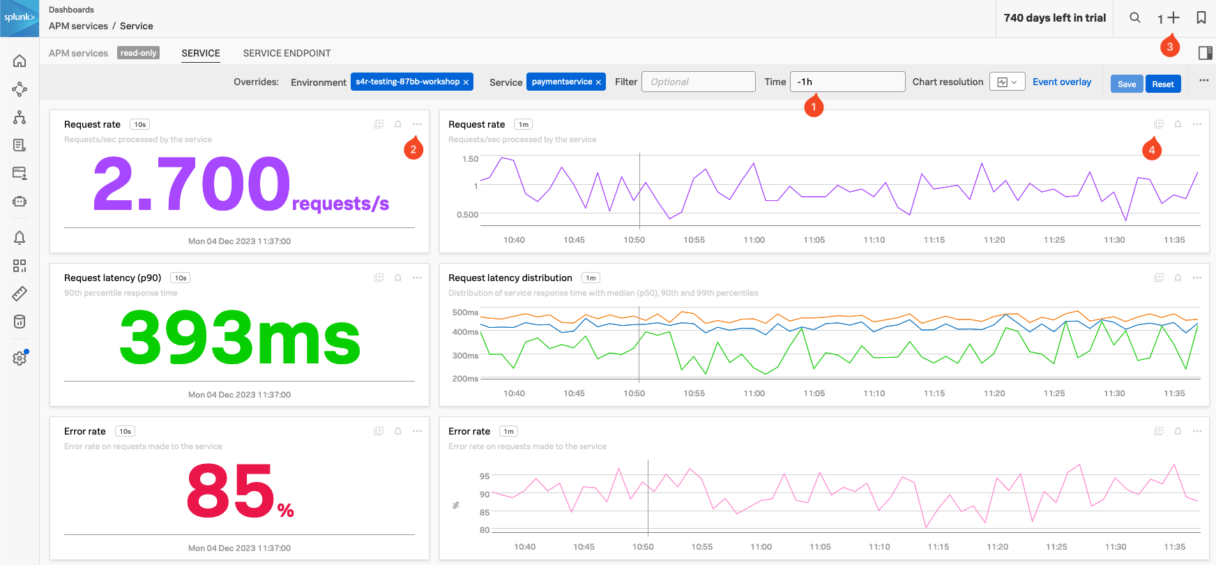
Exercise
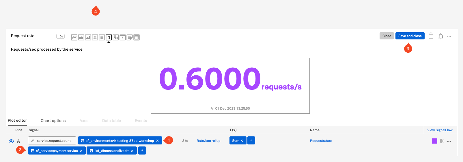
- Check the Time box (1), you can see that the dashboards only show data relevant to the time it took for the APM trace we selected to complete (note that the charts are static).
- In the time box change enter -1h and hit enter.
- The Single Value charts, Request rate, Request latency (p90) and Error rate will start updating every 10 seconds showing that we still have a large number of errors occurring.
- These charts are very useful to quickly identify performance issues. You can use this dashboard to keep an eye on the health of your service or use it as a base for a custom one.
- We want to use some of these charts in a later exercise:
- In the Request rate Single Value chart (2), click the … and select Copy. Note that you now have a 1 before the + at the top right of the page (3), indicating you have a copied chart to the clipboard.
- In the Request rate line chart (4), either click on the Add to clipboard indicator that appeared (just at the (4) in the screenshot) to add it to the clipboard or use the … and select Add to clipboard.
- Note that you now have 2 before the + on the top right of the page. (3)
- Now let’s go back to the explore view, you can hit the back button in your Browser

Exercise
In the Service Map hover over the paymentservice. What can you conclude from the popup service chart?
The error percentage is very high.
We need to understand if there is a pattern to this error rate. We have a handy tool for that, Tag Spotlight.
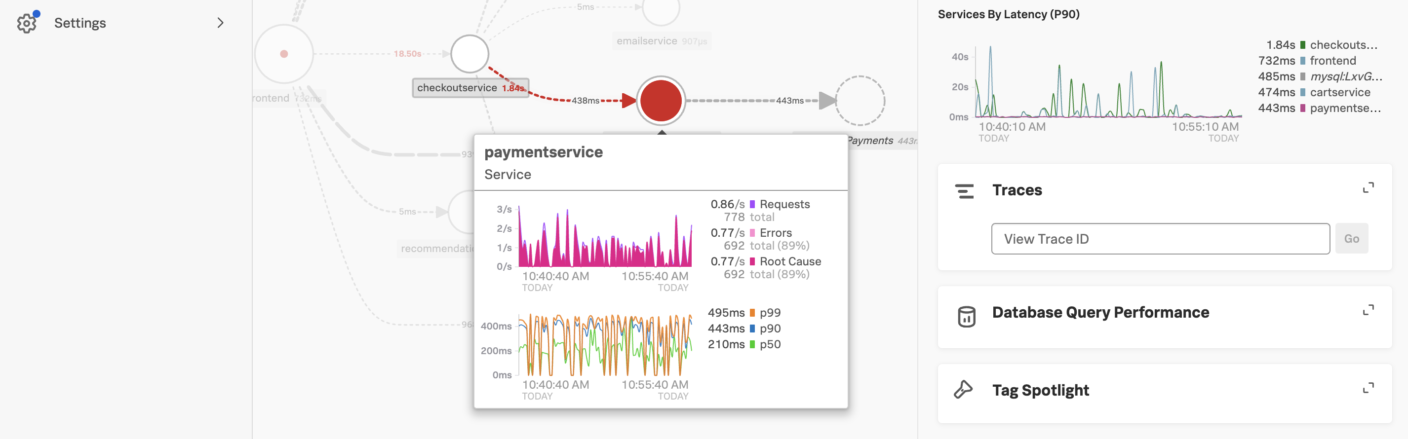
3. APM Tag Spotlight
Exercise
- To view the tags for the paymentservice click on the paymentservice and then click on Tag Spotlight in the right-hand side functions pane (you may need to scroll down depending upon your screen resolution).
- Once in Tag Spotlight ensure the toggle Show tags with no values is off.

There are two views available in Tag Spotlight. The default is Request/Errors and the other is Latency.
Request/Error charts display the total number of requests, errors, and root cause errors. The Latency charts display p50, p90, and p99 latency. These values are based on Troubleshooting MetricSets (TMS), which Splunk APM generates for every indexed span tag. These are known as RED metrics (request, error, and duration).
Exercise
Which chart exposes the tag that identifies what the problem is?
The version chart. The number of requests against v350.10 matches the number of errors.
- Now that we have identified the version of the paymentservice that is causing the issue, let’s see if we can find out more information about the error. Click on ← Tag Spotlight at the top of the page to get back to the Service Map.
4. APM Service Breakdown
Exercise
- In the right-hand pane click on the Breakdown.
- Select
tenant.level in the list. This is a tag that exposes the customers’ status and can be useful to see trends related to customer status. - Back in the Service Map Click on gold to select it.
- Click on Breakdown and select
version, this is the tag that exposes the service version. - Repeat this for silver and bronze.
What can you conclude from what you are seeing?
Every tenant is being impacted by v350.10
You will now see the paymentservice broken down into three services, gold, silver and bronze. Each tenant is broken down into two services, one for each version (v350.10 and v350.9).
Exercise
- Click on the outer main box that surrounds the 3 red circles, the box will become highlighted.
Span Tags
Using span tags to break down services is a very powerful feature. It allows you to see how your services are performing for different customers, different versions, different regions, etc. In this exercise, we have determined that v350.10 of the paymentservice is causing problems for all our customers.
Next, we need to drill down into a trace to see what is going on.
5. APM Trace Analyzer
As Splunk APM provides a NoSample™ end-to-end visibility of every service Splunk APM captures every trace. For this workshop, the Order Confirmation ID is available as a tag. This means that we can use this to search for the exact trace of the poor user experience you encountered earlier in the workshop.
Trace Analyzer
Splunk Observability Cloud provides several tools for exploring application monitoring data. Trace Analyzer is suited to scenarios where you have high-cardinality, high-granularity searches and explorations to research unknown or new issues.
Exercise
- With the outer box of the paymentservice selected, in the right-hand pane, click on Traces.
- To ensure we are using Trace Analyzer make sure the button Switch to Classic View is showing. If it is not, click on Switch to Trace Analyzer.
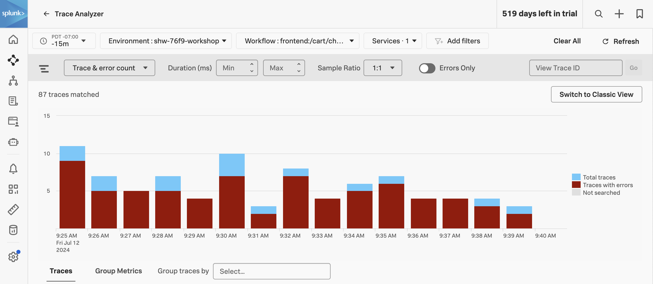
The Trace & error count view shows the total traces and traces with errors in a stacked bar chart. You can use your mouse to select a specific period within the available time frame.
Exercise
- Click on the dropdown menu that says Trace & error count, and change it to Trace duration
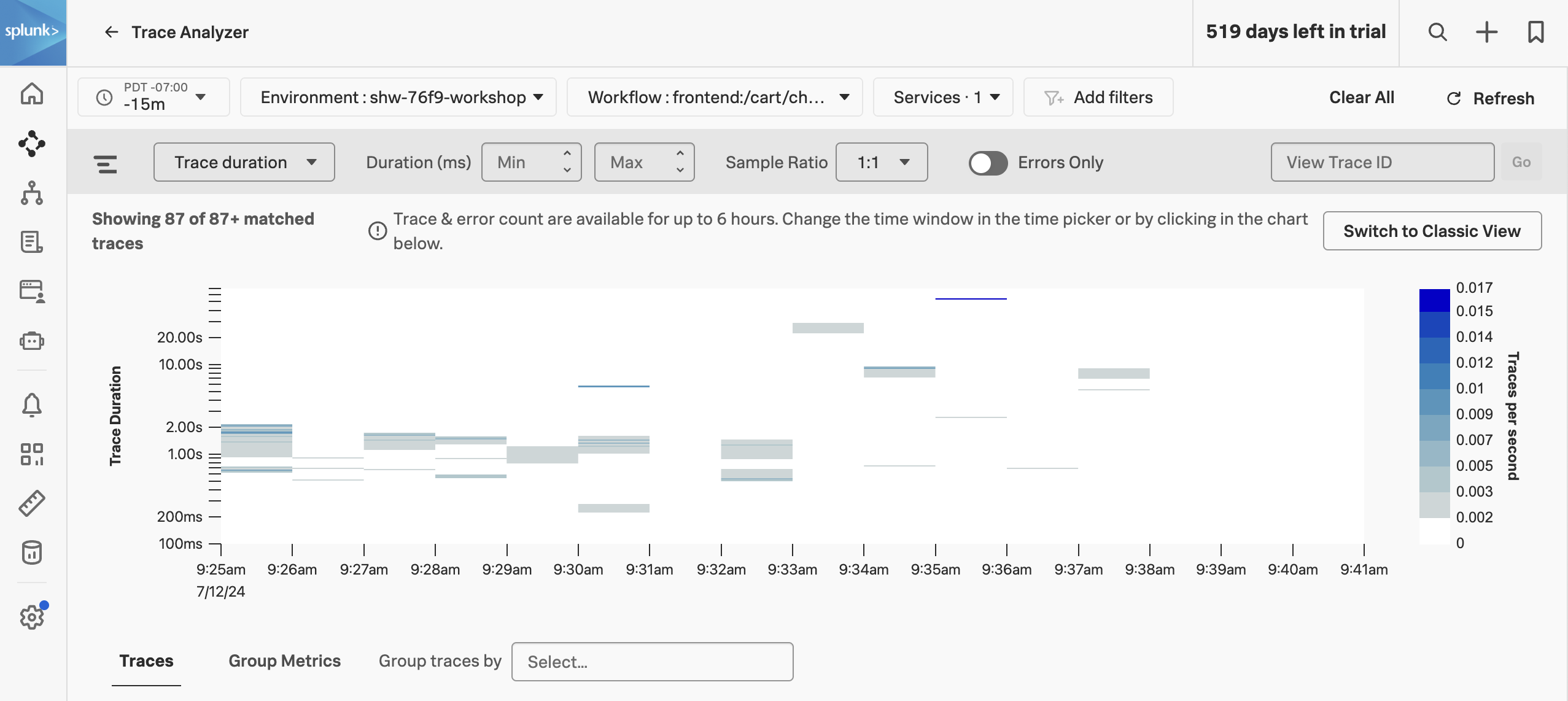
The Trace Duration view shows a heatmap of traces by duration. The heatmap represents 3 dimensions of data:
- Time on the x-axis
- Trace duration on the y-axis
- The traces (or requests) per second are represented by the heatmap shades
You can use your mouse to select an area on the heatmap, to focus on a specific time period and trace duration range.
Exercise
- Switch from Trace duration back to Trace & Error count.
- In the time picker select Last 1 hour.
- Note, that most of our traces have errors (red) and there are only a limited amount of traces that are error-free (blue).
- Make sure the Sample Ratio is set to
1:1 and not 1:10. - Click on Add filters, type in
orderId and select orderId from the list. - Paste in your Order Confirmation ID from when you went shopping earlier in the workshop and hit enter. If you didn’t capture one, please ask your instructor for one.
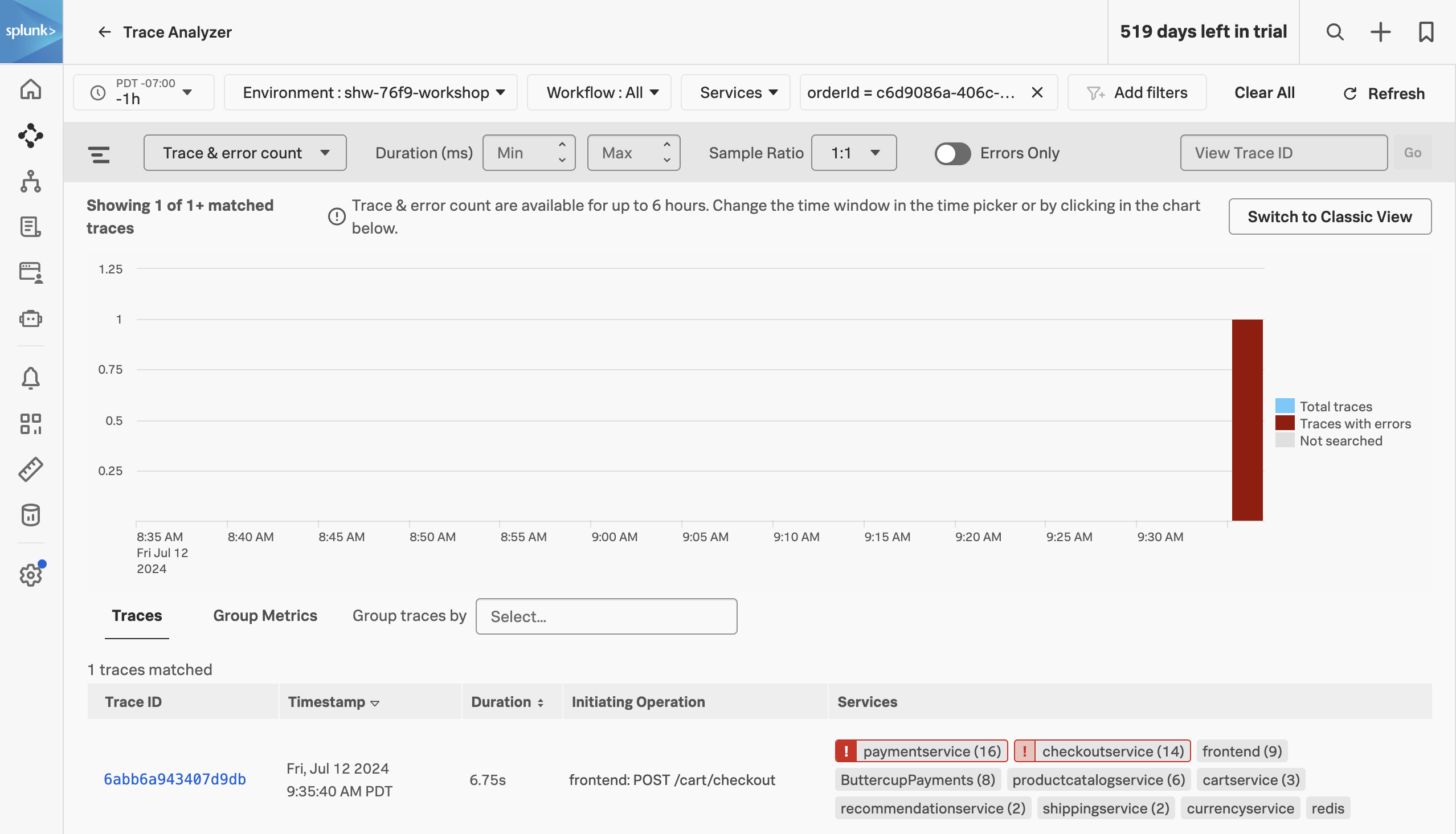
We have now filtered down to the exact trace where you encountered a poor user experience with a very long checkout wait. A secondary benefit to viewing this trace is that the trace will be accessible for up to 13 months. This will allow developers to come back to this issue at a later stage and still view this trace for example.
Exercise
- Click on the trace in the list.
Next, we will walk through the trace waterfall.
6. APM Waterfall
We have arrived at the Trace Waterfall from the Trace Analyzer. A trace is a collection of spans that share the same trace ID, representing a unique transaction handled by your application and its constituent services.
Each span in Splunk APM captures a single operation. Splunk APM considers a span to be an error span if the operation that the span captures results in an error.
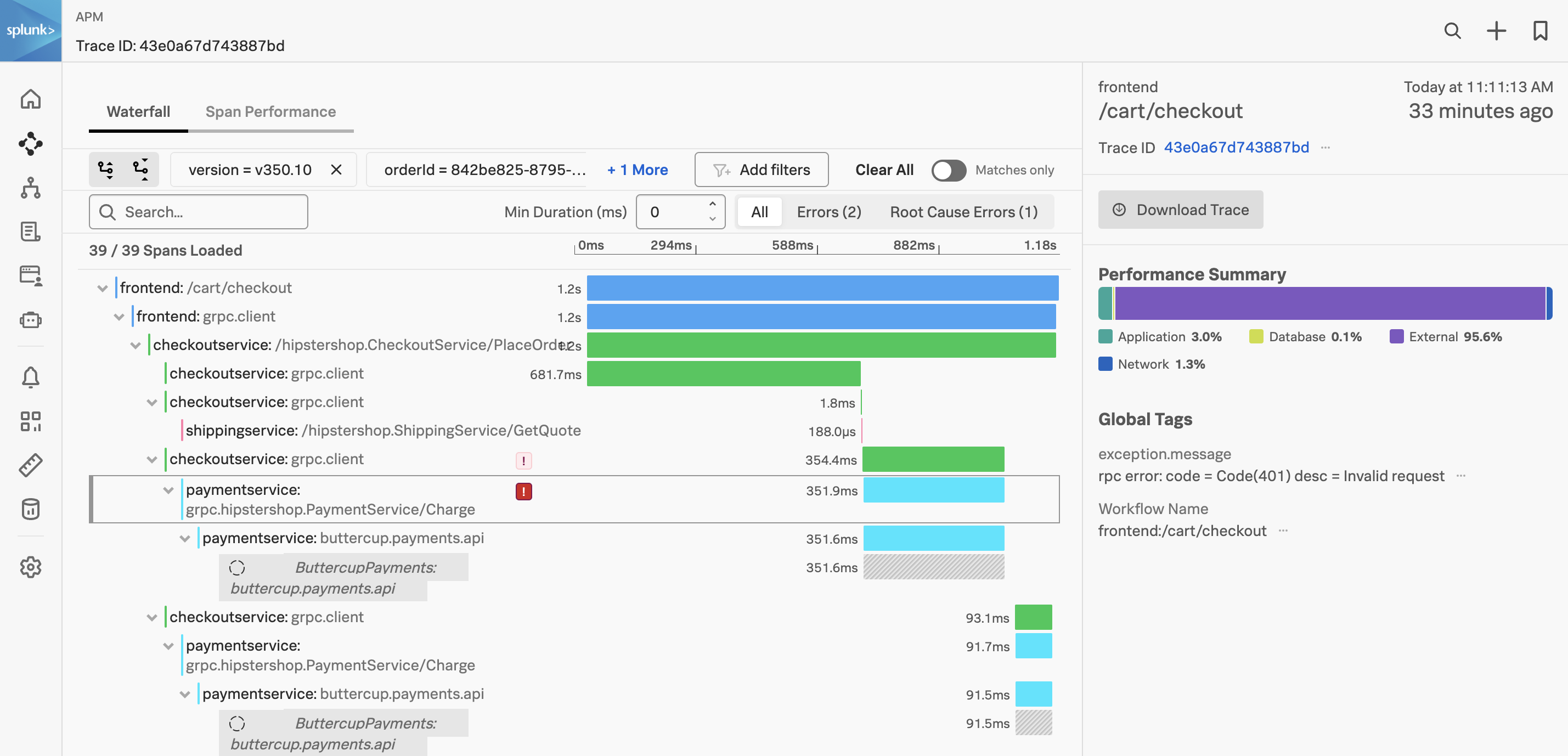
Exercise
- Click on the ! next to any of the
paymentservice:grpc.hipstershop.PaymentService/Charge spans in the waterfall.
What is the error message and version being reported in the span metadata?
Invalid request and v350.10.
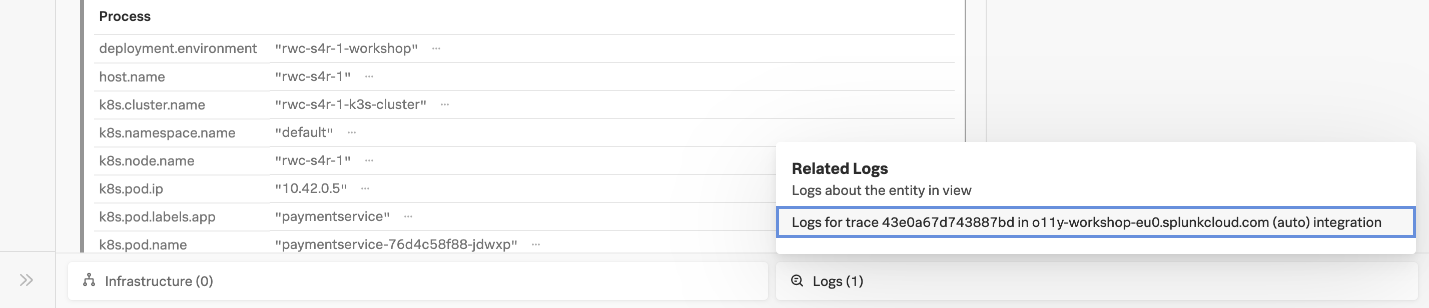
Related Content relies on specific metadata that allow APM, Infrastructure Monitoring, and Log Observer to pass filters around Observability Cloud. For related logs to work, you need to have the following metadata in your logs:
service.namedeployment.environmenthost.nametrace_idspan_id
Exercise
- At the very bottom of the Trace Waterfall click on the word Logs (1). This highlights that there are Related Logs for this trace.
- Click on the Logs for trace XXX entry in the pop-up, this will open the logs for the complete trace in Log Observer.
Splunk Log Observer
20 minutes
Persona
Remaining in your back-end developer role, you need to inspect the logs from your application to determine the root cause of the issue.
Using the content related to the APM trace (logs) we will now use Splunk Log Observer to drill down further to understand exactly what the problem is.
Related Content is a powerful feature that allows you to jump from one component to another and is available for metrics, traces and logs.
Subsections of Splunk Log Observer
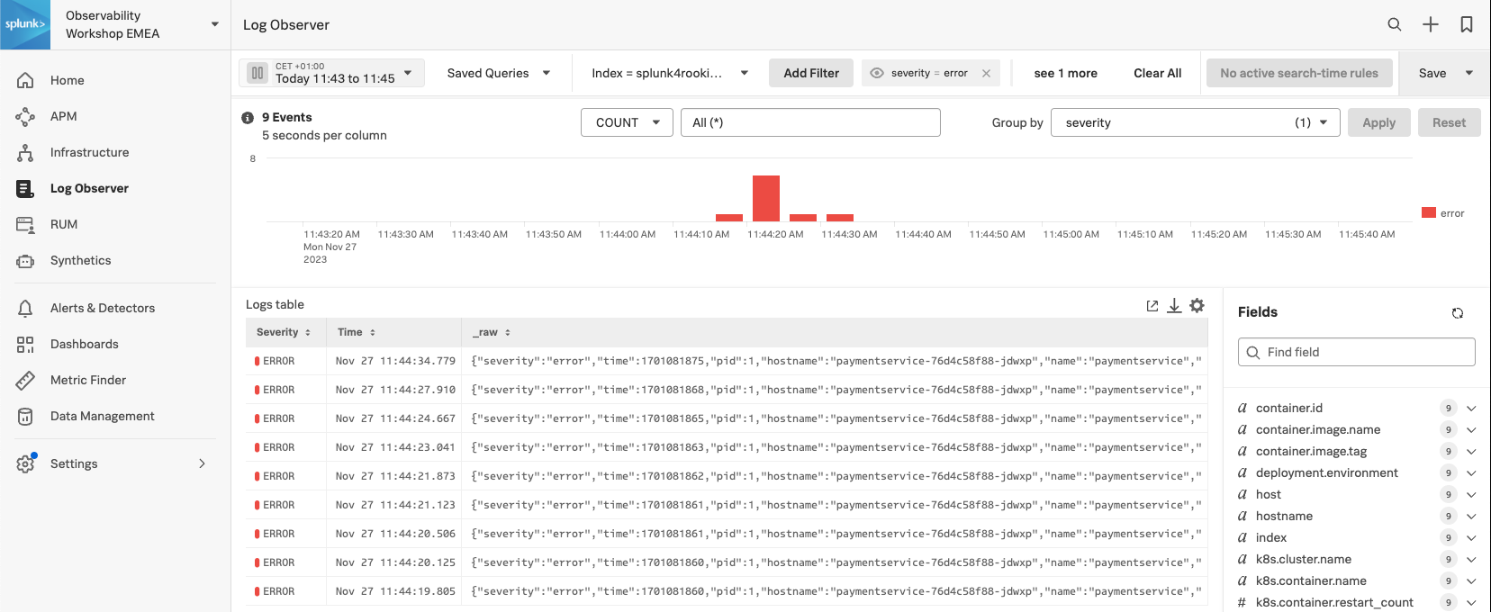
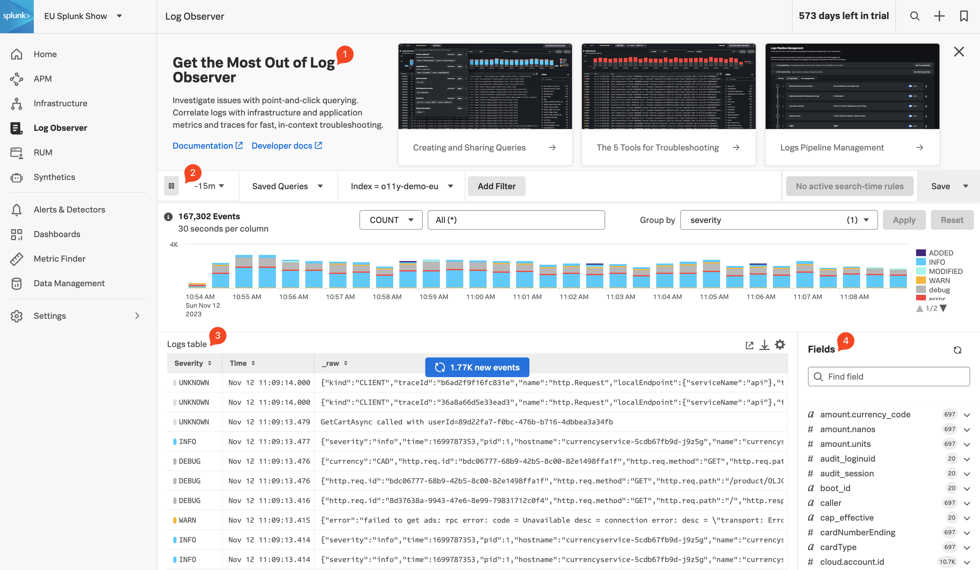
1. Log Filtering
Log Observer (LO), can be used in multiple ways. In the quick tour, you used the LO no-code interface to search for specific entries in the logs. This section, however, assumes you have arrived in LO from a trace in APM using the Related Content link.
The advantage of this is, as it was with the link between RUM & APM, that you are looking at your logs within the context of your previous actions. In this case, the context is the time frame (1), which matches that of the trace and the filter (2) which is set to the trace_id.
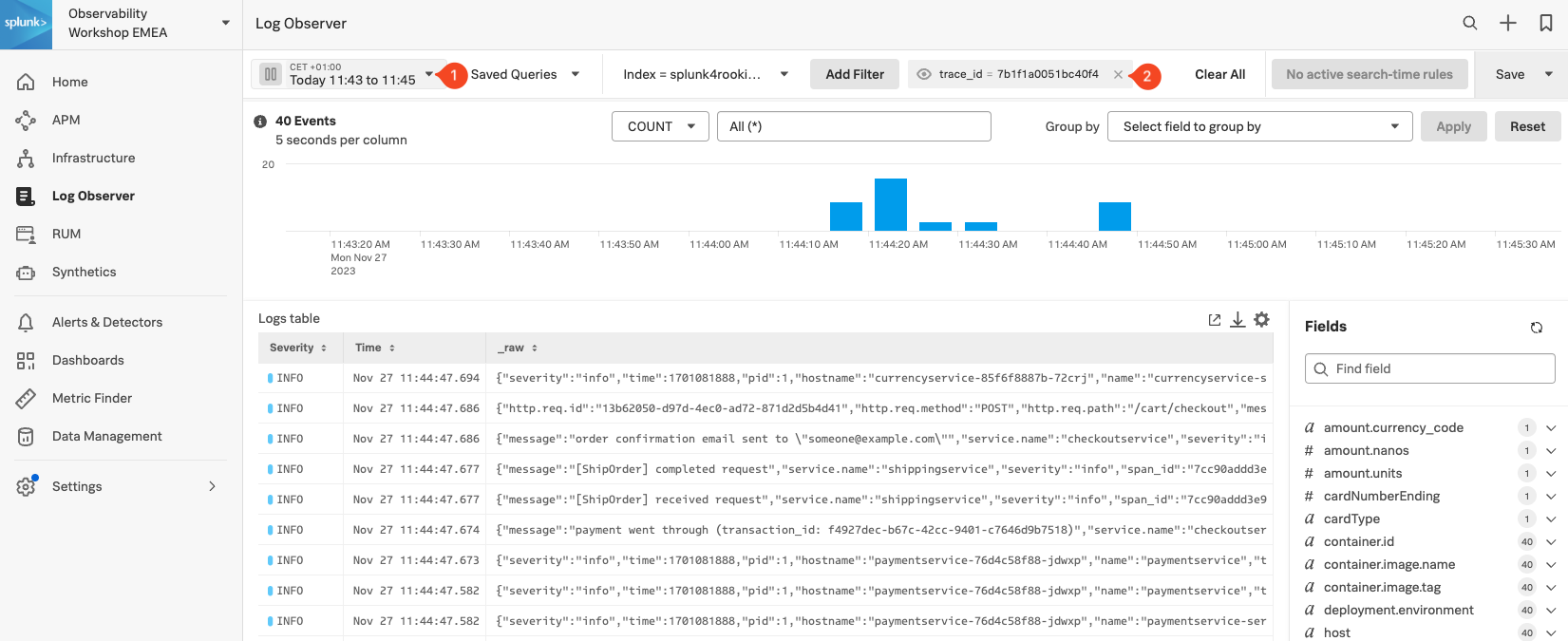
This view will include all the log lines from all applications or services that participated in the back-end transaction started by the end-user interaction with the Online Boutique.
Even in a small application such as our Online Boutique, the sheer amount of logs found can make it hard to see the specific log lines that matter to the actual incident we are investigating.
Next, we will look at log entries in detail.
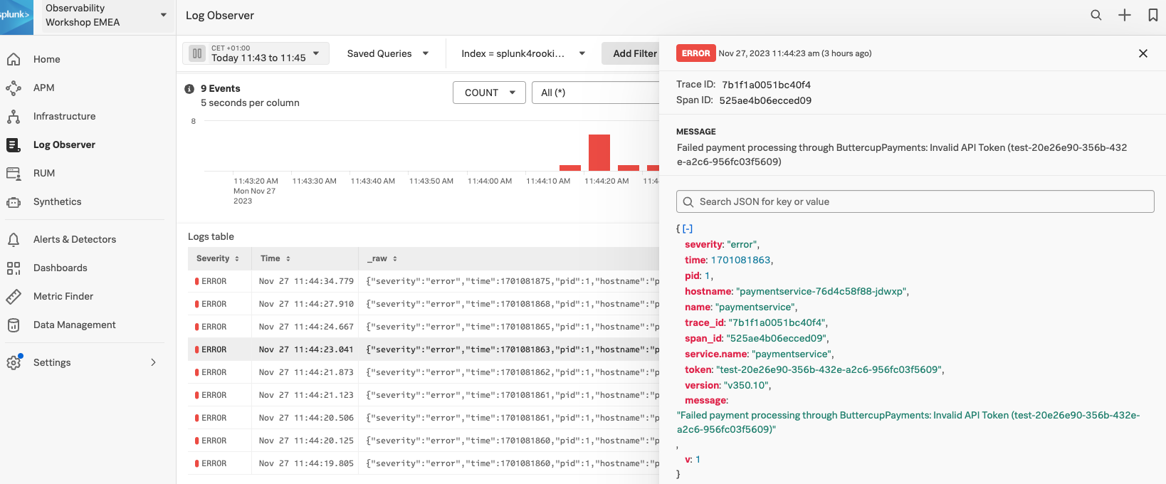
2. Viewing Log Entries
Before we look at a specific log line, let’s quickly recap what we have done so far and why we are here based on the 3 pillars of Observability:
| Metrics | Traces | Logs |
|---|
| Do I have a problem? | Where is the problem? | What is the problem? |
- Using metrics we identified we have a problem with our application. This was obvious from the error rate in the Service Dashboards as it was higher than it should be.
- Using traces and span tags we found where the problem is. The paymentservice comprises of two versions,
v350.9 and v350.10, and the error rate was 100% for v350.10. - We did see that this error from the paymentservice
v350.10 caused multiple retries and a long delay in the response back from the Online Boutique checkout. - From the trace, using the power of Related Content, we arrived at the log entries for the failing paymentservice version. Now, we can determine what the problem is.
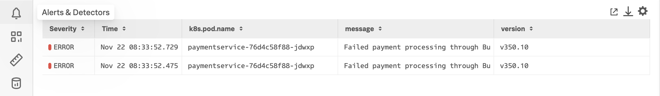
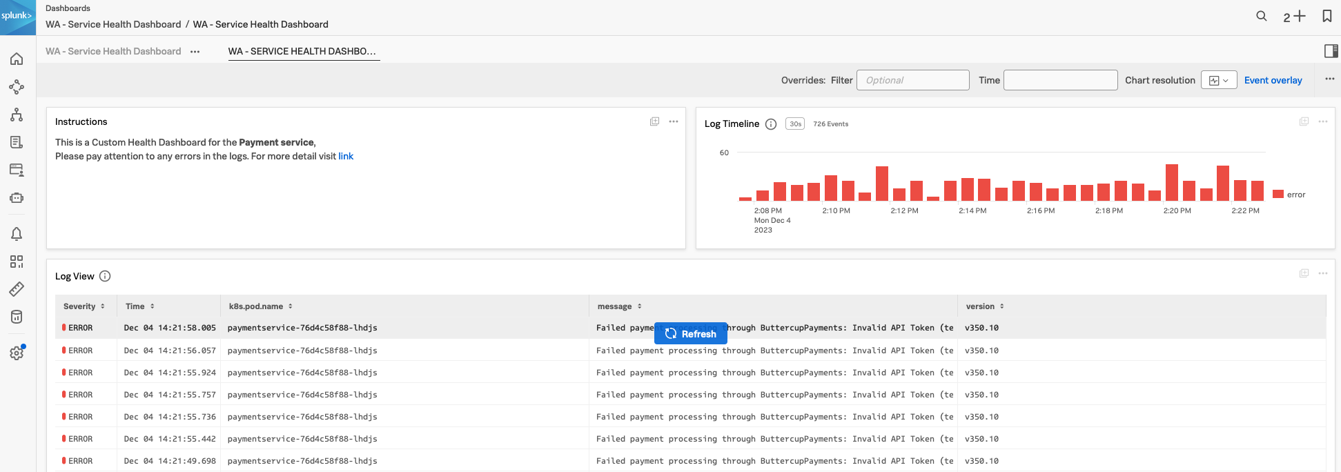
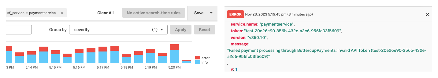
Exercise
- Click on an error entry in the log table (make sure it says
hostname: "paymentservice-xxxx" in case there is a rare error from a different service in the list too.
Based on the message, what would you tell the development team to do to resolve the issue?
The development team needs to rebuild and deploy the container with a valid API Token or rollback to v350.9.
- Click on the X in the log message pane to close it.
Congratulations
You have successfully used Splunk Observability Cloud to understand why you experienced a poor user experience whilst shopping at the Online Boutique. You used RUM, APM and logs to understand what happened in your service landscape and subsequently, found the underlying cause, all based on the 3 pillars of Observability, metrics, traces and logs
You also learned how to use Splunk’s intelligent tagging and analysis with Tag Spotlight to detect patterns in your applications’ behavior and to use the full stack correlation power of Related Content to quickly move between the different components whilst keeping in context of the issue.
In the next part of the workshop, we will move from problem-finding mode into mitigation, prevention and process improvement mode.
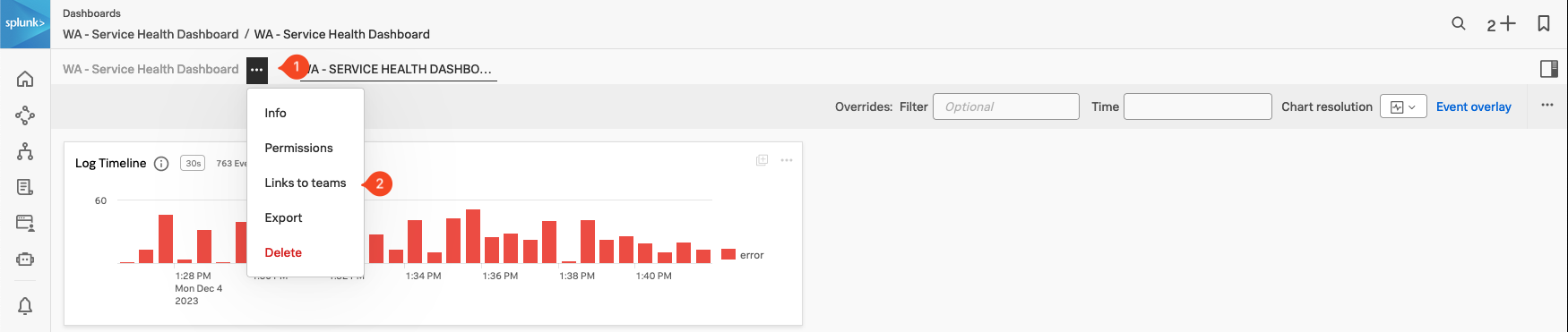
Next up, creating log charts in a custom dashboard.
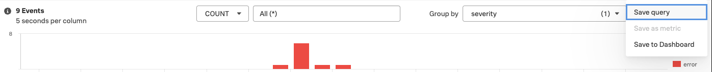
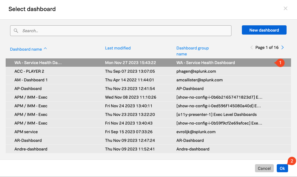
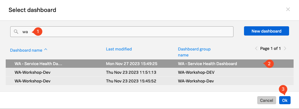
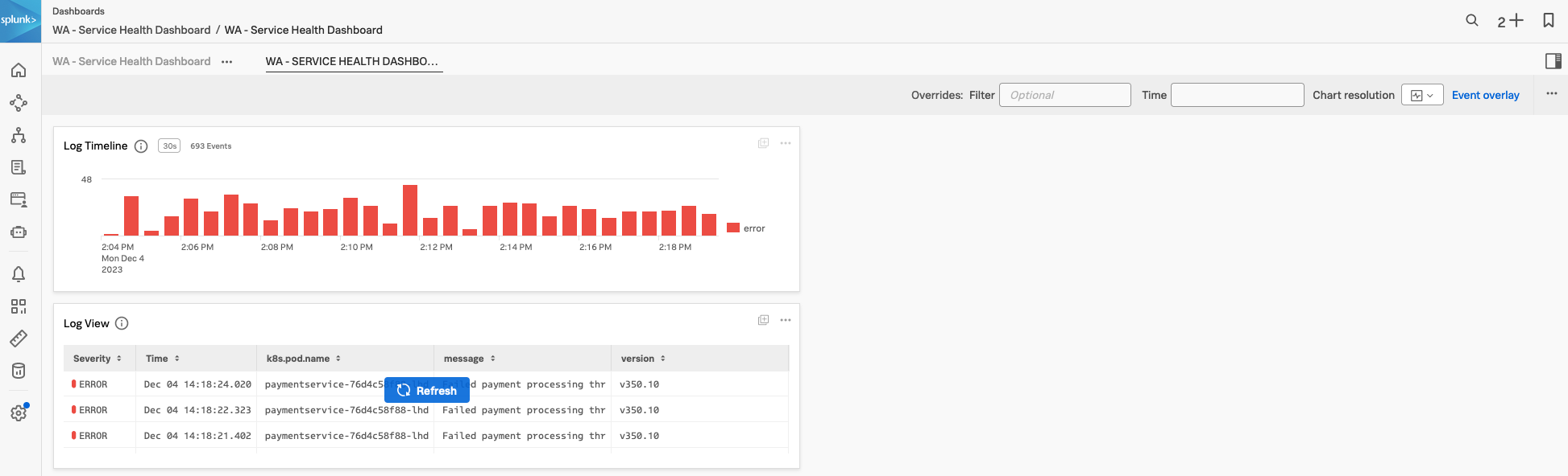
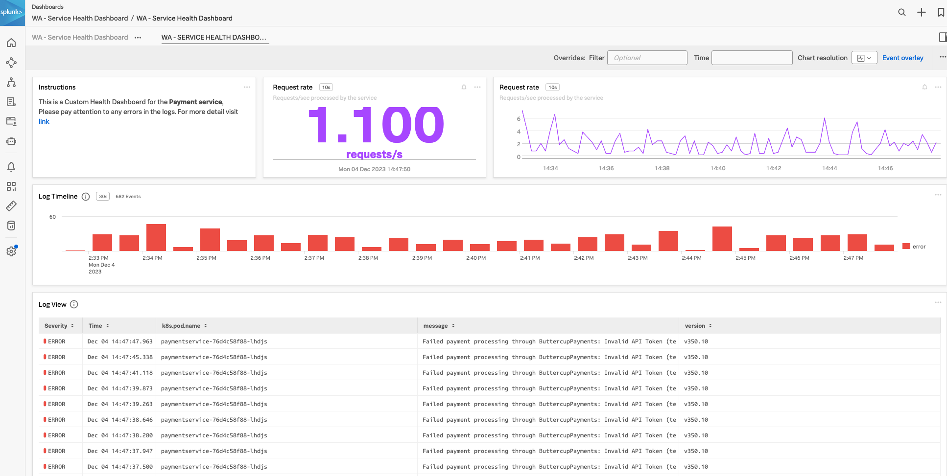
3. Log Timeline Chart
Once you have a specific view in Log Observer, it is very useful to be able to use that view in a dashboard, to help in the future with reducing the time to detect or resolve issues. As part of the workshop, we will create an example custom dashboard that will use these charts.
Let’s look at creating a Log Timeline chart. The Log Timeline chart is used for visualizing log messages over time. It is a great way to see the frequency of log messages and to identify patterns. It is also a great way to see the distribution of log messages across your environment. These charts can be saved to a custom dashboard.
Next, we will create a Log View chart.
4. Log View Chart
The next chart type that can be used with logs is the Log View chart type. This chart will allow us to see log messages based on predefined filters.
As with the previous Log Timeline chart, we will add a version of this chart to our Customer Health Service Dashboard:
In the next session, we will look at Splunk Synthetics and see how we can automate the testing of web-based applications.
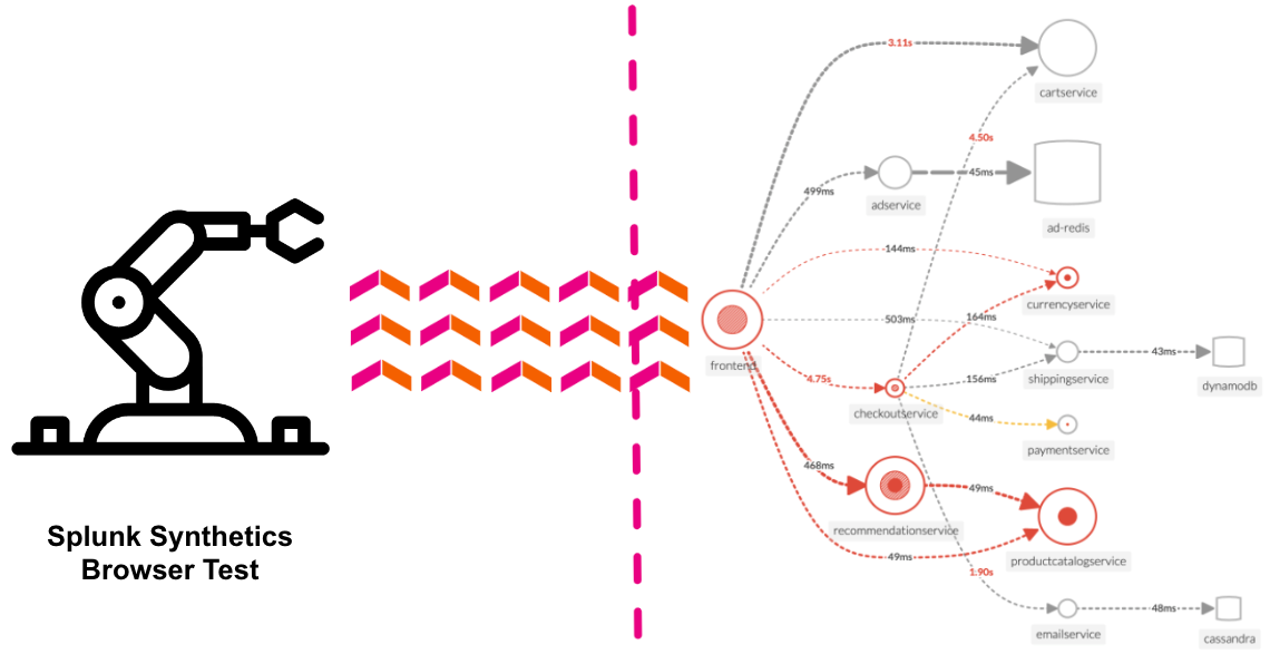
Splunk Synthetics
15 minutes
Persona
Putting your SRE hat back on, you have been asked to set up monitoring for the Online Boutique. You need to ensure that the application is available and performing well 24 hours a day, 7 days a week.
Wouldn’t it be great if we could have 24/7 monitoring of our application, and be alerted when there is a problem? This is where Synthetics comes in. We will show you a simple test that runs every 1 minute and checks the performance and availability of a typical user journey through the Online Boutique.
Subsections of Splunk Synthetics
1. Synthetics Dashboard
In Splunk Observability Cloud from the main menu, click on Synthetics. Click on All or Browser tests to see the list of active tests.
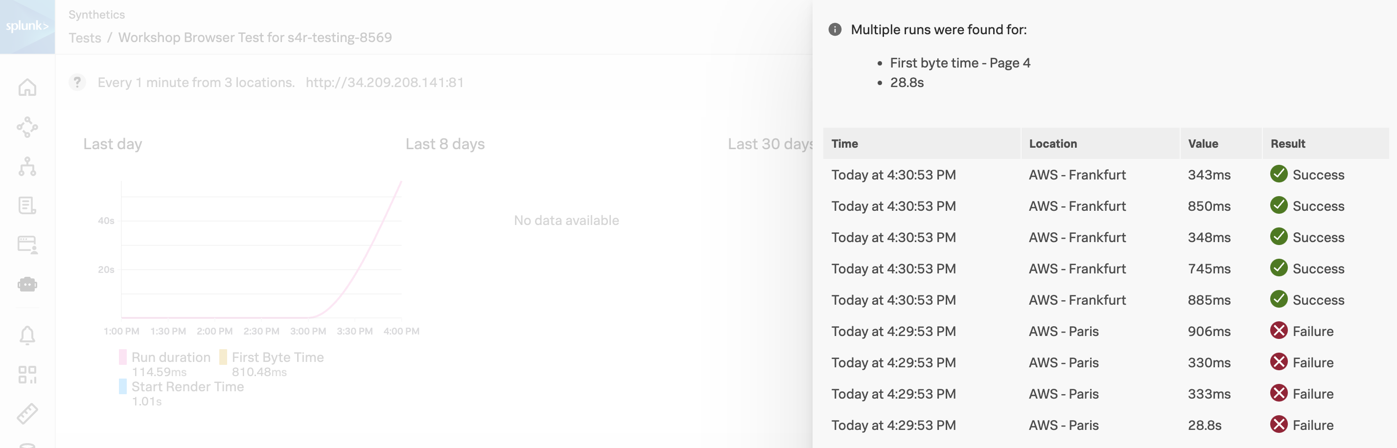
During our investigation in the RUM section, we found there was an issue with the Place Order Transaction. Let’s see if we can confirm this from the Synthetics test as well. We will be using the metric First byte time for the 4th page of the test, which is the Place Order step.
You will now be taken to the Run results for this particular test run.
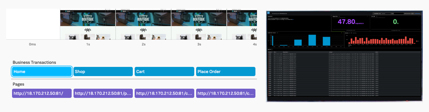
2. Synthetics Test Detail
Right now we are looking at the result of a single Synthetic Browser Test. This test is split up into Business Transactions, think of this as a group of one or more logically related interactions that represent a business-critical user flow.
Info
The screenshot below doesn’t contain a red banner with an error in it however you might be seeing one in your run results. This is expected as in some cases the test run fails and does not impact the workshop.
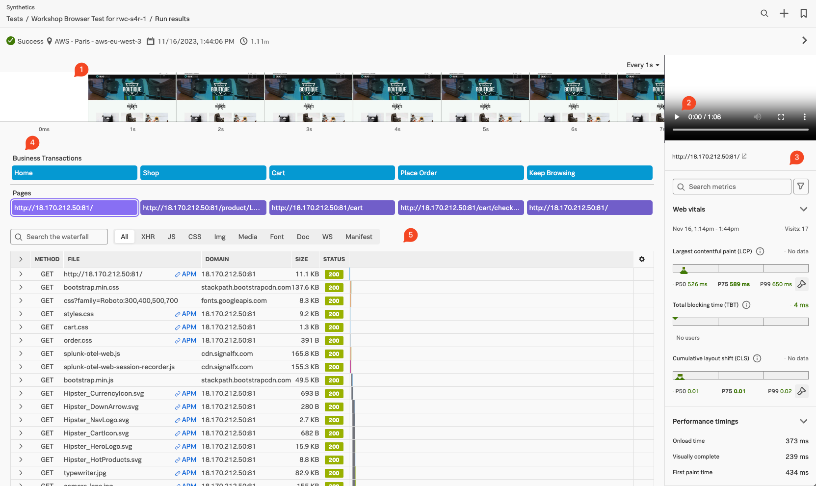
- Filmstrip: Offers a set of screenshots of site performance so that you can see how the page responds in real-time.
- Video: This lets you see exactly what a user trying to load your site from the location and device of a particular test run would experience.
- Browser test metrics: A View that offers you a picture of website performance.
- Synthetic transactions: List of the Synthetic transactions that made up the interaction with the site
- Waterfall chart The waterfall chart is a visual representation of the interaction between the test runner and the site being tested.
By default, Splunk Synthetics provides screenshots and video capture of the test. This is useful for debugging issues. You can see, for example, the slow loading of large images, the slow rendering of a page etc.
Exercise
- Use your mouse to scroll left and right through the filmstrip to see how the site was being rendered during the test run.
- In the Video pane, press on the play button ▶ to see the test playback. If you click the ellipses ⋮ you can change the playback speed, view it Picture in Picture and even Download the video.
- In the Synthetic Transaction pane, under the header Business Transactions, click on the first button Home
- The waterfall below will show all the objects that make up the page. The first line is the HTML page itself. The next lines are the objects that make up the page (HTML, CSS, JavaScript, Images, Fonts, etc.).
- In the waterfall find the line GET splunk-otel-web.js.
- Click on the > button to open the metadata section to see the Request/Response Header information.
- In the Synthetic Transaction pane, click on the second Business Transaction Shop. Note that the filmstrip adjusts and moves to the beginning of the new transaction.
- Repeat this for all the other Transactions, then finally select thePlaceOrder transaction.
3. Synthetics to APM
We now should have a view similar to the one below.
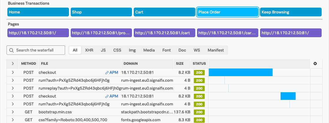
Exercise
- In the waterfall find an entry that starts with POST checkout.
- Click on the > button in front of it to drop open the metadata section. Observe the metadata that is collected, and note the Server-Timing header. This header is what allows us to correlate the test run to a back-end trace.
- Click on the blue APM link on the POST checkout line in the waterfall.
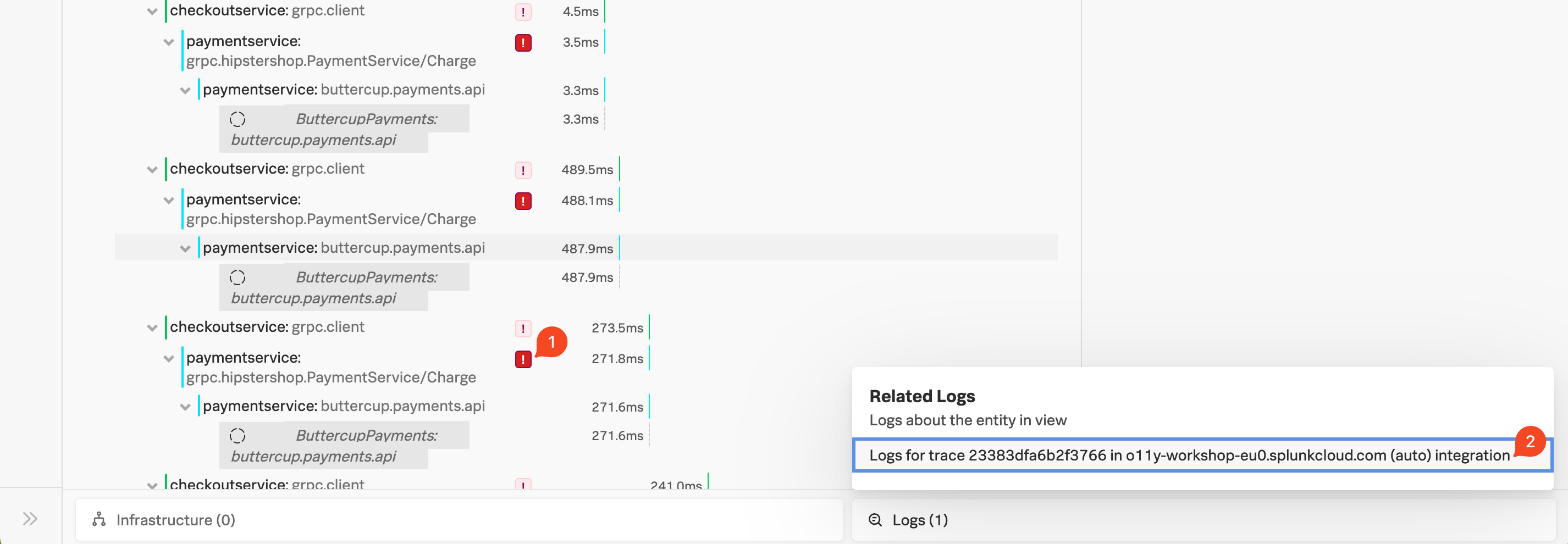
Exercise
- Validate you see one or more errors for the paymentservice (1).
- To validate that it’s the same error, click on the related content for Logs (2).
- Repeat the earlier exercise to filter down to the errors only.
- View the error log to validate the failed payment due to an invalid token.
4. Synthetics Detector
Given you can run these tests 24/7, it is an ideal tool to get warned early if your tests are failing or starting to run longer than your agreed SLA instead of getting informed by social media, or Uptime websites.
To stop that from happening let’s detect if our test is taking more than 1.1 minutes.
Exercise
Go back to the Synthetics home page via the menu on the left
Select the workshop test again and click the Create Detector button at the top of the page.
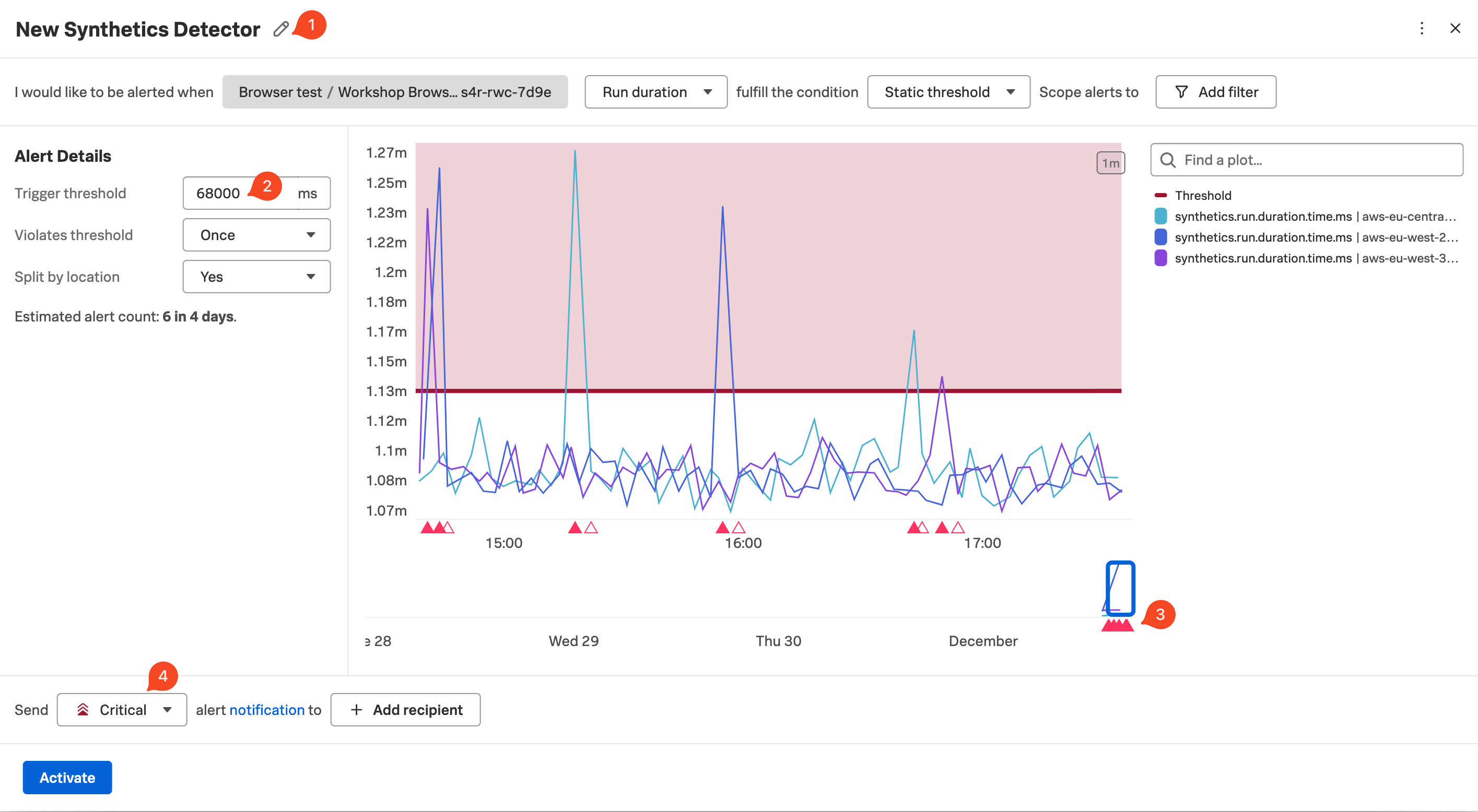
Edit the text New Synthetics Detector (1) and replace it with INITIALS - [WORKSHOPNAME]`.
Ensure that Run duration and Static threshold are selected.
Set the Trigger threshold (2) to be around 65,000 to 68,000 and hit enter to update the chart. Make sure you have more than one spike cutting through the threshold line as shown above (you may have to adjust the threshold value a bit to match your actual latency).
Leave the rest as default.
Note that there is now a row of red and white triangles appearing below the spikes (3). The red triangles let you know that your detector found that your test was above the given threshold & the white triangle indicates that the result returned below the threshold. Each red triangle will trigger an alert.
You can change the Alerts criticality (4) by changing the drop-down to a different level, as well as the method of alerting. Make sure you do NOT add a Recipient as this could lead to you being subjected to an alert storm!
Click Activate to deploy your detector.
To see your new created detector click Edit Test button
At the bottom of the page is a list of active detectors.
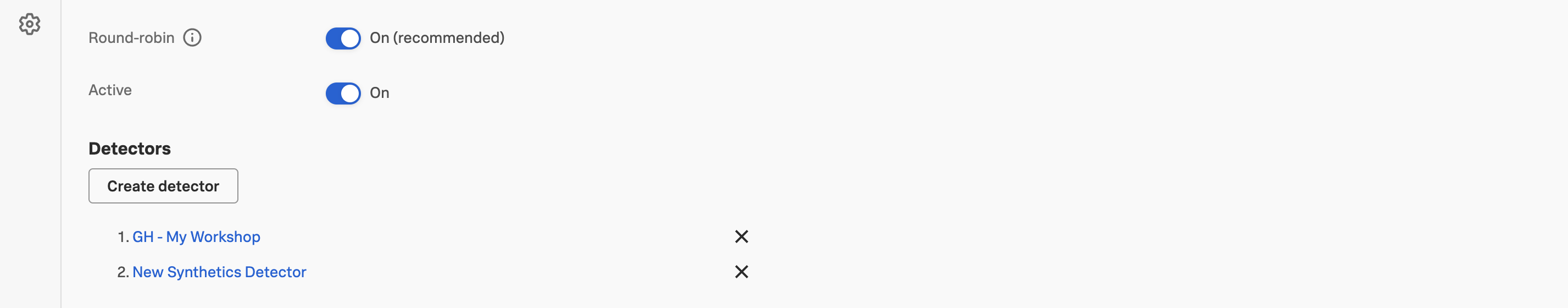
If you can’t find yours, but see one called New Synthetic Detector, you may not have saved it correctly with your name. Click on the New Synthetic Detector link, and redo the rename.
Click on the Close button to exit the edit mode.
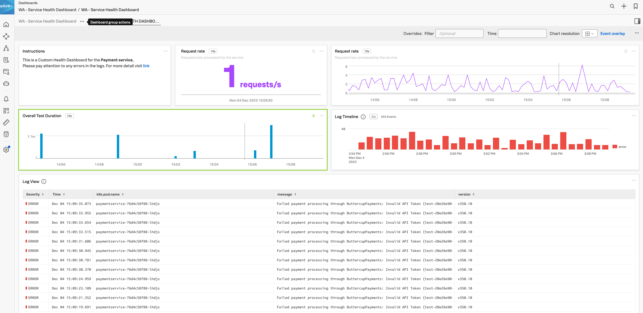
Custom Service Health Dashboard 🏥
15 minutes
Persona
As the SRE hat suits you let’s keep it on as you have been asked to build a custom Service Health Dashboard for the paymentservice. The requirement is to display RED metrics, logs and Synthetic test duration results.
It is common for development and SRE teams to require a summary of the health of their applications and/or services. More often or not these are displayed on wall-mounted TVs. Splunk Observability Cloud has the perfect solution for this by creating custom dashboards.
In this section we are going to build a Service Health Dashboard we can use to display on teams’ monitors or TVs.
Subsections of Custom Service Health Dashboard 🏥
Enhancing the Dashboard
As we already saved some useful log charts in a dashboard in the Log Observer exercise, we are going to extend that dashboard.
This looks great, let’s continue and add more meaningful charts.
Adding Copied Charts
In this section, we are going to use the Copy and Paste functionality to extend our dashboard. Remember we copied some charts during the APM Service Dashboard section, we will now add those charts to our dashboard.
Next, we are going to create a custom chart based on our Synthetic test that is running.
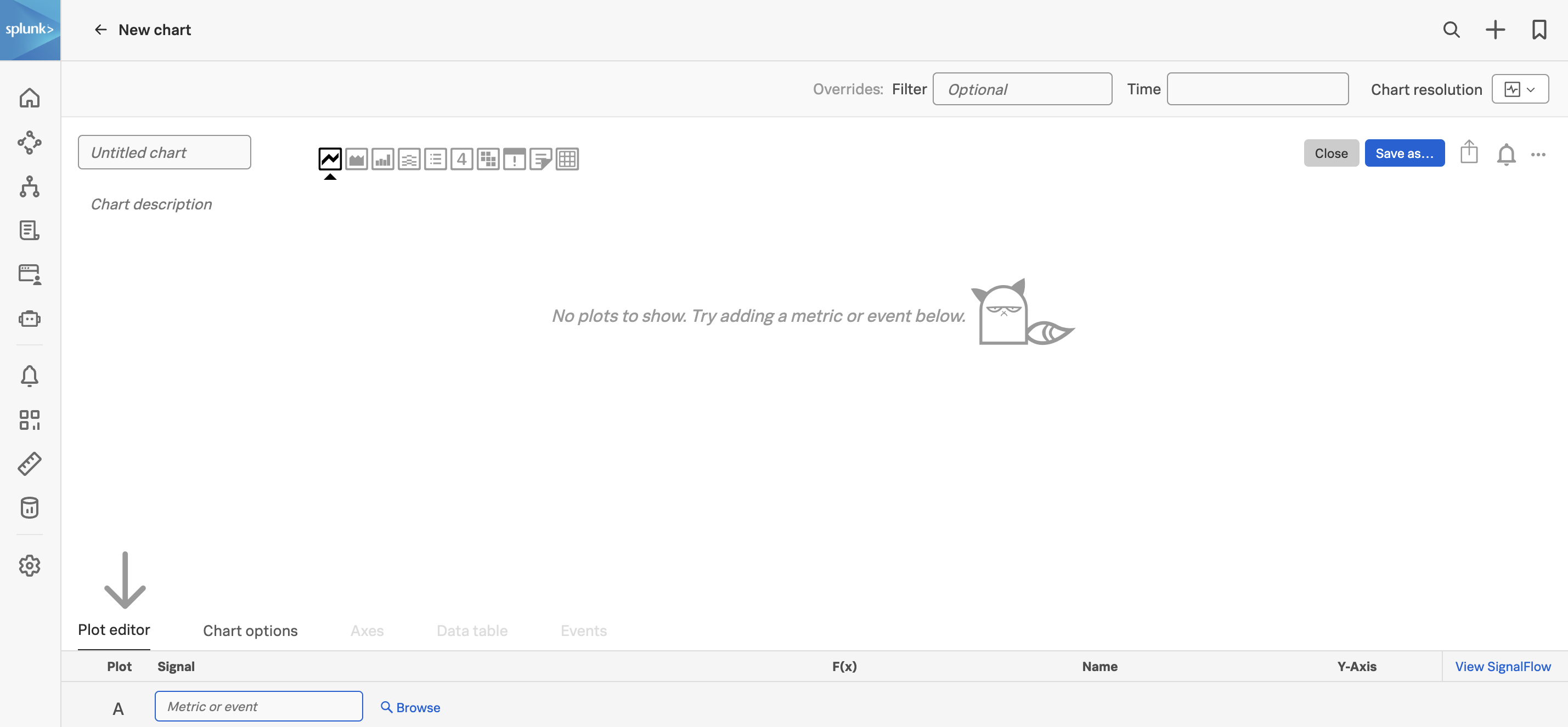
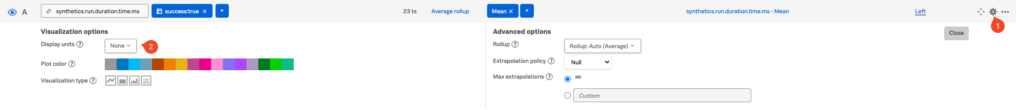
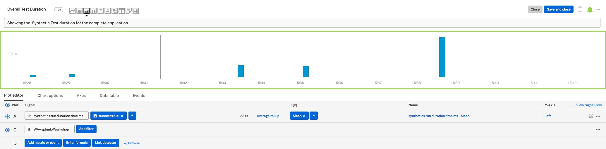
Adding a Custom Chart
In this part of the workshop we are going to create a chart that we will add to our dashboard, we will also link it to the detector we previously built. This will allow us to see the behavior of our test and get alerted if one or more of our test runs breach its SLA.
Tip
In your spare time have a try at adding another custom chart to the dashboard using RUM metrics. You could copy a chart from the out-of-the-box RUM applications dashboard group. Or you could use the RUM metric rum.client_error.count to create a chart that shows the number of client errors in the application.
Finally, we will run through a workshop wrap-up.
Workshop Wrap-up 🎁
10 minutes
Congratulations, you have completed the Splunk4Rookies - Observability Cloud Workshop. Today, you have become familiar with how to use Splunk Observability Cloud to monitor your applications and infrastructure.
Celebrate your achievement by adding this certificate to your LinkedIn
profile.
Let’s recap what we have learned and what you can do next.

Subsections of Workshop Wrap-up 🎁
Key Takeaways
During the workshop, we have seen how the Splunk Observability Cloud in combination with the OpenTelemetry signals (metrics, traces and logs) can help you to reduce mean time to detect (MTTD) and also reduce mean time to resolution (MTTR).
- We have a better understanding of the Main User interface and its components, the Landing, Infrastructure, APM, RUM, Synthetics, Dashboard pages, and a quick peek at the Settings page.
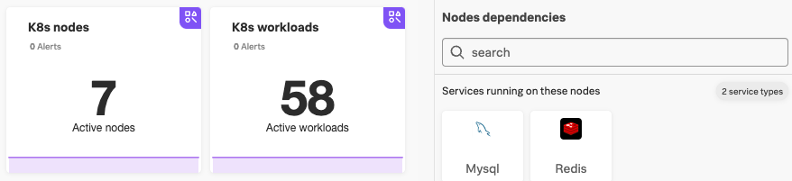
- Depending on time, we did an Infrastructure exercise and looked at Metrics used in the Kubernetes Navigators and saw related services found on our Kubernetes cluster:
- Understood what users were experiencing and used RUM & APM to Troubleshoot a particularly long page load, by following its trace across the front and back end and right to the log entries.
We used tools like RUM Session replay and the APM Dependency map with Breakdown to discover what is causing our issue:
- Used Tag Spotlight, in both RUM and APM, to understand blast radius, detect trends and context for our performance issues and errors. We drilled down in Span’s in the APM Trace waterfall to see how services interacted and find errors:

- We used the Related content feature to follow the link between our Trace directly to the Logs related to our Trace and used filters to drill down to the exact cause of our issue.
We then looked at Synthetics, which can simulate web and mobile traffic and we used the available Synthetic Test, first to confirm our finding from RUM/AMP and Log observer, then we created a Detector so we would be alerted if when the run time of a test exceeded our SLA.
In the final exercise, we created a health dashboard to keep that running for our Developers and SREs on a TV screen: