Workshop Overview
2 minutes
Introduction
The goal of this workshop is to give you hands-on experience troubleshooting an issue using Splunk Observability Cloud to identify its root cause. We’ve provided a fully instrumented microservices-based application that actually mimic a wire transfer workflow that is running on Kubernetes, which sends metrics, traces, and logs to Splunk Observability Cloud for real-time analysis.
Who Should Attend?
This workshop is ideal for anyone looking to gain practical knowledge of Splunk Observability. It’s designed for individuals with little or no prior experience with the platform.
What You’ll Need
All you need is your laptop and a browser with access to external websites. The workshop can be attended either in-person or via Zoom. If you don’t have the Zoom client installed, you can still join using your browser.
Workshop Overview
In this 3-hour session, we’ll cover the fundamentals of Splunk Observability—the only platform offering streaming analytics and NoSample Full Fidelity distributed tracing—in an interactive, hands-on setting. Here’s what you can expect:
OpenTelemetry
Learn why OpenTelemetry is essential for modern observability and how it enhances visibility into your systems.
Tour of the Splunk Observability User Interface
Take a guided tour of Splunk Observability Cloud’s interface, where we’ll show you how to navigate the five key components: APM, Log Observer, and Infrastructure.
Splunk Application Performance Monitoring (APM)
Gain end-to-end visibility of your customers’ request path using APM traces. You’ll explore how telemetry from various services is captured and visualized in Splunk Observability Cloud, helping you detect anomalies and errors.
Splunk Log Observer (LO)
Learn how to leverage the “Related Content” feature to easily navigate between components. In this case, we’ll move from an APM trace to the related logs for deeper insight into issues.
By the end of this session, you’ll have gained practical experience with Splunk Observability Cloud and a solid understanding of how to troubleshoot and resolve issues across your application stack.
What is OpenTelemetry & why should you care?
2 minutes
OpenTelemetry
With the rise of cloud computing, microservices architectures, and ever-more complex business requirements, the need for Observability has never been greater. Observability is the ability to understand the internal state of a system by examining its outputs. In the context of software, this means being able to understand the internal state of a system by examining its telemetry data, which includes metrics, traces, and logs.
To make a system observable, it must be instrumented. That is, the code must emit traces, metrics, and logs. The instrumented data must then be sent to an Observability back-end such as Splunk Observability Cloud.
| Metrics | Traces | Logs |
|---|
| Do I have a problem? | Where is the problem? | What is the problem? |
OpenTelemetry does two important things:
- Allows you to own the data that you generate rather than be stuck with a proprietary data format or tool.
- Allows you to learn a single set of APIs and conventions
These two things combined enable teams and organizations the flexibility they need in today’s modern computing world.
There are a lot of variables to consider when getting started with Observability, including the all-important question: “How do I get my data into an Observability tool?”. The industry-wide adoption of OpenTelemetry makes this question easier to answer than ever.
Why Should You Care?
OpenTelemetry is completely open-source and free to use. In the past, monitoring and Observability tools relied heavily on proprietary agents meaning that the effort required to change or set up additional tooling required a large amount of changes across systems, from the infrastructure level to the application level.
Since OpenTelemetry is vendor-neutral and supported by many industry leaders in the Observability space, adopters can switch between supported Observability tools at any time with minor changes to their instrumentation. This is true regardless of which distribution of OpenTelemetry is used – like with Linux, the various distributions bundle settings and add-ons but are all fundamentally based on the community-driven OpenTelemetry project.
Splunk has fully committed to OpenTelemetry so that our customers can collect and use ALL their data, in any type, any structure, from any source, on any scale, and all in real-time. OpenTelemetry is fundamentally changing the monitoring landscape, enabling IT and DevOps teams to bring data to every question and every action. You will experience this during these workshops.

Subsections of 3. UI - Quick Tour
Getting Started
2 minutes
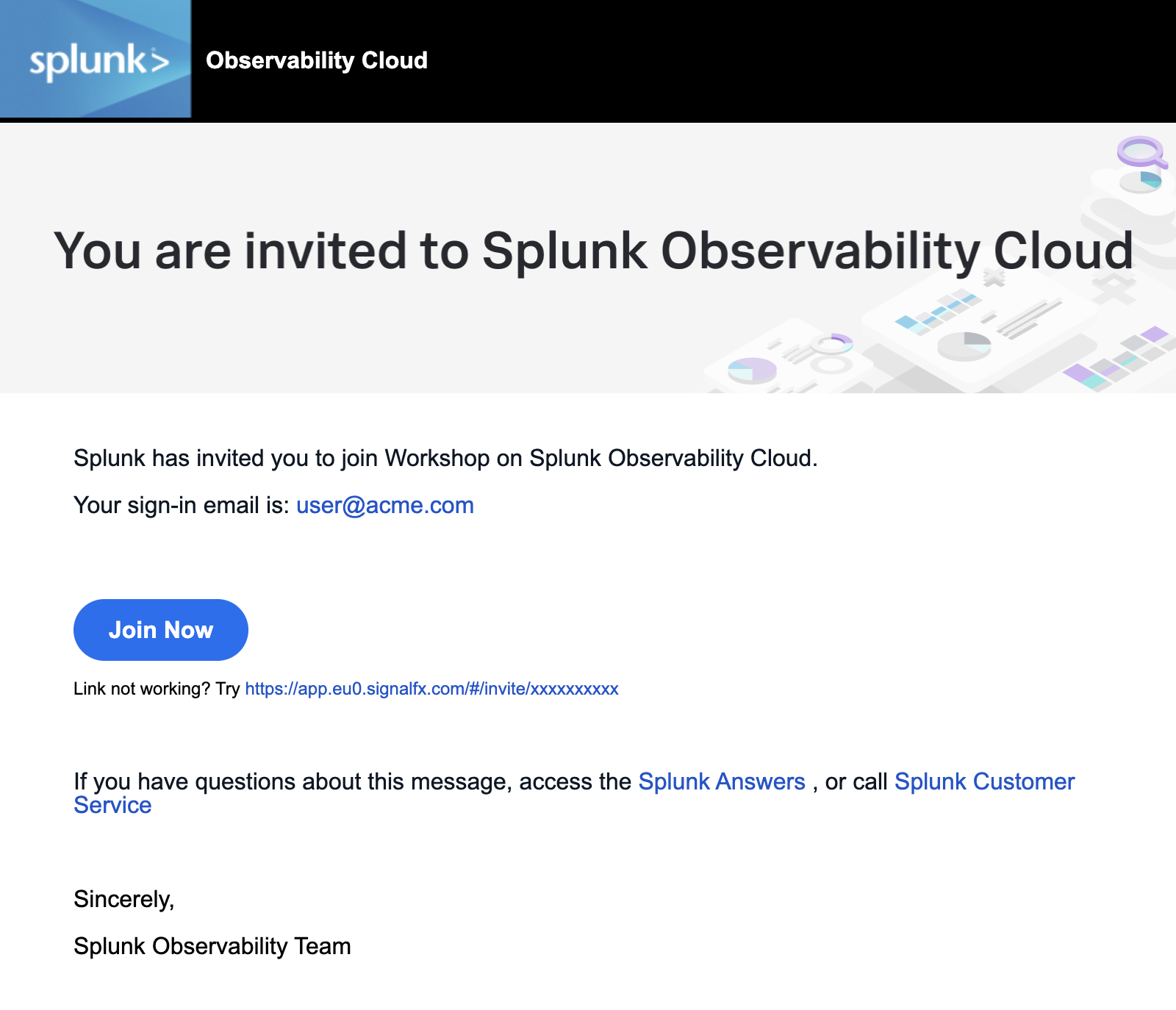
1. Sign in to Splunk Observability Cloud
You should have received an e-mail from Splunk inviting you to the Workshop Org. This e-mail will look like the screenshot below, if you cannot find it, please check your Spam/Junk folders or inform your Instructor. You can also check for other solutions in our login F.A.Q..
To proceed click the Join Now button or click on the link provided in the e-mail.
If you have already completed the registration process you can skip the rest and proceed directly to Splunk Observability Cloud and log in:
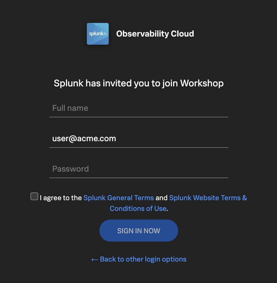
If this is your first time using Splunk Observability Cloud, you will be presented with the registration form. Enter your full name, and desired password. Please note that the password requirements are:
- Must be between 8 and 32 characters
- Must contain at least one capital letter
- Must have at least one number
- Must have at least one symbol (e.g. !@#$%^&*()_+)
Click the checkbox to agree to the terms and conditions and click the SIGN IN NOW button.
Subsections of 1. Getting Started
Home Page
5 minutes
After you have registered and logged into Splunk Observability Cloud you will be taken to the home or landing page. Here, you will find several useful features to help you get started.

- Explore your data pane: Displays which integrations are enabled and allows you to add additional integrations if you are an Administrator.
- Documentation pane: Training videos and links to documentation to get you started with Splunk Observability Cloud.
- Recents pane: Recently created/visited dashboards and/or detectors for quick access.
- Main Menu pane: Navigate the components of Splunk Observability Cloud.
- Org Switcher: Easily switch between Organizations (if you are a member of more than one Organization).
- Expand/Contract Main Menu: Expand » / Collapse « the main menu if space is at a premium.
Let’s start with our first exercise:
Exercise
- Expand the Main Menu and click on Settings.
- Check in the Org Switcher if you have access to more than one Organization.
Tip
If you have used Splunk Observability before, you may be placed in an Organization you have used previously. Make sure you are in the correct workshop organization. Verify this with your instructor if you have access to multiple Organizations.
Exercise
- Click Onboarding Guidance (Here you can toggle the visibility of the onboarding panes. This is useful if you know the product well enough, and can use the space to show more information).
- Hide the Onboarding Content for the Home Page.
- At the bottom of the menu, select your preferred appearance: Light, Dark or Auto mode.
- Did you also notice this is where the Sign Out option is? Please don’t 😊 !
- Click < to get back to the main menu.
Next, let’s check out Splunk Real User Monitoring (RUM).
5 minutes
Splunk APM provides a NoSample end-to-end visibility of every service and its dependency to solve problems quicker across monoliths and microservices. Teams can immediately detect problems from new deployments, confidently troubleshoot by scoping and isolating the source of an issue, and optimize service performance by understanding how back-end services impact end users and business workflows.
Real-time monitoring and alerting: Splunk provides out-of-the-box service dashboards and automatically detects and alerts on RED metrics (rate, error and duration) when there is a sudden change.
Dynamic telemetry maps: Easily visualize service performance in modern production environments in real-time. End-to-end visibility of service performance from infrastructure, applications, end users, and all dependencies helps quickly scope new issues and troubleshoot more effectively.
Intelligent tagging and analysis: View all tags from your business, infrastructure and applications in one place to easily compare new trends in latency or errors to their specific tag values.
AI-directed troubleshooting identifies the most impactful issues: Instead of manually digging through individual dashboards, isolate problems more efficiently. Automatically identify anomalies and the sources of errors that impact services and customers the most.
Complete distributed tracing analyses every transaction: Identify problems in your cloud-native environment more effectively. Splunk distributed tracing visualizes and correlates every transaction from the back-end and front-end in context with your infrastructure, business workflows and applications.
Full stack correlation: Within Splunk Observability, APM links traces, metrics, logs and profiling together to easily understand the performance of every component and its dependency across your stack.
Monitor database query performance: Easily identify how slow and high execution queries from SQL and NoSQL databases impact your services, endpoints and business workflows — no instrumentation required.

Subsections of 2. APM Overview
Application Performance Monitoring Home page
Click APM in the main menu, the APM Home Page is made up of 3 distinct sections:

- Onboarding Pane Pane: Training videos and links to documentation to get you started with Splunk APM.
- APM Overview Pane: Real-time metrics for the Top Services and Top Business Workflows.
- Functions Pane: Links for deeper analysis of your services, tags, traces, database query performance and code profiling.
The APM Overview pan provides a high-level view of the health of your application. It includes a summary of the services, latency and errors in your application. It also includes a list of the top services by error rate and the top business workflows by error rate (a business workflow is the start-to-finish journey of the collection of traces associated with a given activity or transaction and enables monitoring of end-to-end KPIs and identifying root causes and bottlenecks).
About Environments
To easily differentiate between multiple applications, Splunk uses environments. The naming convention for workshop environments is [NAME OF WORKSHOP]-workshop. Your instructor will provide you with the correct one to select.
Exercise
- Verify that the time window we are working with is set to the last 15 minutes (-15m).
- Change the environment to the workshop one by selecting its name from the drop-down box and make sure that is the only one selected.
What can you conclude from the Top Services by Error Rate chart?
The wire-transfer-service has a high error rate
If you scroll down the Overview Page you will notice some services listed have Inferred Service next to them.
Splunk APM can infer the presence of the remote service, or inferred service if the span calling the remote service has the necessary information. Examples of possible inferred services include databases, HTTP endpoints, and message queues. Inferred services are not instrumented, but they are displayed on the service map and the service list.
Next, let’s check out Splunk Log Observer (LO).
Log Observer Overview
5 minutes
Log Observer Connect allows you to seamlessly bring in the same log data from your Splunk Platform into an intuitive and no-code interface designed to help you find and fix problems quickly. You can easily perform log-based analysis and seamlessly correlate your logs with Splunk Infrastructure Monitoring’s real-time metrics and Splunk APM traces in one place.
End-to-end visibility: By combining the powerful logging capabilities of Splunk Platform with Splunk Observability Cloud’s traces and real-time metrics for deeper insights and more context of your hybrid environment.
Perform quick and easy log-based investigations: By reusing logs that are already ingested in Splunk Cloud Platform or Enterprise in a simplified and intuitive interface (no need to know SPL!) with customizable and out-of-the-box dashboards
Achieve higher economies of scale and operational efficiency: By centralizing log management across teams, breaking down data and team silos, and getting better overall support

Subsections of 3. Log Observer Overview
Log Observer Home Page
Click Log Observer in the main menu, the Log Observer Home Page is made up of 4 distinct sections:

- Onboarding Pane: Training videos and links to documentation to get you started with Splunk Log Observer.
- Filter Bar: Filter on time, indexes, and fields and also Save Queries.
- Logs Table Pane: List of log entries that match the current filter criteria.
- Fields Pane: List of fields available in the currently selected index.
Splunk indexes
Generally, in Splunk, an “index” refers to a designated place where your data is stored. It’s like a folder or container for your data. Data within a Splunk index is organized and structured in a way that makes it easy to search and analyze. Different indexes can be created to store specific types of data. For example, you might have one index for web server logs, another for application logs, and so on.
Tip
If you have used Splunk Enterprise or Splunk Cloud before, you are probably used to starting investigations with logs. As you will see in the following exercise, you can do that with Splunk Observability Cloud as well. This workshop, however, will use all the OpenTelemetry signals for investigations.
Let’s run a little search exercise:
Exercise
Set the time frame to -15m.
Click on Add Filter in the filter bar then click on Fields in the dialog.
Type in cardType and select it.
Under Top values click on visa, then click on = to add it to the filter.
Click Run search

Click on one of the log entries in the Logs table to validate that the entry contains cardType: "visa".
Let’s find all the wire transfer orders that have been compelted. Click on Clear All in the filter bar to remove the previous filter.
Click again on Add Filter in the filter bar, then select Keyword. Next just type order in the Enter Keyword… box and press enter.
Click Run search
You should now only have log lines that contain the word order. There are still a lot of log lines – some of which may not be our service – so let’s filter some more.
Add another filter, this time select the Fields box, then type severity in the Find a field … search box and select it.

Under Top values click on error, then click on = to add it to the filter.
Click Run search
You should now have a list of wire transfer orders that failed to complete for the last 15 minutes.
Next, let’s check out Splunk Synthetics.
Infrastructure Overview
5 minutes
Splunk Infrastructure Monitoring (IM) is a market-leading monitoring and observability service for hybrid cloud environments. Built on a patented streaming architecture, it provides a real-time solution for engineering teams to visualize and analyze performance across infrastructure, services, and applications in a fraction of the time and with greater accuracy than traditional solutions.
OpenTelemetry standardization: Gives you full control over your data — freeing you from vendor lock-in and implementing proprietary agents.
Splunk’s OTel Collector: Seamless installation and dynamic configuration, auto-discovers your entire stack in seconds for visibility across clouds, services, and systems.
300+ Easy-to-use OOTB content: Pre-built navigators and dashboards, deliver immediate visualizations of your entire environment so that you can interact with all your data in real time.
Kubernetes navigator: Provides an instant, comprehensive out-of-the-box hierarchical view of nodes, pods, and containers. Ramp up even the most novice Kubernetes user with easy-to-understand interactive cluster maps.
AutoDetect alerts and detectors: Automatically identify the most important metrics, out-of-the-box, to create alert conditions for detectors that accurately alert from the moment telemetry data is ingested and use real-time alerting capabilities for important notifications in seconds.
Log views in dashboards: Combine log messages and real-time metrics on one page with common filters and time controls for faster in-context troubleshooting.
Metrics pipeline management: Control metrics volume at the point of ingest without re-instrumentation with a set of aggregation and data-dropping rules to store and analyze only the needed data. Reduce metrics volume and optimize observability spend.

Subsections of 4. Splunk APM
1. APM Explore
When you click into the APM section of Splunk Observability Cloud you are greated with an overview of your APM data including top services by error rates, and R.E.D. metrics for services and workflows.
The APM Service Map displays the dependencies and connections among your instrumented and inferred services in APM. The map is dynamically generated based on your selections in the time range, environment, workflow, service, and tag filters.
You can see the services involved in any of your APM user workflows by clicking into the Service Map. When you select a service in the Service Map, the charts in the Business Workflow sidepane are updated to show metrics for the selected service. The Service Map and any indicators are syncronized with the time picker and chart data displayed.
Exercise
- Click on the wire-transfer-service in the Service Map.

Splunk APM also provides built-in Service Centric Views to help you see problems occurring in real time and quickly determine whether the problem is associated with a service, a specific endpoint, or the underlying infrastructure. Let’s have a closer look.
Exercise
- In the right hand pane, click on wire-transfer-service in blue.

2. APM Service View
Service View
As a service owners you can use the service view in Splunk APM to get a complete view of your service health in a single pane of glass. The service view includes a service-level indicator (SLI) for availability, dependencies, request, error, and duration (RED) metrics, runtime metrics, infrastructure metrics, Tag Spotlight, endpoints, and logs for a selected service. You can also quickly navigate to code profiling and memory profiling for your service from the service view.

Exercise
- In the Time box change the timeframe to -1h. Note how the charts update.
- These charts are very useful to quickly identify performance issues. You can use this dashboard to keep an eye on the health of your service.
- Scroll down the page and expand Infrastructure Metrics. Here you will see the metrics for the Host and Pod.
- Runtime Metrics are not available as profiling data is not available for services written in Node.js.
- Now let’s go back to the explore view, you can hit the back button in your Browser
Exercise
In the Service Map hover over the wire-transfer-service. What can you conclude from the popup service chart?
The error percentage is very high.

We need to understand if there is a pattern to this error rate. We have a handy tool for that, Tag Spotlight.
3. APM Tag Spotlight
Exercise
- To view the tags for the wire-transfer-service click on the wire-transfer-service and then click on Tag Spotlight in the right-hand side functions pane (you may need to scroll down depending upon your screen resolution).* Once in Tag Spotlight ensure the toggle Show tags with no values is off.

The views in Tag Spotlight are configurable for both the chart and cards. The view defaults to Requests & Errors.
It is also possible to configure which tag metrics are displayed in the cards. It is possible to select any combinations of:
- Requests
- Errors
- Root cause errors
- P50 Latency
- P90 Latency
- P99 Latency
Also ensure that the Show tags with no values toggle is unchecked.
Scroll through the cards and get familiar with the tags provided by the wire-transfer-service’s telemetry.
Exercise
Which card exposes the tag that identifies what the problem is?
The version card. The number of requests against v350.10 matches the number of errors i.e. 100%
Now that we have identified the version of the wire-transfer-service that is causing the issue, let’s see if we can find out more information about the error. Press the back button on your browser to get back to the Service Map.
4. APM Service Breakdown
Exercise
- Select the wire-transfer-service in the Service Map.
- In the right-hand pane click on the Breakdown.
- Select
tenant.level in the list. - Back in the Service Map click on gold (our most valuable user tier).
- Click on Breakdown and select
version, this is the tag that exposes the service version. - Repeat this for silver and bronze.
What can you conclude from what you are seeing?
Every tenant.level is being impacted by v350.10
You will now see the wire-transfer-service broken down into three services, gold, silver and bronze. Each tenant is broken down into two services, one for each version (v350.10 and v350.9).

Span Tags
Using span tags to break down services is a very powerful feature. It allows you to see how your services are performing for different customers, different versions, different regions, etc. In this exercise, we have determined that v350.10 of the wire-transfer-service is causing problems for all our customers.
Next, we need to drill down into a trace to see what is going on.
5. APM Trace Analyzer
As Splunk APM provides a NoSample end-to-end visibility of every service Splunk APM captures every trace. For this workshop, the wire transfer orderId is available as a tag. This means that we can use this to search for the exact trace of the poor user experience encountered by users.
Trace Analyzer
Splunk Observability Cloud provides several tools for exploring application monitoring data. Trace Analyzer is suited to scenarios where you have high-cardinality, high-granularity searches and explorations to research unknown or new issues.
Exercise
- With the outer box of the wire-transfer-service selected, in the right-hand pane, click on Traces.
- Set Time Range to Last 15 minutes.
- Ensure the Sample Ratio is set to
1:1 and not 1:10.

The Trace & error count view shows the total traces and traces with errors in a stacked bar chart. You can use your mouse to select a specific period within the available time frame.
Exercise
- Click on the dropdown menu that says Trace & error count, and change it to Trace duration

The Trace Duration view shows a heatmap of traces by duration. The heatmap represents 3 dimensions of data:
- Time on the x-axis
- Trace duration on the y-axis
- The traces (or requests) per second are represented by the heatmap shades
You can use your mouse to select an area on the heatmap, to focus on a specific time period and trace duration range.
Exercise
- Switch from Trace duration back to Trace & Error count.
- In the time picker select Last 1 hour.
- Note, that most of our traces have errors (red) and there are only a limited amount of traces that are error-free (blue).
- Make sure the Sample Ratio is set to
1:1 and not 1:10. - Click on Add filters, type in
orderId and select orderId from the list. - Find and select the orderId provided by your workshop leader and hit enter.

We have now filtered down to the exact trace where users reported a poor experience with a very long processing wait.
A secondary benefit to viewing this trace is that the trace will be accessible for up to 13 months. This will allow developers to come back to this issue at a later stage and still view this trace for example.
Exercise
- Click on the trace in the list.
Next, we will walk through the trace waterfall.
6. APM Waterfall
We have arrived at the Trace Waterfall from the Trace Analyzer. A trace is a collection of spans that share the same trace ID, representing a unique transaction handled by your application and its constituent services.
Each span in Splunk APM captures a single operation. Splunk APM considers a span to be an error span if the operation that the span captures results in an error.

Exercise
- Click on the ! next to any of the
wire-transfer-service spans in the waterfall.
What is the error message and version being reported in the Span Details?
Invalid request and v350.10.
Related Content relies on specific metadata that allow APM, Infrastructure Monitoring, and Log Observer to pass filters around Observability Cloud. For related logs to work, you need to have the following metadata in your logs:
service.namedeployment.environmenthost.nametrace_idspan_id
Exercise
- At the very bottom of the Trace Waterfall click on Logs (1). This highlights that there are Related Logs for this trace.
- Click on the Logs for trace xxx entry in the pop-up, this will open the logs for the complete trace in Log Observer.

Next, let’s find out more about the error in the logs.
Subsections of 5. Splunk Log Observer
1. Log Filtering
Log Observer (LO), can be used in multiple ways. In the quick tour, you used the LO no-code interface to search for specific entries in the logs. This section, however, assumes you have arrived in LO from a trace in APM using the Related Content link.
The advantage of this is, as it was with the link between RUM & APM, that you are looking at your logs within the context of your previous actions. In this case, the context is the time frame (1), which matches that of the trace and the filter (2) which is set to the trace_id.

This view will include all the log lines from all applications or services that participated in the back-end transaction started by the end-user interaction with the Online Boutique.
Even in a small application, the sheer amount of logs found can make it hard to see the specific log lines that matter to the actual incident we are investigating.
Exercise
Next, we will look at log entries in detail.
2. Viewing Log Entries
Before we look at a specific log line, let’s quickly recap what we have done so far and why we are here based on the 3 pillars of Observability:
| Metrics | Traces | Logs |
|---|
| Do I have a problem? | Where is the problem? | What is the problem? |
- Using metrics we identified we have a problem with our application. This was obvious from the error rate in the Service Dashboards as it was higher than it should be.
- Using traces and span tags we found where the problem is. The wire-transfer-service comprises of two versions,
v350.9 and v350.10, and the error rate was 100% for v350.10. - We did see that this error from the wire-transfer-service
v350.10 caused multiple retries and a long delay in the response back from the compliance check service. - From the trace, using the power of Related Content, we arrived at the log entries for the failing wire-transfer-service version. Now, we can determine what the problem is.
Exercise
- Click on an error entry in the log table (make sure it says
hostname: "wire-transfer-service-xxxx" in case there is a rare error from a different service in the list too.
Based on the message, what would you tell the development team to do to resolve the issue?
The development team needs to rebuild and deploy the container with a valid API Token or rollback to v350.9.

- Click on the X in the log message pane to close it.
Congratulations
You have successfully used Splunk Observability Cloud to understand why users are experiencing issues while using the wire transfer service. You used Splunk APM and Splunk Log Observer to understand what happened in your service landscape and subsequently, found the underlying cause, all based on the 3 pillars of Observability, metrics, traces and logs
You also learned how to use Splunk’s intelligent tagging and analysis with Tag Spotlight to detect patterns in your applications’ behavior and to use the full stack correlation power of Related Content to quickly move between the different components and telemetry while keeping in context of the issue.
In the next part of the workshop, we will move from problem-finding mode into mitigation, prevention and process improvement mode.
Next up, creating log charts in a custom dashboard.
3. Log Timeline Chart
Once you have a specific view in Log Observer, it is very useful to be able to use that view in a dashboard, to help in the future with reducing the time to detect or resolve issues. As part of the workshop, we will create an example custom dashboard that will use these charts.
Let’s look at creating a Log Timeline chart. The Log Timeline chart is used for visualizing log messages over time. It is a great way to see the frequency of log messages and to identify patterns. It is also a great way to see the distribution of log messages across your environment. These charts can be saved to a custom dashboard.
Exercise
Next, we will create a Log View chart.
4. Log View Chart
The next chart type that can be used with logs is the Log View chart type. This chart will allow us to see log messages based on predefined filters.
As with the previous Log Timeline chart, we will add a version of this chart to our Customer Health Service Dashboard:
Exercise
- After the previous exercise make sure you are still in Log Observer.
- The filters should be the same as the previous exercise, with the time picker set to the Last 15 minutes and filtering on severity=error,
sf_service=wire-transfer-service and sf_environment=[WORKSHOPNAME]. - Make sure we have the header with just the fields we wanted.
- Click again on Save and then Save to Dashboard.
- This will again provide you with the Chart creation dialog.
- For the Chart name use Log View.
- This time Click Select Dashboard and search for the Dashboard you created in the previous exercise. You can start by typing your initials in the search box (1).

- Click on your dashboard name to highlight it (2) and click OK (3).
- This will return you to the create chart dialog.
- Ensure Log View is selected as the Chart Type.

- To see your dashboard click Save and go to dashboard.
- The result should be similar to the dashboard below:

- As the last step in this exercise, let us add your dashboard to your workshop team page, this will make it easy to find later in the workshop.
- At the top of the page, click on the … to the left of your dashboard name.

- Select Link to teams from the drop-down.
- In the following Link to teams dialog box, find the Workshop team that your instructor will have provided for you and click Done.
Workshop Wrap-up 🎁
10 minutes
Congratulations, you have completed the Splunk4Rookies - Observability Cloud Workshop. Today, you have become familiar with how to use Splunk Observability Cloud to monitor your applications and infrastructure.
Celebrate your achievement by adding this certificate to your LinkedIn
profile.
Let’s recap what we have learned and what you can do next.