Locating our Sample Data
10 minutes1. Exploring the Sample Data
In the list of available dashboards, look for a group called Sample Data (2).
This group contains dashboards that showcase visualizations built from sample metrics. These will give you a sense of how different data can be represented using charts and dashboards in Splunk Observability.
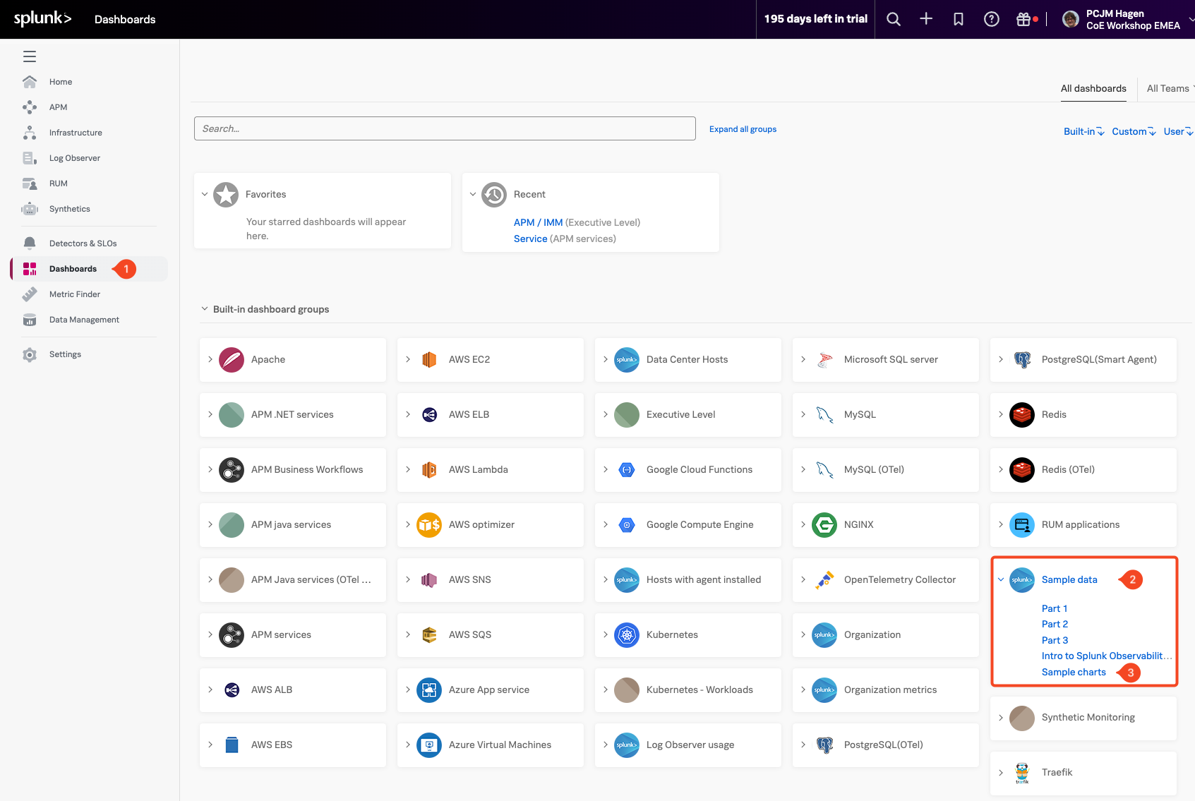
Expand the Sample Data dashboard group by clicking on it, then select the Sample Charts (3) dashboard.
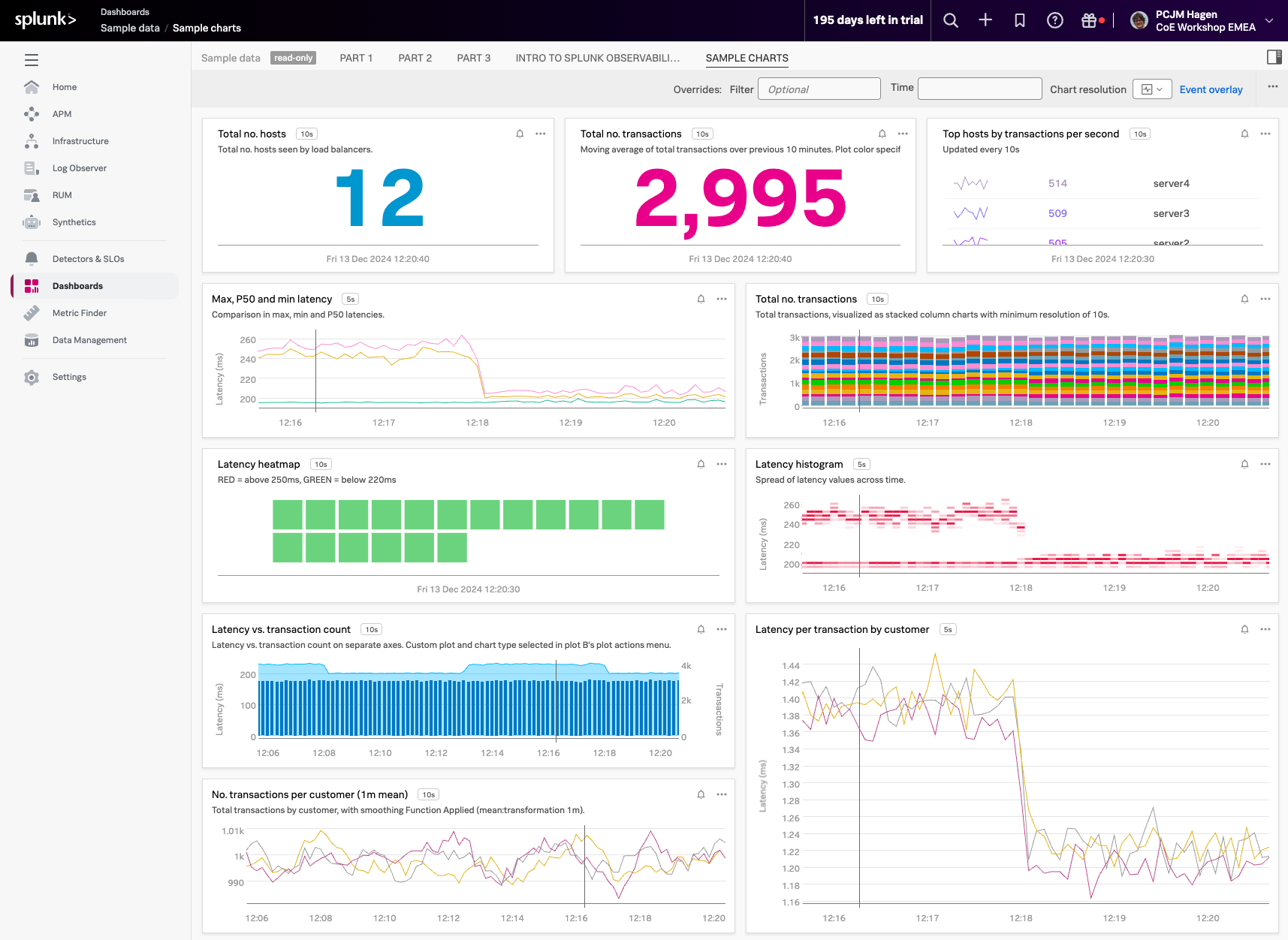
This dashboard showcases a variety of chart types, styles, and formatting options available in Splunk Observability. It’s a great way to get a feel for how flexible and customizable your dashboards can be.
The sample data runs on a 10-minute cycle, generating different patterns and behaviors over time.
To see these changes in action, adjust the time range in the top-right corner of the dashboard to Last 15 minutes or, for a better overview, select Last 1 hour. This will help you observe how the data updates and cycles through different conditions.
Take a moment to explore the charts in this dashboard, each one provides a different perspective on how sample data can be visualized.