Editing Charts
In this section, we’ll start exploring how charts are structured by editing an existing one. This is a great way to get hands-on experience with the chart editor and understand how chart settings, data sources, and visualization options all come together.
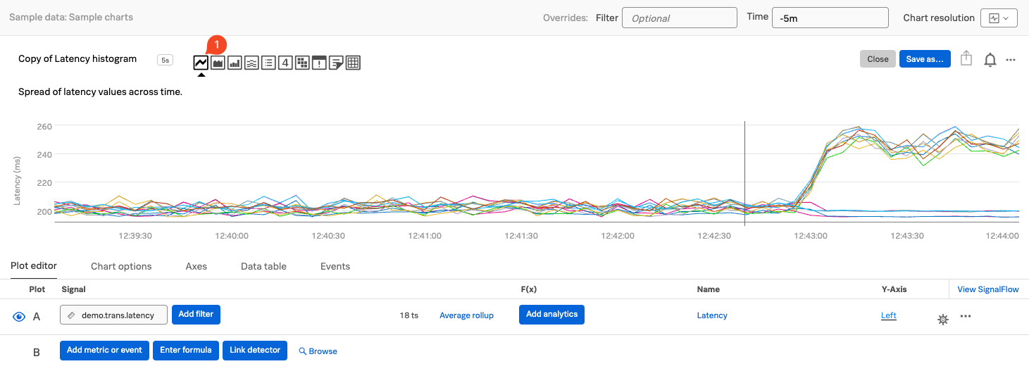
With the Latency histogram chart open in the chart editor, let’s begin configuring it for our workshop.
Click on the Line chart type icon (1) in the visualization pane to change the chart type. The data will now be displayed as a line plot.
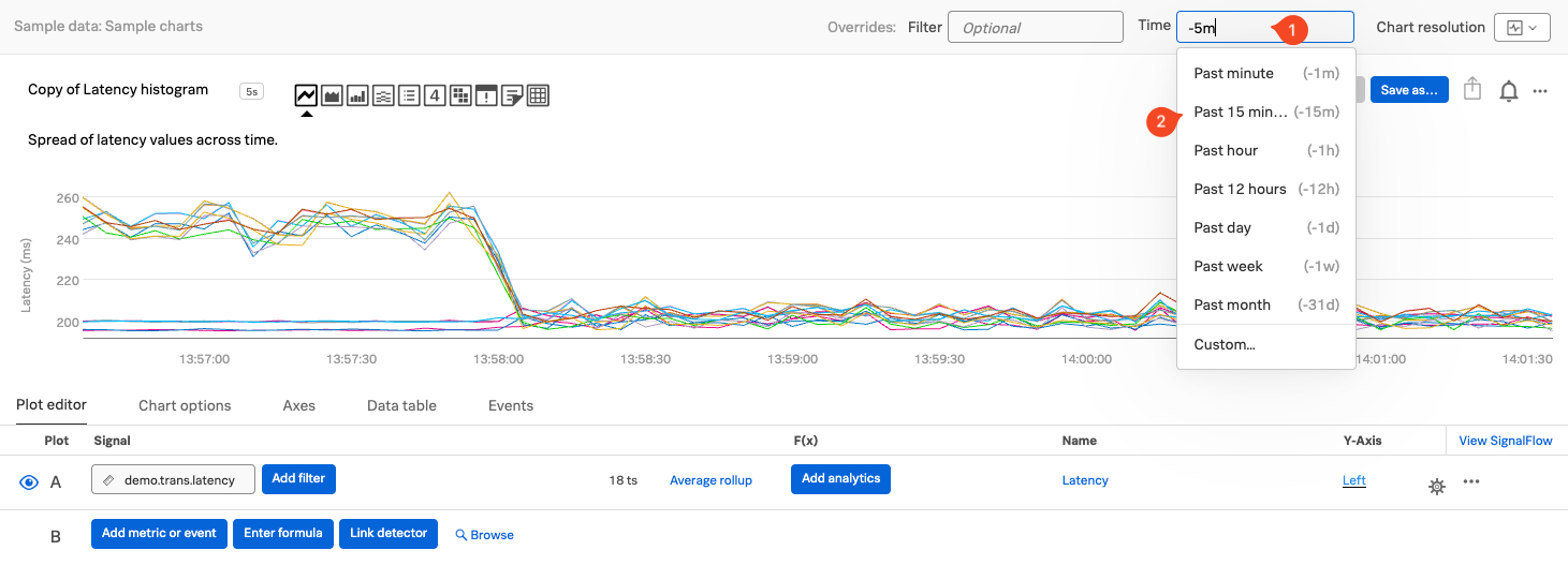
2. Changing the Chart’s Time Window
You can adjust the time range for the chart to view more historical data. To do this, click on the Time (1) dropdown in the top-right corner of the chart editor and select Past 15 minutes (2).
This will expand the time window and allow you to see more of the metric trends over a longer period.
3. Exploring the Data Table
Click on the Data Table (1) tab in the chart editor.
The Data Table gives you a behind-the-scenes look at the metric time series powering the chart.
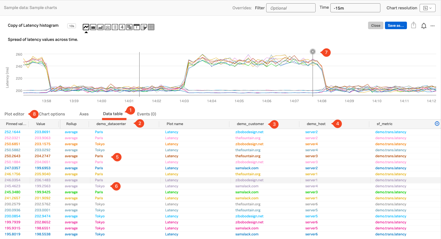
Each row in the table represents a single time series, and each column shows a dimension associated with that series. For the metric demo.trans.latency, you’ll see the following dimensions:
demo_datacenter(2)demo_customer(3)demo_host(4)
In the demo_datacenter column, you’ll notice there are two data centers: Paris (5) and Tokyo (6)
Each has multiple associated time series.
As you move your cursor across the chart (horizontally through time), the Data Table updates in real time to reflect the values at the current time point. If you click on a specific line in the chart, it will pin that time series in the table, showing a fixed value—this is indicated with a pinned value (7).
When you’re ready, click back on the Plot editor (8) tab to close the data table.
Next, let’s save this chart to a dashboard, so we can reuse it later!