Create New Chart
1 Creating a New Chart
Now let’s create a new chart and add it to the dashboard we’ve been working on!
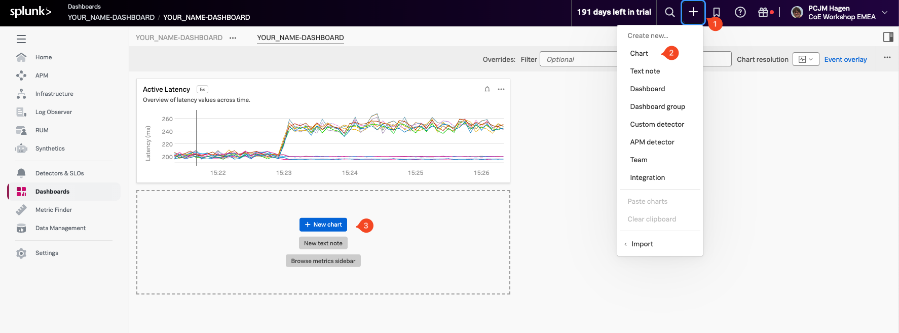
To get started, click the plus icon (1) in the top-middle part of the interface. From the dropdown, select Chart (2). Alternatively, you can click the + New Chart Button (3) button to create a new chart directly.
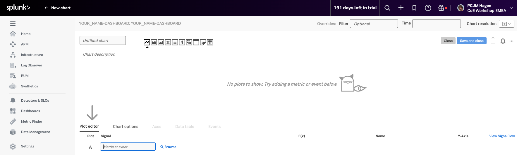
You’ll now see a blank chart template, ready for configuration:
Let’s begin by adding a metric to visualize. For this example, we’ll continue working with demo.trans.latency, the same metric we used earlier.
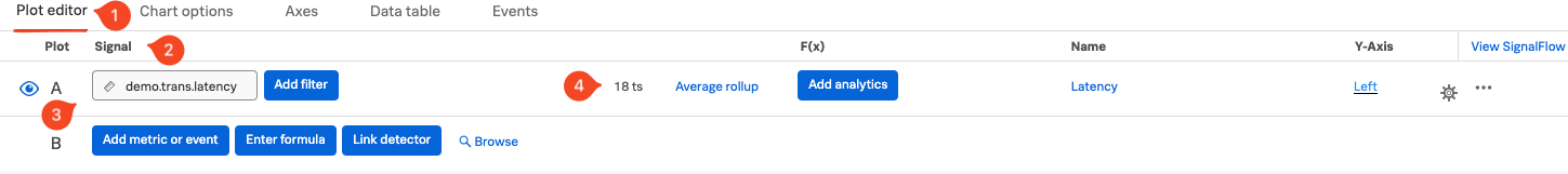
In the Plot Editor (1), go to the Signal (2) section, and enter demo.trans.latency(3) into the input field. This will load the latency time series data into the chart, so we can start building and customizing our visualization.
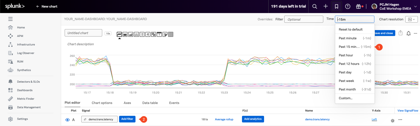
You should now see a familiar line chart displaying 18 time series (4). To view recent activity, change the time range to Past 15 minutes by selecting it from the Time dropdown (1)