Using TimeShift & Formula's
1. Using Timeshift Analytical Function
In many cases, it’s useful to compare current performance against historical data—for example, to identify trends, regressions, or improvements over time. The Timeshift function makes this easy by shifting a time series backward in time, letting you see past values side by side with the present.
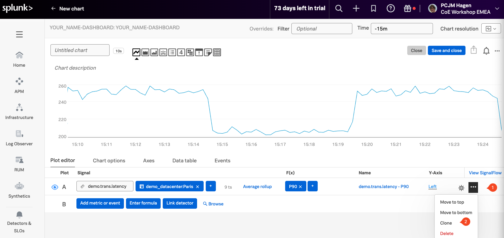
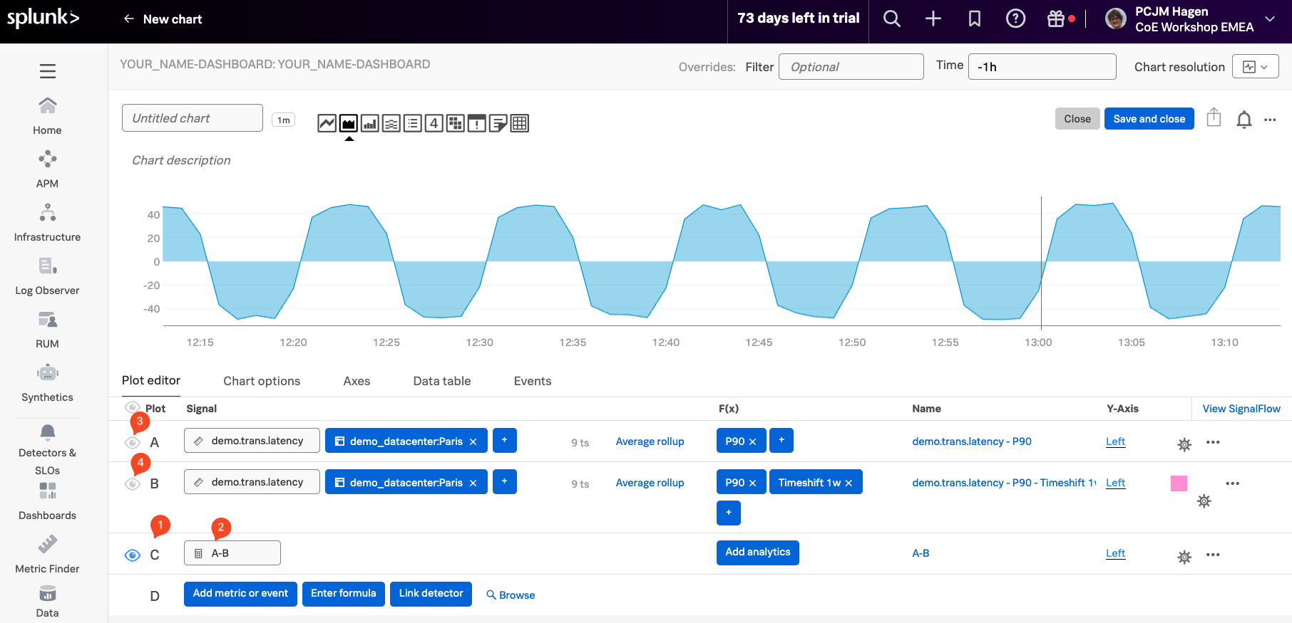
To get started, clone Signal A by clicking the ... menu (1) next to it and selecting Clone (2) from the dropdown.
Cloning a signal creates an identical copy with the same metric, filters, and settings. This duplicate—Signal B—can then be used for further calculations or comparisons, such as applying a Timeshift to visualize what the metric looked like one week ago, without altering the original signal.
After cloning, you’ll see a new signal labeled Signal B (1). Since it’s an exact copy of Signal A, both signals display the same data over the same time range. As a result, they appear to overlap completely on the chart, making it look like there’s only one line.
To make the comparison meaningful, we’ll apply a Timeshift to Signal B, shifting its data one week into the past. This allows us to see how current latency trends compare to those from the same time last week.
In the F(x) column next to Signal B, click the + (2), then choose the Timeshift (3) function from the list.
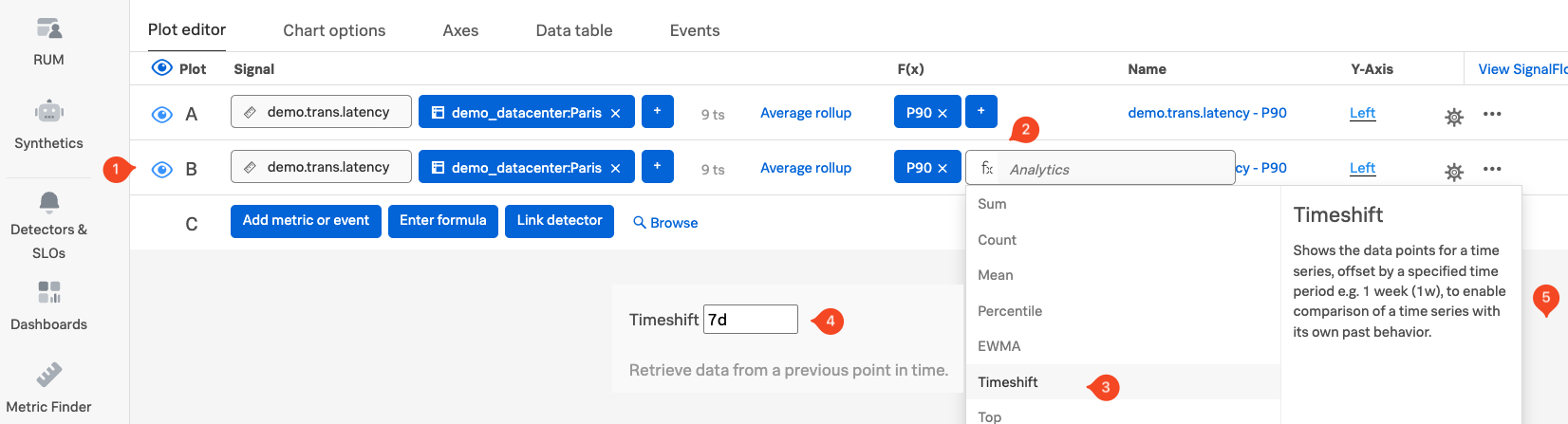
When prompted, enter 1w (or 7d for 7 days) (4) as the time shift value. Click anywhere outside the panel (5) to confirm the change.
This will shift Signal B’s data one week into the past, allowing you to visually compare current latency trends with those from the same time last week.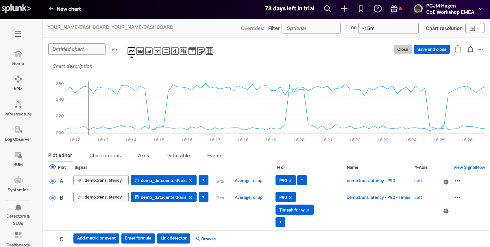
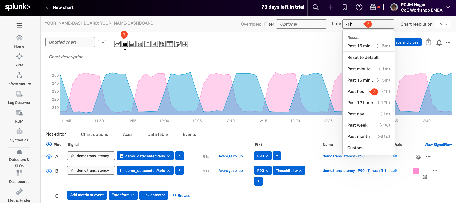
To change the color of Signal B, click the ⚙️ settings icon (1) on the far right of its row to open the settings menu. Then, select a Plot Color, such as pink (2), to visually distinguish Signal B from the original signal on the chart.
When you are done, click on theClose (3)

You should now see two plots on the chart: the p90 of current latency (Signal A) shown in blue, and the p90 from one week ago (Signal B) shown in pink.
To make the difference between them easier to interpret, click the Area chart icon (1) to change the visualization style. This highlights the areas under the curves, making it easier to spot when last week’s latency was higher than the current values.
Next, update the time range by clicking the field next to Time (2) in the Override bar and selecting Past Hour (3) from the dropdown.
2. Using Formulas
Now let’s take it a step further by calculating the difference between two time-shifted metric values—for example, comparing today’s data with data from exactly one week ago.
Click the Enter Formula button one line C (1), then type in A - B (2) to subtract Signal B from Signal A. This creates a new calculated signal, labeled C.
To focus only on the result of this formula, hide the other signals by clicking the eye icon next to A (3) and B (4), leaving only C visible.
You should now see a single line that represents the difference between the current metric values (A) and those from a week ago (B). In the chart, some values may appear negative—this happens when the older metric (B) was higher than the current one (A) at that point in time.
Now that we’ve explored visual chart analytics, let’s take a look under the hood at the SignalFlow powering our charts and detectors in the next section!