Using SignalFlow
1. Introduction to SignalFlow
Now let’s take a closer look at SignalFlow, the powerful analytics language behind Splunk Observability Cloud. SignalFlow enables you to define monitoring logic as code, offering a flexible and real-time way to work with metrics and automate alerting.
At the core of Splunk Infrastructure Monitoring is the SignalFlow analytics engine, which processes streaming metric data in real time. SignalFlow is written in a Python-like syntax and allows you to build computations that take in metric time series (MTS), perform transformations or calculations, and output new MTS.
Some common use cases for SignalFlow include:
- Comparing current values with historical trends, such as week-over-week comparisons
- Creating population-level insights using distributed percentile charts
- Monitoring rates of change or thresholds, such as detecting when a Service Level Objective (SLO) is breached
- Identifying correlated dimensions, like pinpointing which service is linked to an increase in low disk space alerts
You can create SignalFlow based computations directly in the Chart Builder interface by selecting metrics and applying analytical functions visually. For more advanced use cases, you can also write and execute SignalFlow programs directly using the SignalFlow API.
SignalFlow includes a robust set of built-in functions that operate on time series data—making it ideal for dynamic, real-time monitoring across complex systems.
Info
For more information on SignalFlow see Analyze incoming data using SignalFlow.
2. View SignalFlow
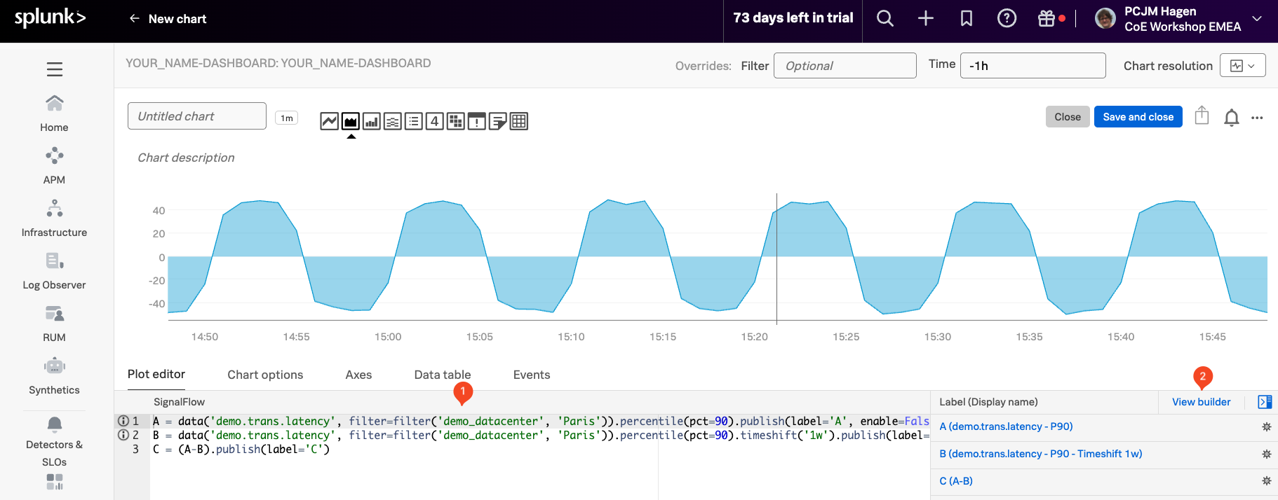
In the Chart Builder, click on View SignalFlow, to open the underlying code that powers your chart.
When you click View SignalFlow, you’ll see the SignalFlow program (1) that defines the logic and transformations behind your chart. This view gives you direct access to the code powering your visualization, allowing you to fine-tune or extend it beyond what’s possible in the visual editor.
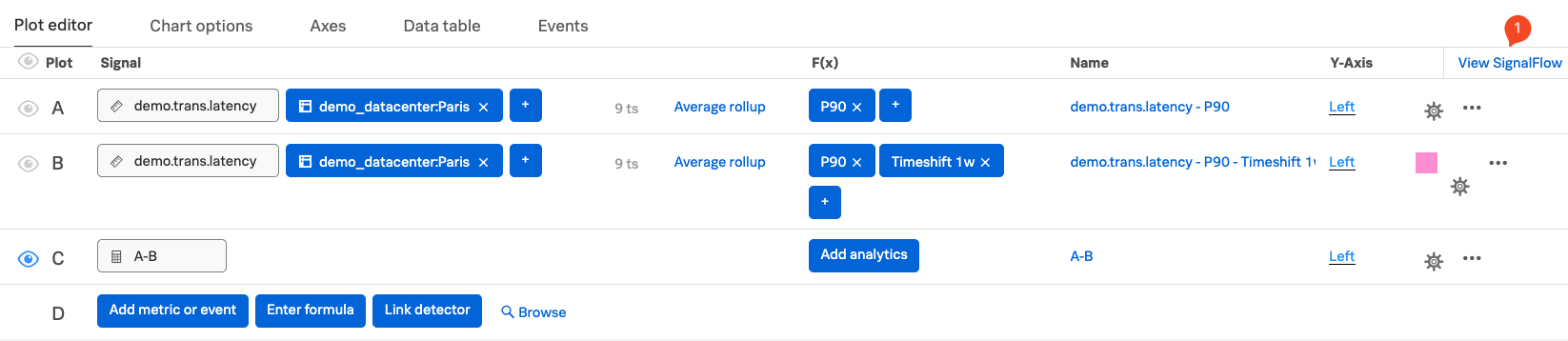
Below is an example of the SignalFlow code for the chart we just created. This snippet shows how we defined the two percentile signals (current and one week ago), applied a timeshift, and calculated the difference between them. Reviewing the code helps clarify how each step contributes to the final chart.
A = data('demo.trans.latency', filter=filter('demo_datacenter', 'Paris')).percentile(pct=95).publish(label='A', enable=False)
B = data('demo.trans.latency', filter=filter('demo_datacenter', 'Paris')).percentile(pct=95).timeshift('1w').publish(label='B', enable=False)
C = (A-B).publish(label='C')
Click on View Builder (2) to go back to the Chart Builder UI.
Let’s save this new chart to our Dashboard!