Adding charts to dashboards
1. Saving to an Existing Dashboard
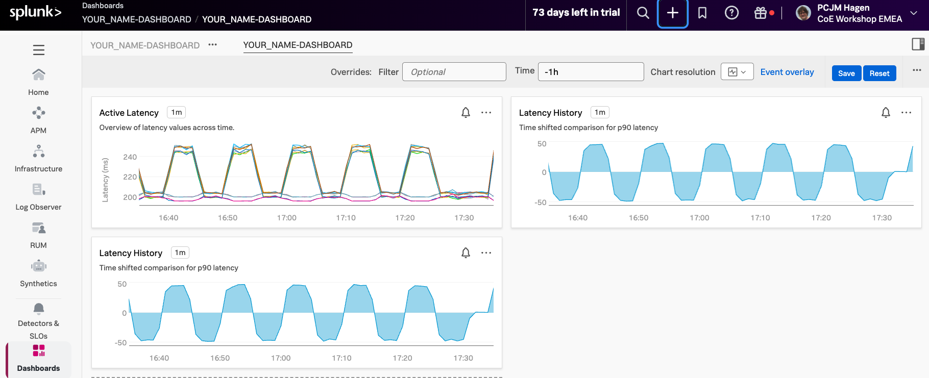
Before saving your chart, check the top-left corner to confirm that YOUR_NAME-Dashboard: YOUR_NAME-Dashboard (1) is selected. This ensures that your chart will be saved to the correct dashboard.
Next, give your chart a name. Enter Latency History (2), and if you’d like, add a brief description in the Chart Description (3) if you wish like in our example.
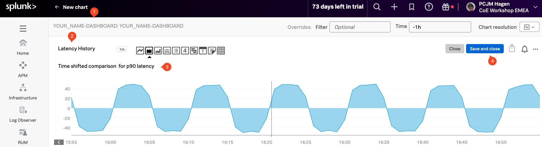
When you’re ready, click the Save And Close button (4). You’ll be returned to your dashboard, which now contains two charts.
2. Copy and Paste a chart
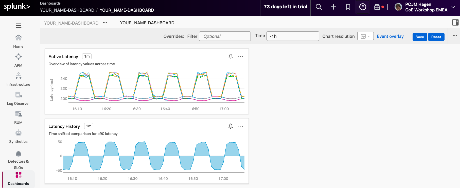
Now let’s quickly add another chart by duplicating the one we just created.
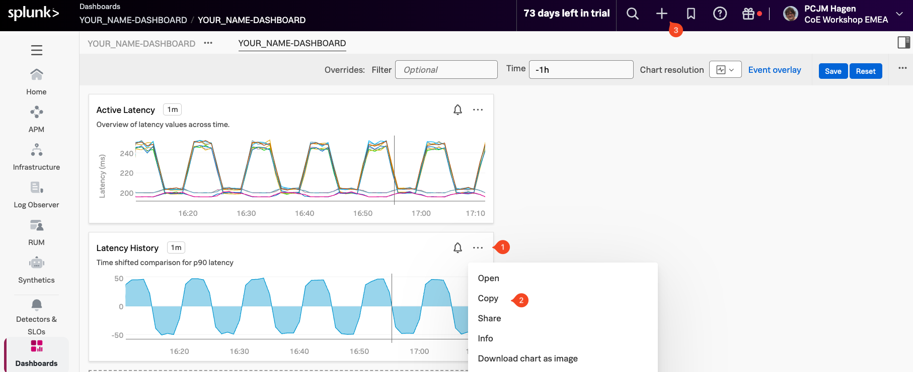
In your dashboard, locate the Latency History chart and click the three dots ... (1) in the upper-right corner of the chart. From the menu, select Copy (2).
After copying, you’ll notice a small white 1 appear in front of the + icon (3) at the top of the page. This indicates that one chart is ready to be pasted.
Click the + icon ()1 at the top of the page, and in the dropdown menu, select (2).
You should also see a 1 at the end of that line, confirming that the copied chart is ready to be added.
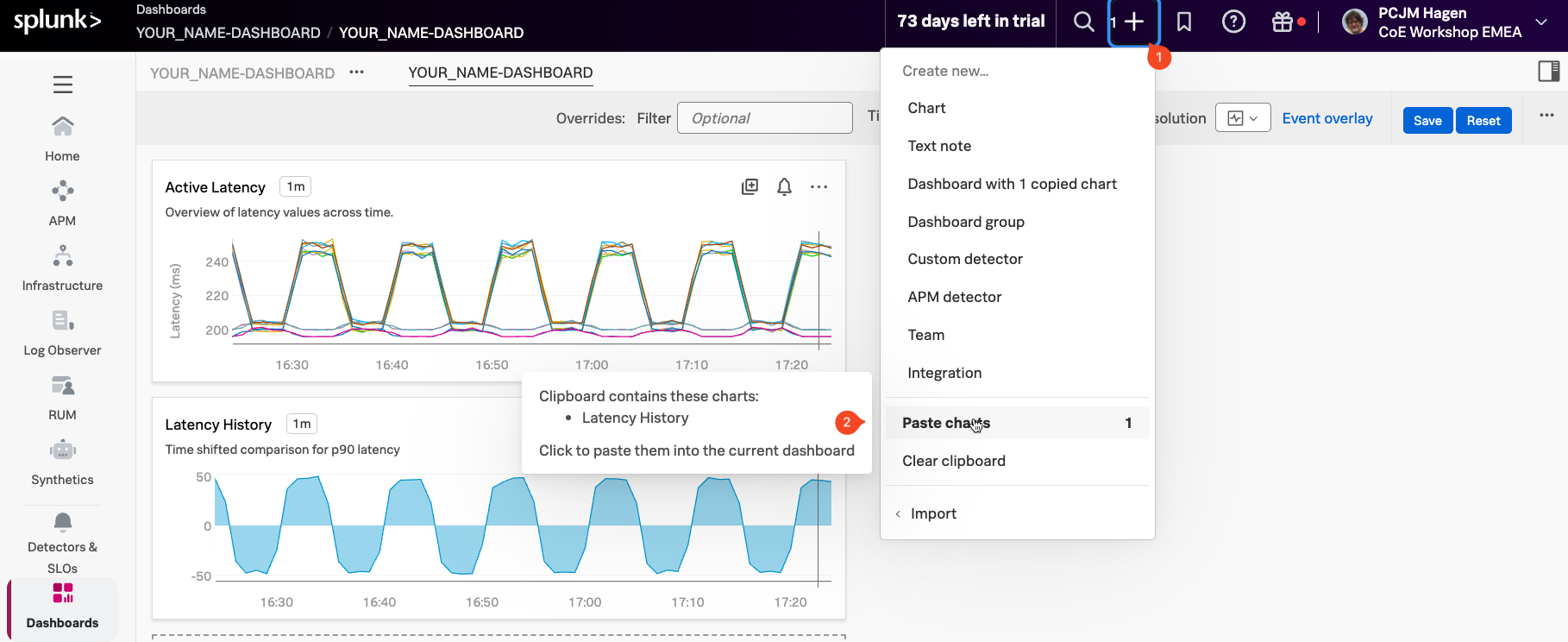
This will place a copy of the previous chart in your dashboard.
3. Edit the pasted chart
To edit the duplicated chart, click the three dots ... on one of the Latency History charts in your dashboard and then select Open. Alternatively, you can click directly on the chart’s title, Latency History, to open it in the editor.
This will bring you to the editor environment again.
Start by adjusting the time range in the top-right corner of the chart. Set it to Past 1 Hour (1) to give you a broader view of recent data.
Next, let’s customize the chart to make it unique. Click the eye icon next to Signal A (2) to make it visible again.
Then hide Signal C (3) by clicking its eye icon.
Update the chart title from Latency history to Latency vs Load (4), and optionally add or edit the chart description to reflect the updated focus (5).
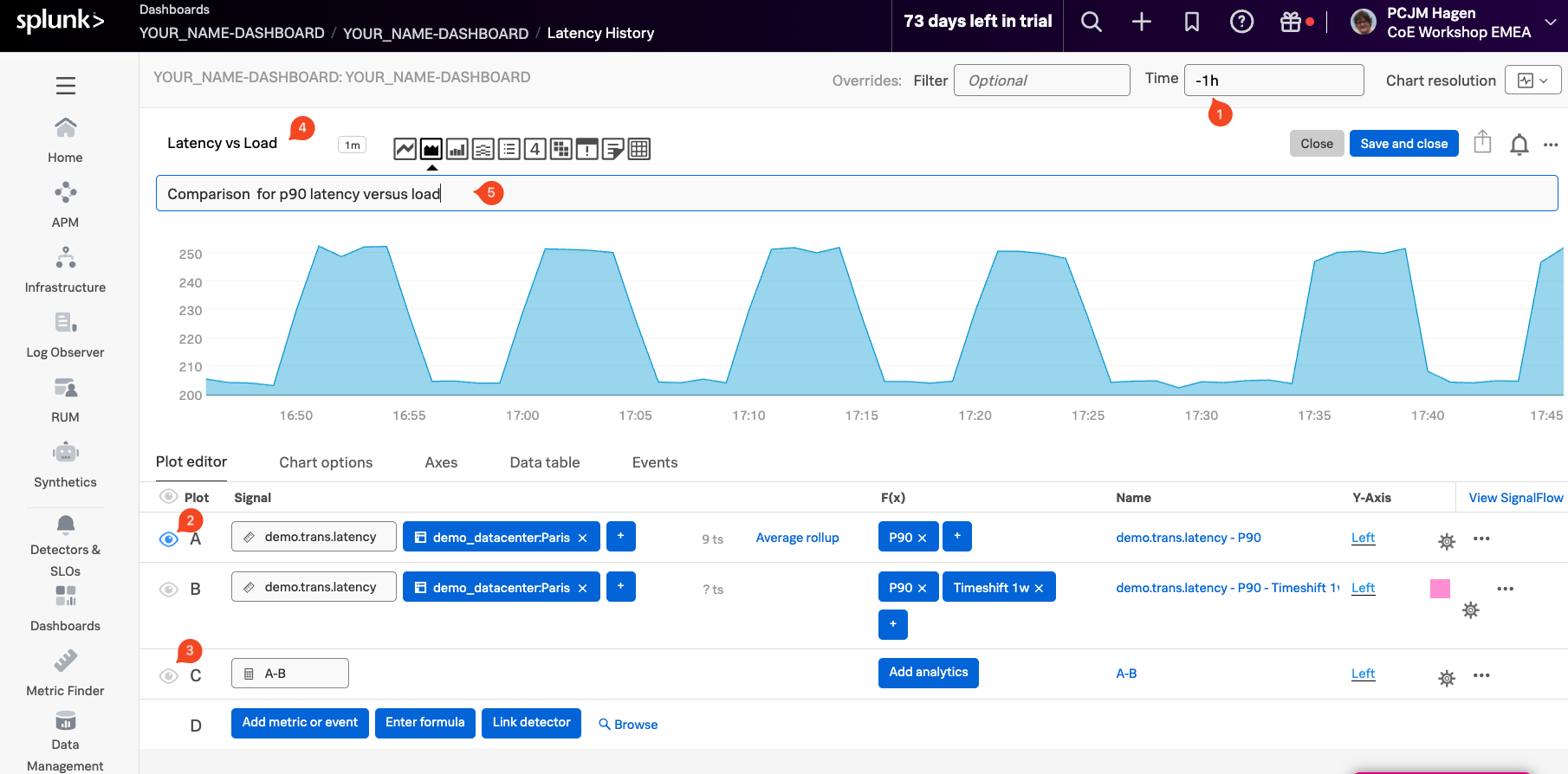
Click on the Add Metric Or Event button to create a new signal. In the input field that appears, type and select demo.trans.count (1) to add it as Signal D.
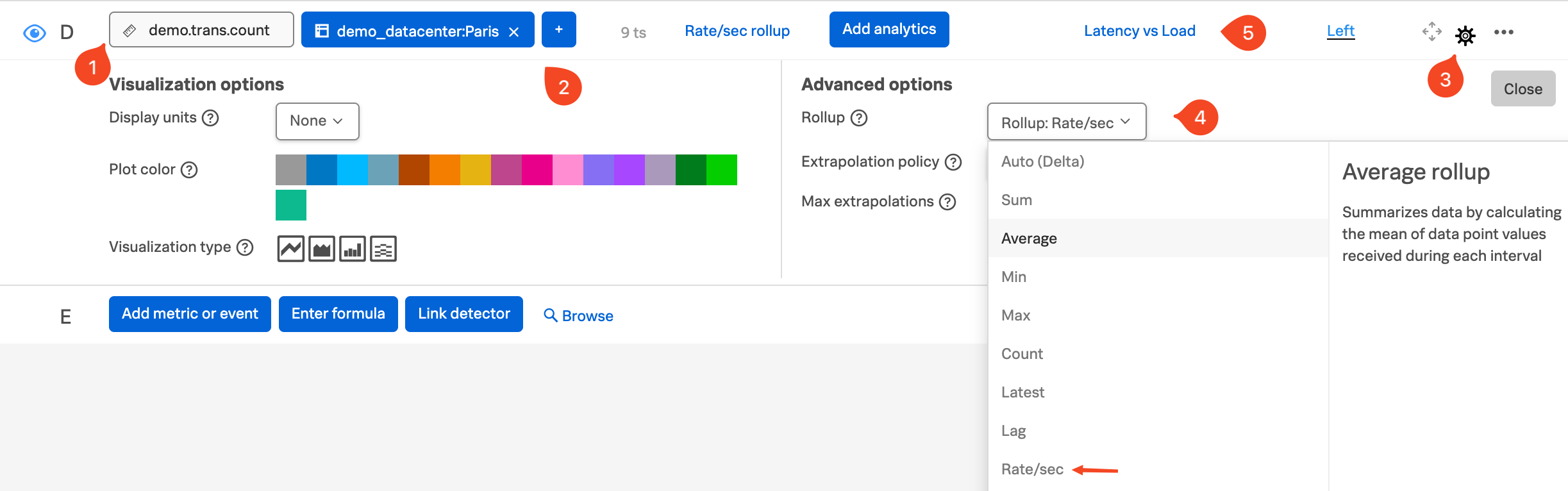
This adds a new signal, Signal D, to your chart. It represents the number of active requests being processed.
To focus on the Paris data center, add a filter for demo_datacenter: Paris (2). Then, click the Configure Plot ⚙️ (3) button to adjust how the data is displayed. Change the rollup type from Auto (Delta) to Rate/sec (4) to show the rate of incoming requests per second.
Finally, rename the signal from demo.trans.count to Latency vs Load (5) to reflect its role in the chart more clearly.
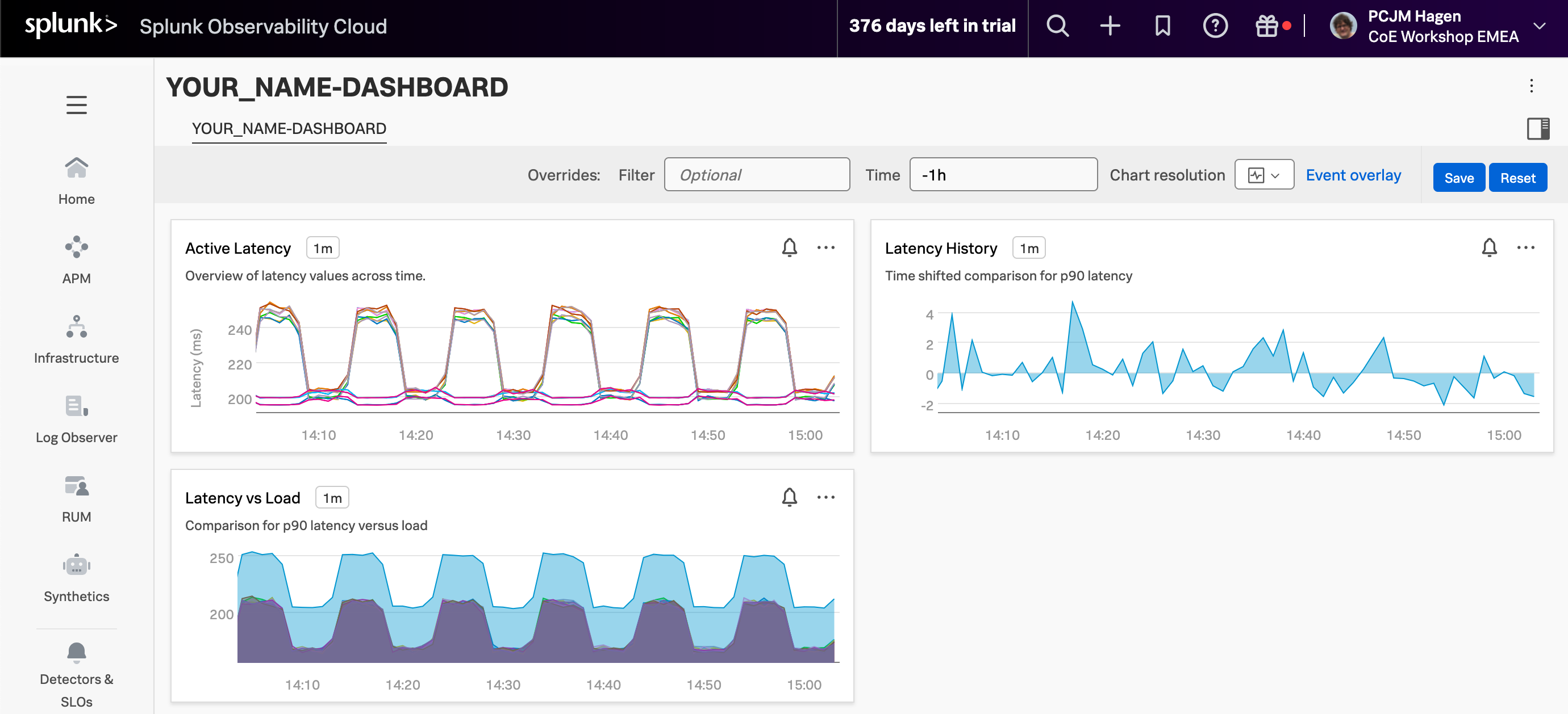
Finally press the Save And Close button. This returns you to your dashboard that now has three different charts!
Let’s add an “instruction” note and arrange the charts!