Subsections of 1. Dashboards
Locating our Sample Data
10 minutes
1. Exploring the Sample Data
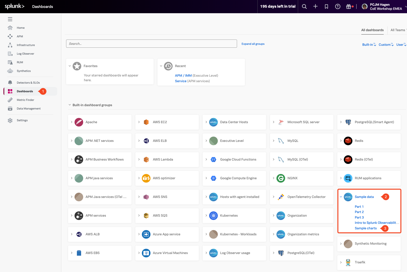
In the list of available dashboards, look for a group called Sample Data (2).
This group contains dashboards that showcase visualizations built from sample metrics. These will give you a sense of how different data can be represented using charts and dashboards in Splunk Observability.

Expand the Sample Data dashboard group by clicking on it, then select the Sample Charts (3) dashboard.
This dashboard showcases a variety of chart types, styles, and formatting options available in Splunk Observability. It’s a great way to get a feel for how flexible and customizable your dashboards can be.
The sample data runs on a 10-minute cycle, generating different patterns and behaviors over time.
To see these changes in action, adjust the time range in the top-right corner of the dashboard to Last 15 minutes or, for a better overview, select Last 1 hour. This will help you observe how the data updates and cycles through different conditions.
Take a moment to explore the charts in this dashboard, each one provides a different perspective on how sample data can be visualized.

Exploring Charts
In this section, we’ll start by exploring how charts are built and displayed in Splunk Observability. By examining and interacting with an existing chart, you’ll get a feel for how the chart editor works—how data sources are selected, how visual options are configured, and how different settings shape what you see.
1. Select a chart
To get started, make sure you have the SAMPLE CHARTS dashboard open and adjust the time range in the top-right corner of the dashboard back to -5M for Last 5 Minutes or select reset to default
Find the Latency histogram chart, then click on the three dots (…) (1) in the upper-right corner of the chart. From the menu, select Open (3). You can also simply click on the chart title (Latency histogram) (2) to open it directly.

Once the chart editor opens, you’ll see the configuration settings for the Latency histogram chart.
The chart editor is where you can control how your data is visualized. You can change the chart type, apply transformation functions, adjust time settings, and customize other visual and data-related options to match your specific needs.

In the Plot Editor (1) tab, under the Signal (2) section, you’ll find the metric currently being used: demo.trans.latency (3). This signal represents the latency data that the chart is plotting. You can use this area to edit or add additional signals to compare or enrich the visualization.
You’ll notice several Line plots displayed in the chart. The label 18 ts (4) indicates that the chart is currently plotting 18 individual metric time series.

To explore different visualization styles, try clicking on the various chart type icons in the editor. As you hover over each icon, its name will appear—helping you understand what each type represents.

For example, click on the Heat Map icon to see how the same data is represented in a different format.

Note
You can visualize your metrics using a variety of chart types—choose the one that best represents the insights you want to highlight.
For a detailed overview of available chart types and when to use them, check out Choosing a chart type.
Editing Charts
In this section, we’ll start exploring how charts are structured by editing an existing one. This is a great way to get hands-on experience with the chart editor and understand how chart settings, data sources, and visualization options all come together.
With the Latency histogram chart open in the chart editor, let’s begin configuring it for our workshop.
Click on the Line chart type icon (1) in the visualization pane to change the chart type. The data will now be displayed as a line plot.

2. Changing the Chart’s Time Window
You can adjust the time range for the chart to view more historical data. To do this, click on the Time (1) dropdown in the top-right corner of the chart editor and select Past 15 minutes (2).
This will expand the time window and allow you to see more of the metric trends over a longer period.

3. Exploring the Data Table
Click on the Data Table (1) tab in the chart editor.
The Data Table gives you a behind-the-scenes look at the metric time series powering the chart.

Each row in the table represents a single time series, and each column shows a dimension associated with that series. For the metric demo.trans.latency, you’ll see the following dimensions:
demo_datacenter (2)demo_customer (3)demo_host (4)
In the demo_datacenter column, you’ll notice there are two data centers: Paris (5) and Tokyo (6)
Each has multiple associated time series.
As you move your cursor across the chart (horizontally through time), the Data Table updates in real time to reflect the values at the current time point. If you click on a specific line in the chart, it will pin that time series in the table, showing a fixed value—this is indicated with a pinned value (7).
When you’re ready, click back on the Plot editor (8) tab to close the data table.
Next, let’s save this chart to a dashboard, so we can reuse it later!
Saving Charts and Dashboards
Once you’ve customized a chart to fit your needs, the next step is to save it as part of a dashboard. Saving your work lets you reuse, share, and monitor key visualizations over time. In this section, you’ll learn how to name and describe your chart, and how to add it to a dashboard for easy access later.
1. Saving a Chart
To begin saving your chart, let’s give it a clear name and description.
Click on the chart title, currently labeled Copy of Latency Histogram, and rename it to “Active Latency” (1).
Next, update the chart description. Click on the existing text, Spread of latency values across time, and change it to:
Overview of latency values in real-time. (2)
These updates help make the chart easier to identify and understand when it’s part of a larger dashboard or shared with others.

Click the Save As (3) button to begin the saving process. The chart will use the name Active Latency that you set earlier, but you can update the name here if needed.
Once you’re ready, click the Ok (1)
button to confirm and continue.

2. Creating a dashboard
Now that we’re saving the chart, we need somewhere to store it—a dashboard.
Dashboards help organize and group related charts together, making it easier to monitor key metrics in one view. For this workshop, we’ll create a new dashboard to hold the charts we are building.
In the Choose dashboard dialog, click the New Dashboard (1) button.
Important: Do not select an existing dashboard—make sure to create a new one for this exercise.

You’ll now see the New Dashboard dialog, where you can configure the details of your new dashboard.
Start by giving your dashboard a name. For this workshop, use the following format: YOUR_NAME-Dashboard
Replace YOUR_NAME with your actual name to make your dashboard easy to identify.
Next, update the permissions. Set them to Restricted Read and Write access, to ensure that only you (or specific users) can view and modify the dashboard. Make sure your user account is included and has both read and write access.

You should now see your own user account listed in the permissions, which means you are currently the only one who can edit this dashboard.
If needed, you can add additional users or teams by selecting them from the dropdown below.
For the purposes of this workshop, let’s remove the restrictions. Change the permissions setting to Everyone can Read and Write so that access isn’t limited during the session.

Now, click the Save button to continue.
Your new dashboard will be created and automatically selected, allowing you to save your chart directly into it

Make sure your newly created dashboard is selected (1), then click the Ok button (2) to proceed.
You’ll now be taken to your dashboard. In the top-left corner, you’ll see that YOUR_NAME-DASHBOARD is part of a Dashboard Group is part of a dashboard group with the same name. You can add additional dashboards to this dashboard group to organize charts around different use cases, systems, or projects.

Create New Chart
1 Creating a New Chart
Now let’s create a new chart and add it to the dashboard we’ve been working on!
To get started, click the plus icon (1) in the top-middle part of the interface. From the dropdown, select Chart (2).
Alternatively, you can click the + New Chart Button (3) button to create a new chart directly.

You’ll now see a blank chart template, ready for configuration:

Let’s begin by adding a metric to visualize. For this example, we’ll continue working with demo.trans.latency, the same metric we used earlier.
In the Plot Editor (1), go to the Signal (2) section, and enter demo.trans.latency(3) into the input field. This will load the latency time series data into the chart, so we can start building and customizing our visualization.
You should now see a familiar line chart displaying 18 time series (4). To view recent activity, change the time range to Past 15 minutes by selecting it from the Time dropdown (1)

Using Filters & Analytics
1. Filtering and Analytics
Splunk Observability makes it easy to explore large volumes of metric data by using filters and analytics functions. Filters help you focus on specific segments of your data—such as a particular service, host, or location—while analytics functions let you transform and analyze that data for deeper insights.
Now let’s narrow down our data to focus on the Paris data center, which will allow us to apply more targeted analytics. We’ll do this by using a Filter.
Start by returning to the Plot Editor tab. Click the Add Filter button (2) as shown in the screenshot below.
Wait a moment for the available dimensions to populate. Then:
- Select demo_datacenter (1) as the filter dimension.
- Choose Paris (2) as the value to filter on.
This filter will limit the chart to show only the time series coming from the Paris data center, making your analysis more focused and meaningful.

In the F(x) (1) column of the chart editor, click the Add Analytics button o apply an analytic function.
From the dropdown list, select Percentile (2), and then choose the Percentile:Aggregation (3) option.
In the follow-up panel, leave the percentile value set to 90, which tells the chart to display the 90th percentile of the selected time series.
In this context, the 90th percentile represents the value below which 90% of the latency measurements fall, in other words, only the highest 10% of values exceed this point. This is a useful way to understand “worst-case normal” performance—filtering out occasional spikes while still showing when latency is approaching unacceptable levels.
To apply the function, simply click anywhere outside the panel to confirm your selection (4).

For info on the Percentile function and the other functions see Chart Analytics.
1. Using Timeshift Analytical Function
In many cases, it’s useful to compare current performance against historical data—for example, to identify trends, regressions, or improvements over time. The Timeshift function makes this easy by shifting a time series backward in time, letting you see past values side by side with the present.
To get started, clone Signal A by clicking the ... menu (1) next to it and selecting Clone (2) from the dropdown.
Cloning a signal creates an identical copy with the same metric, filters, and settings. This duplicate—Signal B—can then be used for further calculations or comparisons, such as applying a Timeshift to visualize what the metric looked like one week ago, without altering the original signal.

After cloning, you’ll see a new signal labeled Signal B (1). Since it’s an exact copy of Signal A, both signals display the same data over the same time range. As a result, they appear to overlap completely on the chart, making it look like there’s only one line.
To make the comparison meaningful, we’ll apply a Timeshift to Signal B, shifting its data one week into the past. This allows us to see how current latency trends compare to those from the same time last week.
In the F(x) column next to Signal B, click the + (2), then choose the Timeshift (3) function from the list.

When prompted, enter 1w (or 7d for 7 days) (4) as the time shift value. Click anywhere outside the panel (5) to confirm the change.
This will shift Signal B’s data one week into the past, allowing you to visually compare current latency trends with those from the same time last week.

To change the color of Signal B, click the ⚙️ settings icon (1) on the far right of its row to open the settings menu. Then, select a Plot Color, such as pink (2), to visually distinguish Signal B from the original signal on the chart.
When you are done, click on theClose (3)

You should now see two plots on the chart: the p90 of current latency (Signal A) shown in blue, and the p90 from one week ago (Signal B) shown in pink.
To make the difference between them easier to interpret, click the Area chart icon (1) to change the visualization style. This highlights the areas under the curves, making it easier to spot when last week’s latency was higher than the current values.
Next, update the time range by clicking the field next to Time (2) in the Override bar and selecting Past Hour (3) from the dropdown.

Now let’s take it a step further by calculating the difference between two time-shifted metric values—for example, comparing today’s data with data from exactly one week ago.
Click the Enter Formula button one line C (1), then type in A - B (2) to subtract Signal B from Signal A. This creates a new calculated signal, labeled C.
To focus only on the result of this formula, hide the other signals by clicking the eye icon next to A (3) and B (4), leaving only C visible.

You should now see a single line that represents the difference between the current metric values (A) and those from a week ago (B). In the chart, some values may appear negative—this happens when the older metric (B) was higher than the current one (A) at that point in time.
Now that we’ve explored visual chart analytics, let’s take a look under the hood at the SignalFlow powering our charts and detectors in the next section!
Using SignalFlow
1. Introduction to SignalFlow
Now let’s take a closer look at SignalFlow, the powerful analytics language behind Splunk Observability Cloud. SignalFlow enables you to define monitoring logic as code, offering a flexible and real-time way to work with metrics and automate alerting.
At the core of Splunk Infrastructure Monitoring is the SignalFlow analytics engine, which processes streaming metric data in real time. SignalFlow is written in a Python-like syntax and allows you to build computations that take in metric time series (MTS), perform transformations or calculations, and output new MTS.
Some common use cases for SignalFlow include:
- Comparing current values with historical trends, such as week-over-week comparisons
- Creating population-level insights using distributed percentile charts
- Monitoring rates of change or thresholds, such as detecting when a Service Level Objective (SLO) is breached
- Identifying correlated dimensions, like pinpointing which service is linked to an increase in low disk space alerts
You can create SignalFlow based computations directly in the Chart Builder interface by selecting metrics and applying analytical functions visually. For more advanced use cases, you can also write and execute SignalFlow programs directly using the SignalFlow API.
SignalFlow includes a robust set of built-in functions that operate on time series data—making it ideal for dynamic, real-time monitoring across complex systems.
Info
For more information on SignalFlow see Analyze incoming data using SignalFlow.
2. View SignalFlow
In the Chart Builder, click on View SignalFlow, to open the underlying code that powers your chart.

When you click View SignalFlow, you’ll see the SignalFlow program (1) that defines the logic and transformations behind your chart. This view gives you direct access to the code powering your visualization, allowing you to fine-tune or extend it beyond what’s possible in the visual editor.
Below is an example of the SignalFlow code for the chart we just created. This snippet shows how we defined the two percentile signals (current and one week ago), applied a timeshift, and calculated the difference between them. Reviewing the code helps clarify how each step contributes to the final chart.
A = data('demo.trans.latency', filter=filter('demo_datacenter', 'Paris')).percentile(pct=95).publish(label='A', enable=False)
B = data('demo.trans.latency', filter=filter('demo_datacenter', 'Paris')).percentile(pct=95).timeshift('1w').publish(label='B', enable=False)
C = (A-B).publish(label='C')
Click on View Builder (2) to go back to the Chart Builder UI.

Let’s save this new chart to our Dashboard!
Adding charts to dashboards
1. Saving to an Existing Dashboard
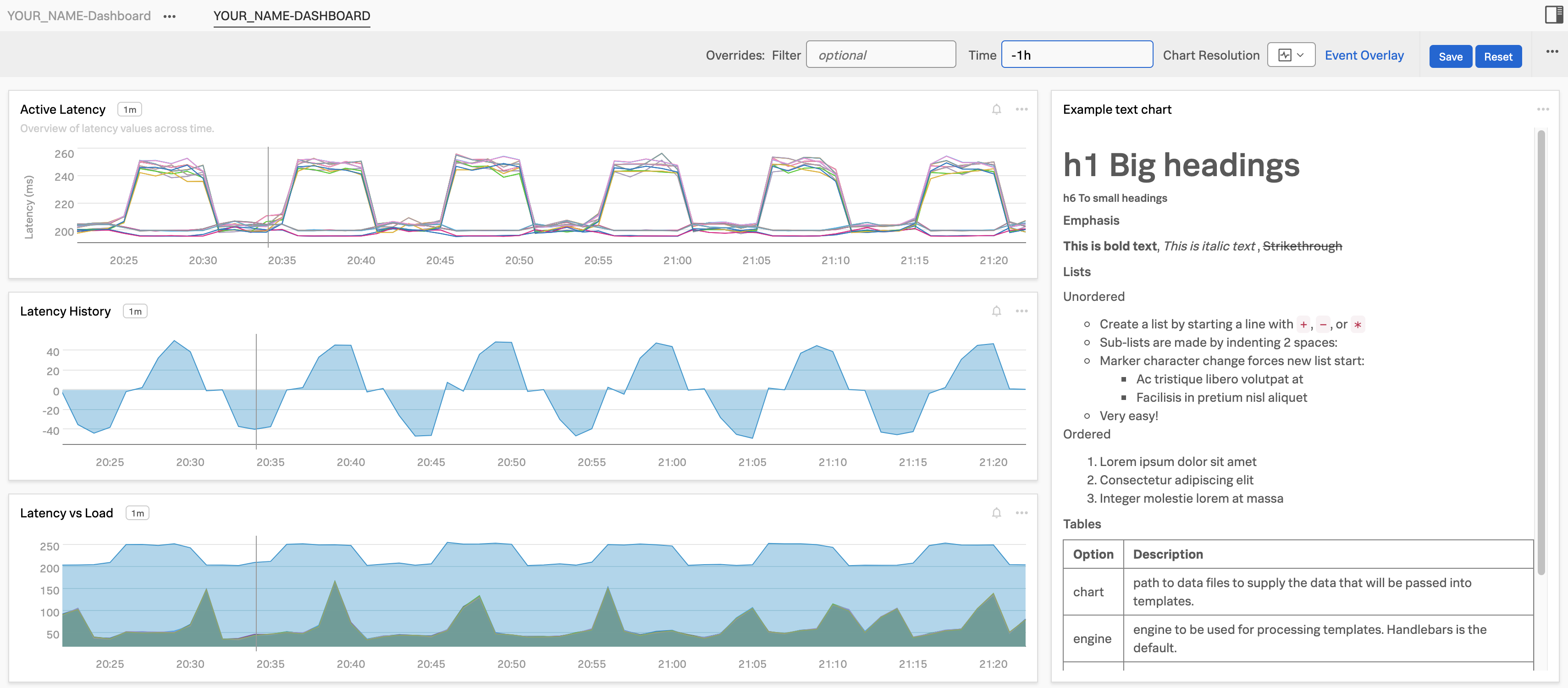
Before saving your chart, check the top-left corner to confirm that YOUR_NAME-Dashboard: YOUR_NAME-Dashboard (1) is selected. This ensures that your chart will be saved to the correct dashboard.
Next, give your chart a name. Enter Latency History (2), and if you’d like, add a brief description in the Chart Description (3) if you wish like in our example.

When you’re ready, click the Save And Close button (4). You’ll be returned to your dashboard, which now contains two charts.

2. Copy and Paste a chart
Now let’s quickly add another chart by duplicating the one we just created.
In your dashboard, locate the Latency History chart and click the three dots ... (1) in the upper-right corner of the chart. From the menu, select Copy (2).
After copying, you’ll notice a small white 1 appear in front of the + icon (3) at the top of the page. This indicates that one chart is ready to be pasted.

Click the + icon ()1 at the top of the page, and in the dropdown menu, select (2).
You should also see a 1 at the end of that line, confirming that the copied chart is ready to be added.

This will place a copy of the previous chart in your dashboard.

3. Edit the pasted chart
To edit the duplicated chart, click the three dots ... on one of the Latency History charts in your dashboard and then select Open. Alternatively, you can click directly on the chart’s title, Latency History, to open it in the editor.
This will bring you to the editor environment again.
Start by adjusting the time range in the top-right corner of the chart. Set it to Past 1 Hour (1) to give you a broader view of recent data.
Next, let’s customize the chart to make it unique. Click the eye icon next to Signal A (2) to make it visible again.
Then hide Signal C (3) by clicking its eye icon.
Update the chart title from Latency history to Latency vs Load (4), and optionally add or edit the chart description to reflect the updated focus (5).

Click on the Add Metric Or Event button to create a new signal. In the input field that appears, type and select demo.trans.count (1) to add it as Signal D.
This adds a new signal, Signal D, to your chart. It represents the number of active requests being processed.
To focus on the Paris data center, add a filter for demo_datacenter: Paris (2). Then, click the Configure Plot ⚙️ (3) button to adjust how the data is displayed. Change the rollup type from Auto (Delta) to Rate/sec (4) to show the rate of incoming requests per second.
Finally, rename the signal from demo.trans.count to Latency vs Load (5) to reflect its role in the chart more clearly.

Finally press the Save And Close button. This returns you to your dashboard that now has three different charts!

Let’s add an “instruction” note and arrange the charts!
Adding Notes and Dashboard Layout
1. Adding Notes
Often on dashboards it makes sense to place a short “instruction” pane that helps users of a dashboard. Lets add one now by clicking on the New Text Note
Button.

This will open the notes editor.

To allow you to add more then just text to you notes, Splunk is allowing you to use Markdown in these notes/panes.
Markdown is a lightweight markup language for creating formatted text using plain-text often used in Webpages.
This includes (but not limited to):
- Headers. (in various sizes)
- Emphasis styles.
- Lists and Tables.
- Links. These can be external webpages (for documentation for example) or directly to other Splunk IM Dashboards
Below is an example of above Markdown options you can use in your note.
# h1 Big headings

###### h6 To small headings

##### Emphasis

**This is bold text**, *This is italic text* , ~~Strikethrough~~

##### Lists

Unordered

+ Create a list by starting a line with `+`, `-`, or `*`
- Sub-lists are made by indenting 2 spaces:
- Marker character change forces new list start:
    * Ac tristique libero volutpat at
    + Facilisis in pretium nisl aliquet
* Very easy!

Ordered

1. Lorem ipsum dolor sit amet
2. Consectetur adipiscing elit
3. Integer molestie lorem at massa

##### Tables

| Option | Description |
| ------ | ----------- |
| chart  | path to data files to supply the data that will be passed into templates. |
| engine | engine to be used for processing templates. Handlebars is the default. |
| ext    | extension to be used for dest files. |

#### Links

[link to webpage](https://www.splunk.com)

[link to dashboard with title](https://app.eu0.signalfx.com/#/dashboard/EaJHrbPAEAA?groupId=EaJHgrsAIAA&configId=EaJHsHzAEAA "Link to the Sample chart Dashboard!")
Copy the above by using the copy button and paste it in the Edit box.
the preview will show you how it will look.
2. Saving our chart
Give the Note chart a name, in our example we used Example text chart, then press the Save And Close Button.

This will bring you back to you Dashboard, that now includes the note.

3. Ordering & sizing of charts
If you do not like the default order and sizes of your charts you can simply use window dragging technique to move and size them to the desired location.
Grab the top border of a chart and you should see the mouse pointer change to a drag icon (see picture below).

Now drag the Latency vs Load chart to sit between the Latency History Chart and the Example text chart.

You can also resize windows by dragging from the left, right and bottom edges.
As a last exercise reduce the width of the note chart to about a third of the other charts. The chart will automatically snap to one of the sizes it supports. Widen the 3 other charts to about a third of the Dashboard. Drag the notes to the right of the others and resize it to match it to the 3 others. Set the Time to -1h and you should have the following dashboard!