Visualize Kubernetes Audit Event Metrics
Now that your metric has dimensions you will create a chart showing the health of different Kubernetes actions using the verb dimension from the events.
Exercise: Visualize Kubernetes Audit Event Metrics
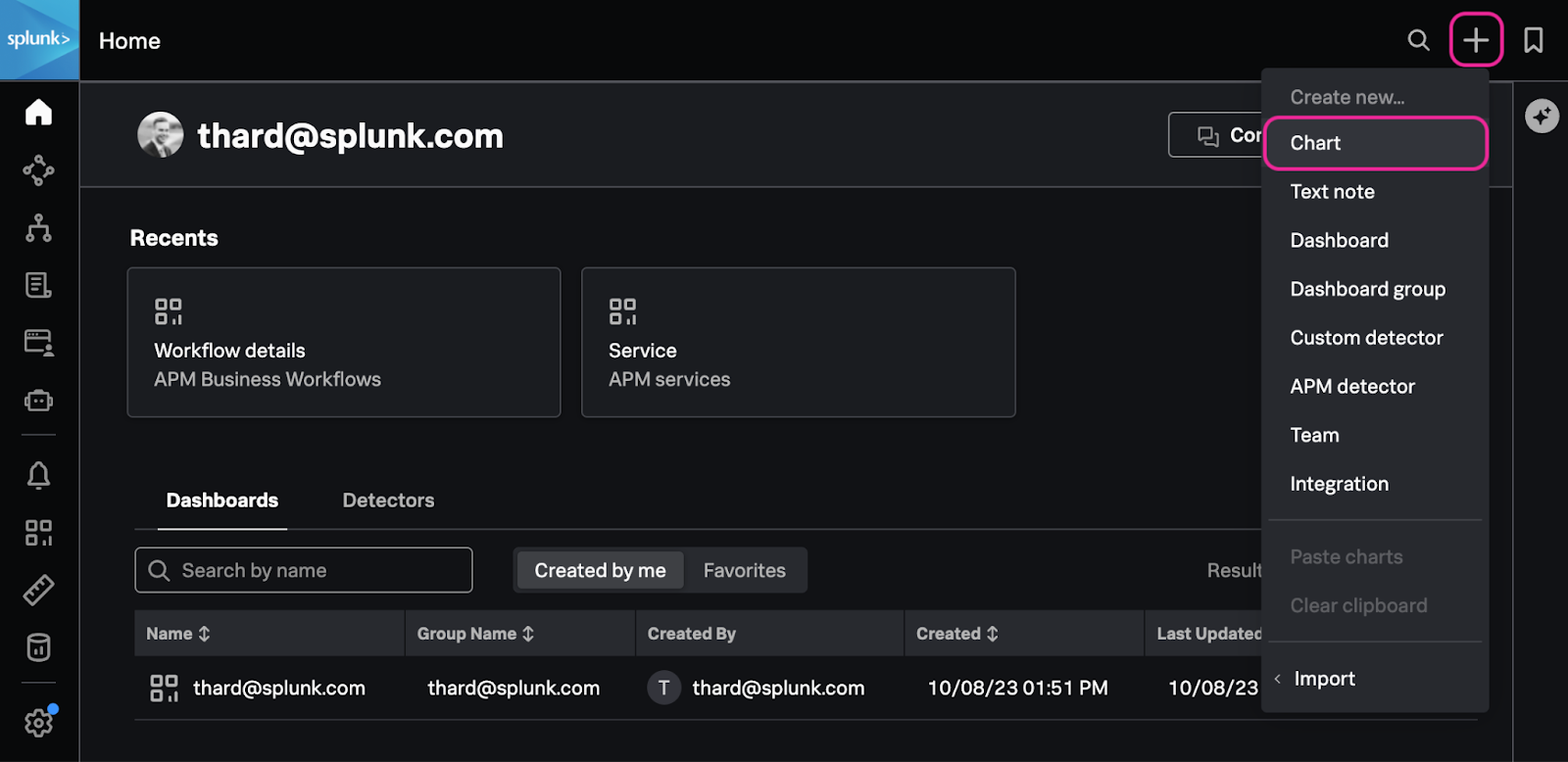
1. If you closed the chart you created in the previous section, in the upper-right corner, click the + Icon → Chart to create a new chart.
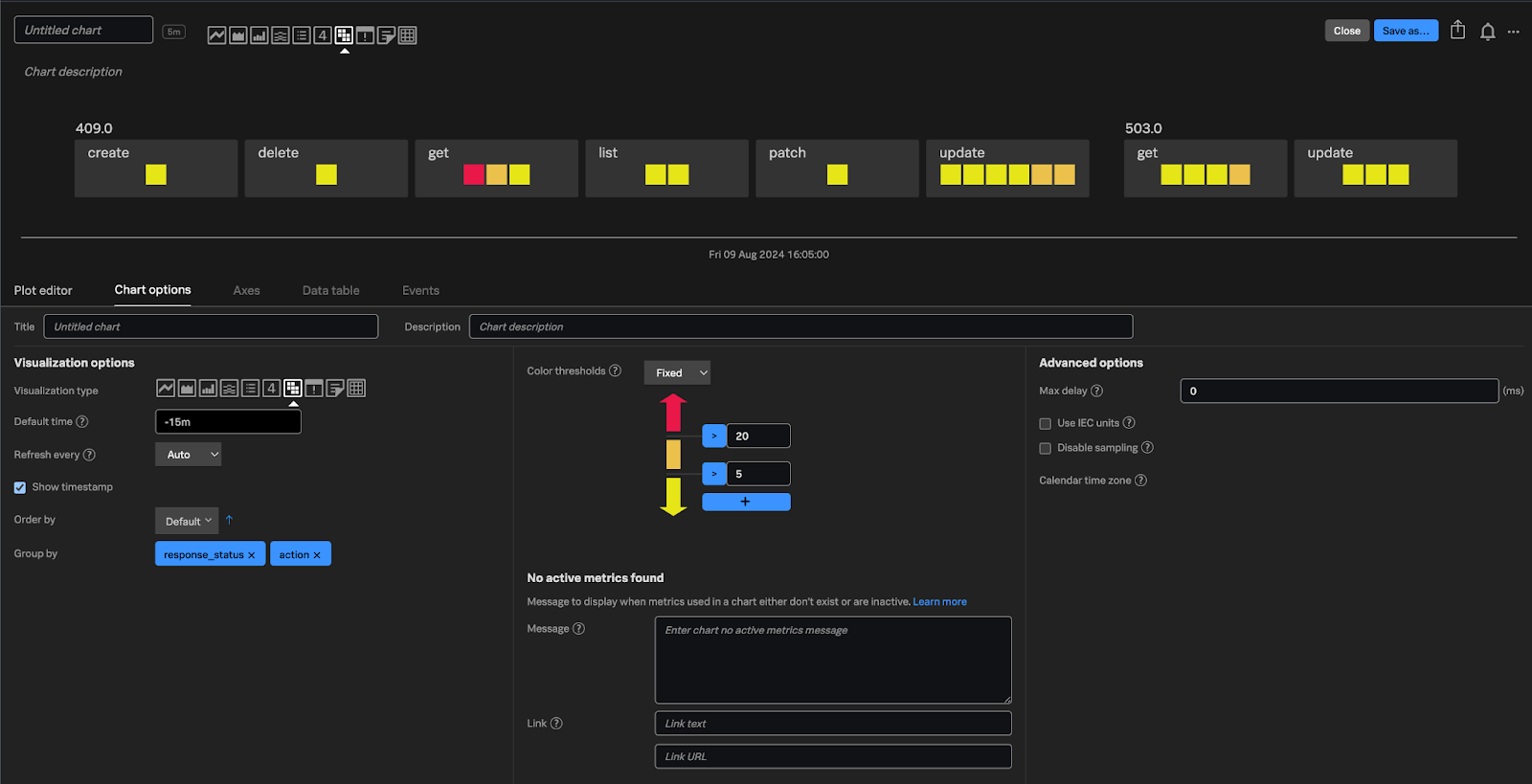
2. In the Plot Editor of the newly created chart enter k8s_audit* in the metric name field. You will use a wildcard here so that you can see all the metrics that are being ingested.
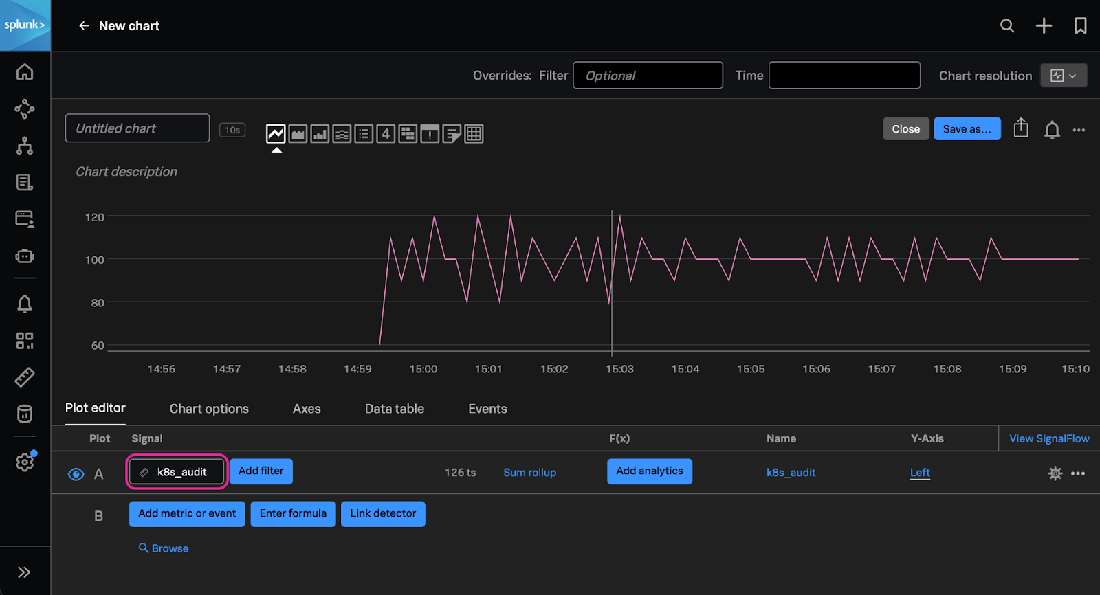
3. Notice the change from one to many metrics, which is when you updated the pipeline to include the dimensions. Now that we have this metric available, let’s adjust the chart to show us if any of our actions have errors associated with them.
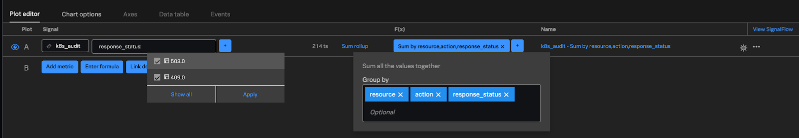
First you’ll filter the Kubernetes events to only those that were not successful using the HTTP response code which is available in the response_status field. We only want events that have a response code of 409, which indicates that there was a conflict (for example a trying to create a resource that already exists) or 503, which indicates that the API was unresponsive for the request.
4. In the plot editor of your chart click the Add filter, use response_status for the field and select 409.0 and 503.0 for the values.
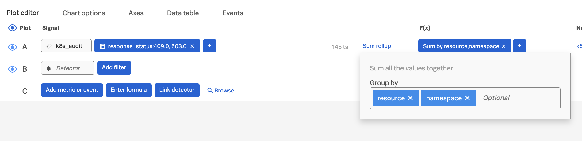
Next, you’ll add a function to the chart which will calculate the total number of events grouped by the resource, action, and response status. This will allow us to see exactly which actions and the associated resources had errors. Now we are only looking at Kubernetes events that were not successful.
5. Click Add analytics → Sum → Sum:Aggregation and add resource, action, and response_status in the Group by field.
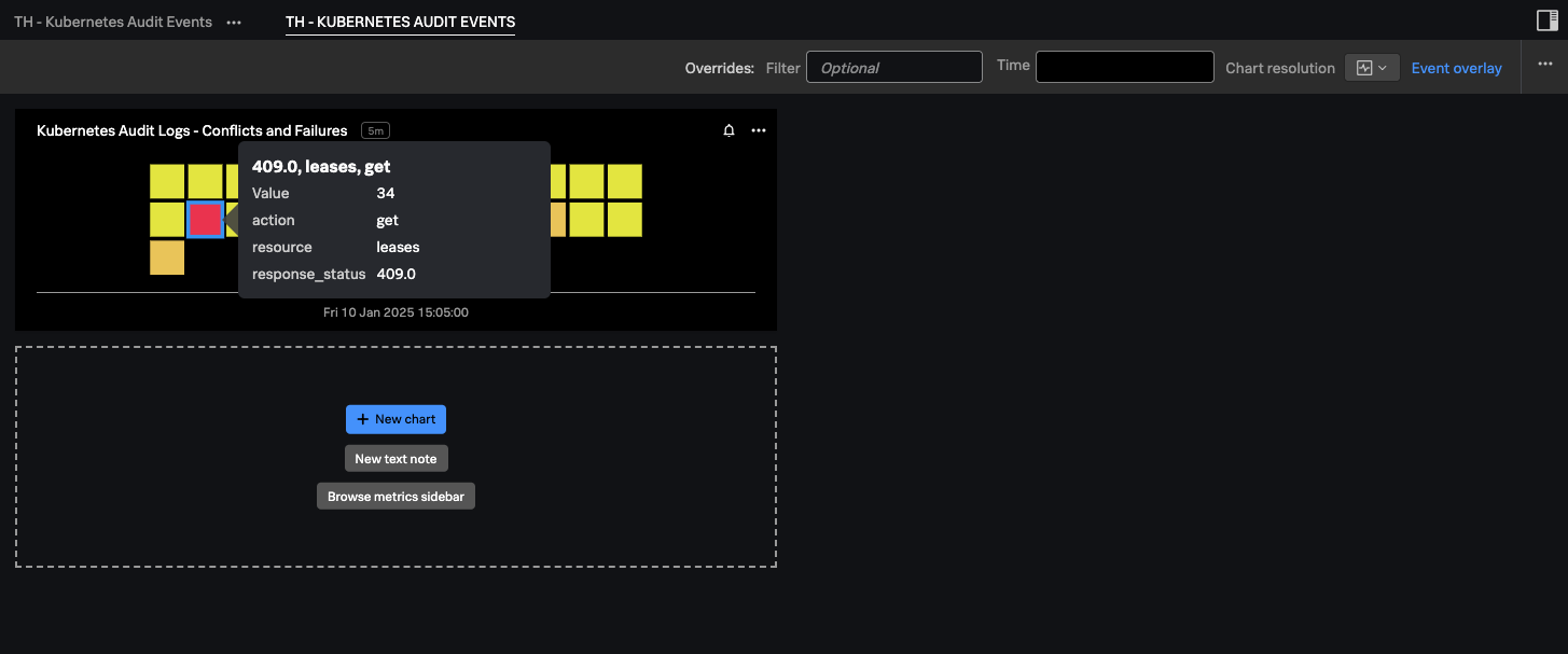
6. Using the chart type along the top buttons, change the chart to a heatmap. Next to the Plot editor, click Chart options. In the Group by section select response_status then action. Change the Color threshold from Auto to Fixed. Click the blue + button to add another threshold. Change the Down arrow to Yellow, the Middle to orange. Leave the Up arrow as red. Enter 5 for the middle threshold and 20 for the upper threshold.
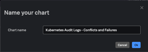
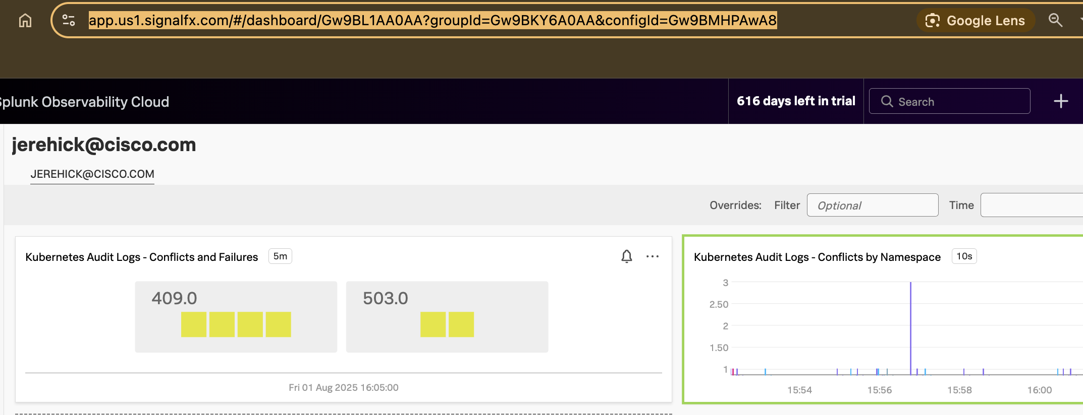
7. In the upper right corner of the chart click the blue Save as…  button. Enter a name for your chart (For Example: Kubernetes Audit Logs - Conflicts and Failures).
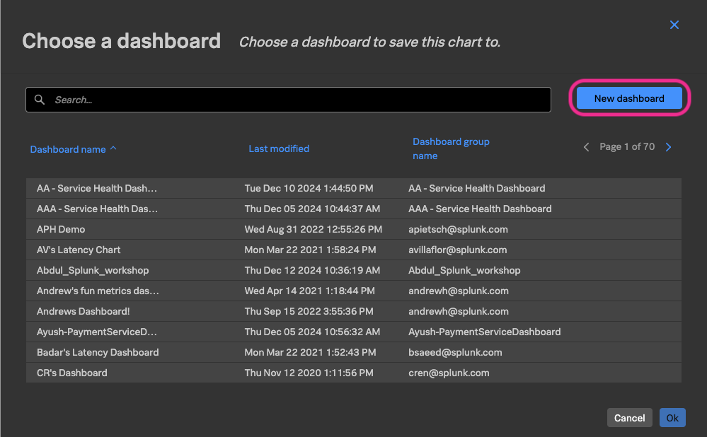
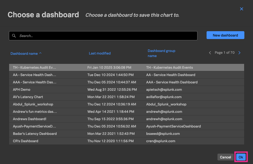
8. On the Choose a dashboard select New dashboard.
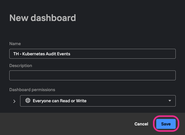
9. Enter a name for your dashboard that includes your initials, so you can easily find it later. Click Save.
10. Make sure the new dashboard you just created is selected and click Ok.
You should now be taken to your new Kubernetes Audit Events dashboard with the chart you created. You can add new charts from other metrics in your environment, such as application errors and response times from the applications running in the Kubernetes cluster, or other Kubernetes metrics such as pod phase, pod memory utilization, etc. giving you a correlated view of your Kubernetes environment from cluster events to application health.
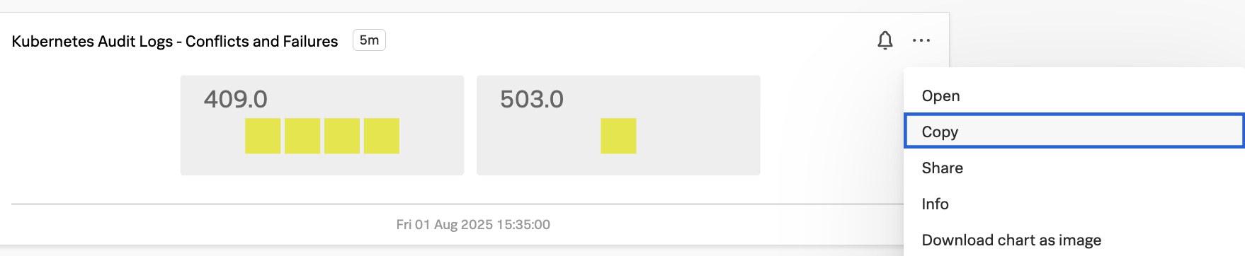
Make a copy of this chart using the three dots ... in the top right of your chart’s visualization box
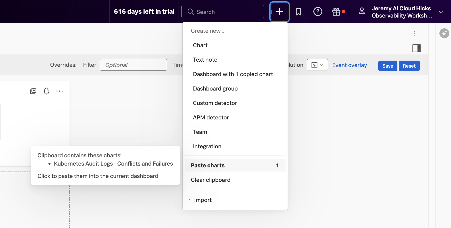
Paste into the same dashboard you’ve been working in using the + icon in the top right of the UI
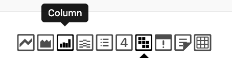
Click into your pasted chart and change the visualization to a Column chart.
Change SUM to just resource, namespace (our filters filter down to just problem codes)
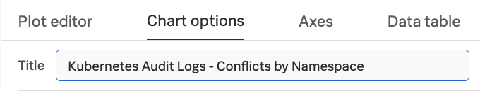
In Chart options change title to Kubernetes Audit Logs - Conflicts by Namespace
Click Save and close
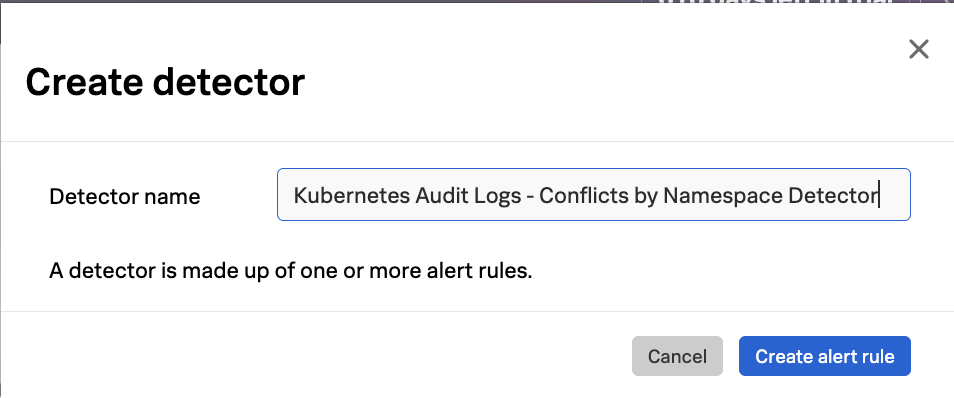
Exercise: Create a detector based on Kubernetes Audit Logs
On your Conflicts by Namespace chart click the little bell icon and New detector from chart
![]()
![]()
Choose a name and click Create alert rule
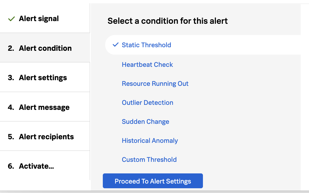
For Alert condition click Static Threshold and click Proceed to Alert Settings
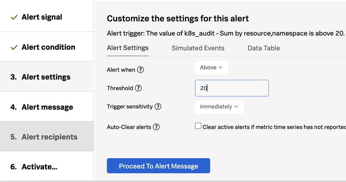
Enter a Threshold of 20
We wont choose any recipients for this alert so click into Activate and choose Activate Alert Rule and Save
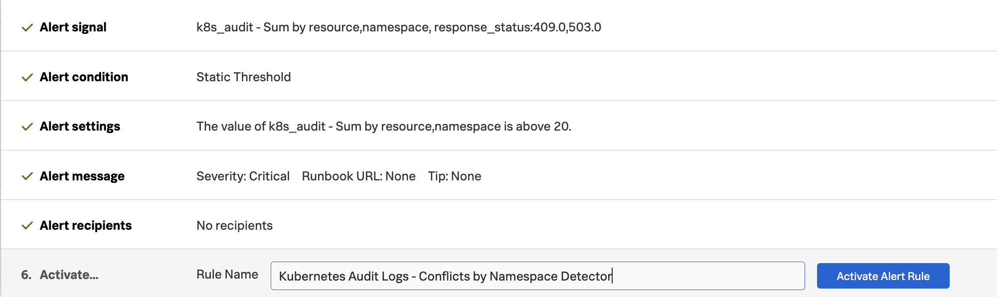
Click Save one final time in the top right to save your detector

Navigate back to your dashboard and you will see a detector associated with the chart denoted by a lit up bell icon on the chart
![]()
![]()
Exercise: Visualize your time series data in Splunk Cloud - Dashboard Studio
Now that we have our time series metrics ingested to the Splunk Observability Cloud data store we can easily visualize these time series metrics in Splunk Cloud!
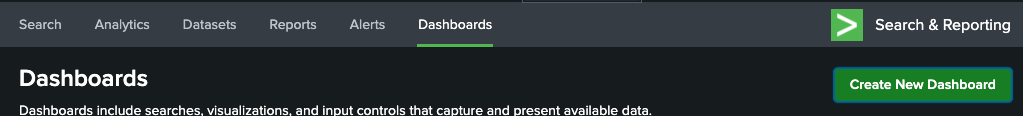
In your Splunk Cloud instance browse to Dashboards and select Create New Dashboard
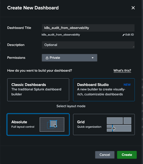
Choose a Dashboard title, permissions and Dashboard Studio along with any Layout Mode. Click Create.
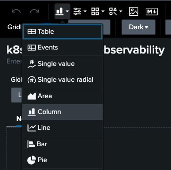
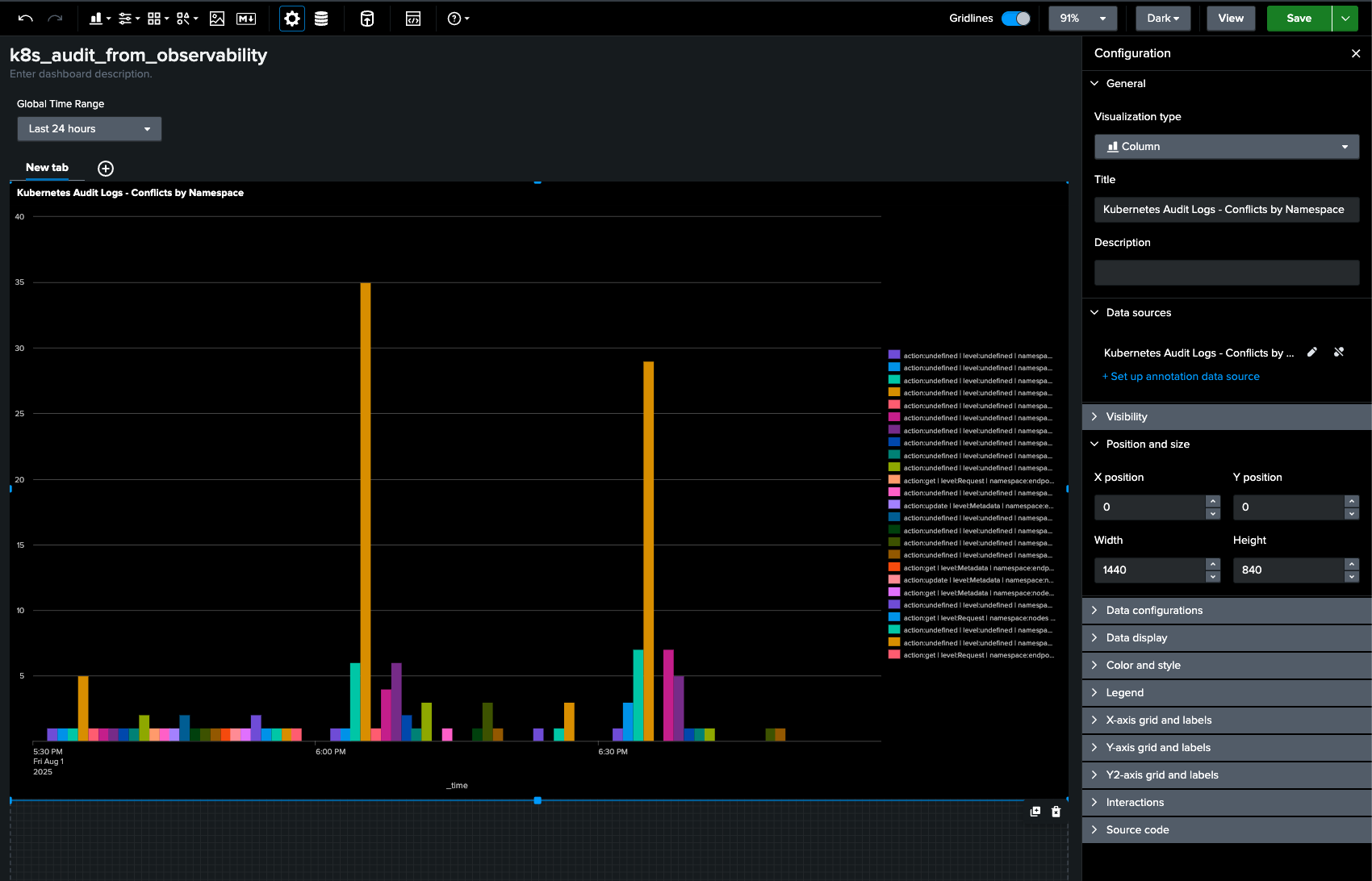
In Dashboard Studio click the chart icon and choose Column
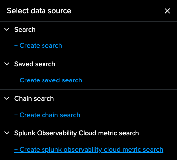
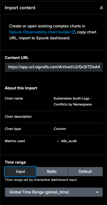
In Select data source choose Create splunk observability cloud metric search
Choose a name for your new datasource and click the Content Import link under Search for metric or metadata
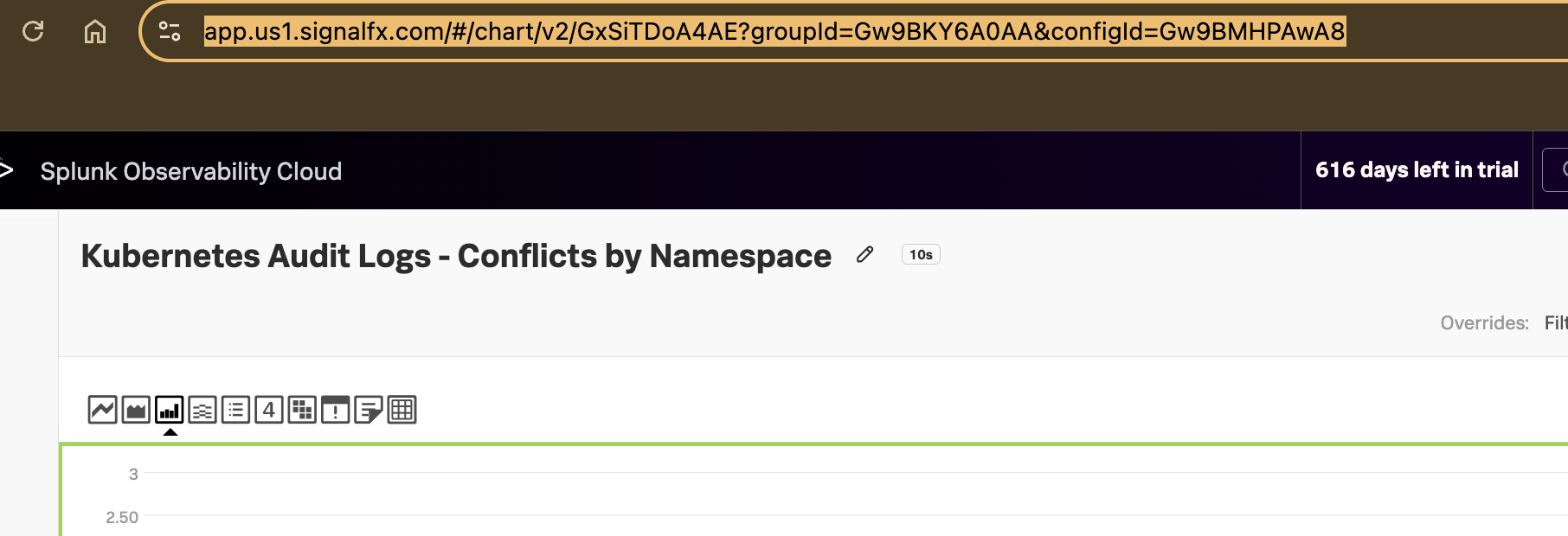
Copy and paste the URL for your chart into the Content URL field
Click Import

Size your chart to your dashboard
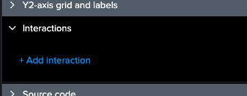
Expand Interactions in the right side of your charts Configuration and click Add Interaction
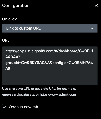
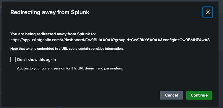
Copy the URL from your dashboard in Splunk Observability
In On click choose Link to custom URL and add the URL for your dashboard in Splunk Observability Cloud for easy navigation back to the source data. Also choose Open in new tab for friendly navigation.
Click Save in the top right to save your Dashboard.

Highlight and click a Column or name in your chart
You will be told you are navigating back to Splunk Observability. Click Continue
You’ve now navigated back to your corresponding Splunk Observability dashboard from Splunk Cloud.