Custom Cell
A Custom Cell is used to update the content of a table cell.
customCell attribute will be used in the table header on the inputs and configuration page.
Properties
| Property | Description |
|---|---|
| globalConfig | is a hierarchical object that contains the globalConfig file’s properties and values. |
| el | is used to render a custom cell element in a table. |
| serviceName | is the name of the service/tab specified in the globalConfig file. |
| row | is the object of the record for which the CustomRowInput constructor is called. |
| field | is the name of the field as specified in the globalConfig file. |
Methods
| Property | Description |
|---|---|
| render | is a method which should have logic for the custom cell component, and it will be executed automatically when the create, edit, or clone actions performed. |
Usage
{
    "name": "account",
    "title": "Account",
    "entity": [],
    "table": {
        "actions": ["edit", "delete", "clone"],
        "header": [{
            "label": "Name",
            "field": "name"
        }, {
            "label": "Auth Type",
            "field": "auth_type"
        }, {
            "label": "Test Custom Cell",
            "field": "test_custom_cell",
            "customCell": {
                "src": "CustomInputCell",
                "type": "external"
            }
        }]
    }
}
Example
class CustomInputCell {
    /**
     * Custom Row Cell
     * @constructor
     * @param {Object} globalConfig - Global configuration.
     * @param {string} serviceName - Input service name.
     * @param {element} el - The element of the custom cell.
     * @param {Object} row - custom row object.
     * @param {string} field - The cell field name.
     */
    constructor(globalConfig, serviceName, el, row, field) {
        this.globalConfig = globalConfig;
        this.serviceName = serviceName;
        this.el = el;
        this.row = row;
        this.field = field;
    }
    render() {
        let html = "";
        // Check for missing configuration in account
        if (this.row.account_multiple_select === "one") {
            html = "Option One";
        } else if (this.row.account_multiple_select === "two"){
            html = "Option Two";
        } else {
            html = "Option is not available"
       }
        this.el.innerHTML = html;
        return this;
    }
}
export default CustomInputCell;
Note: The Javascript file for the custom cell should be saved in the custom folder at
appserver/static/js/build/custom/.
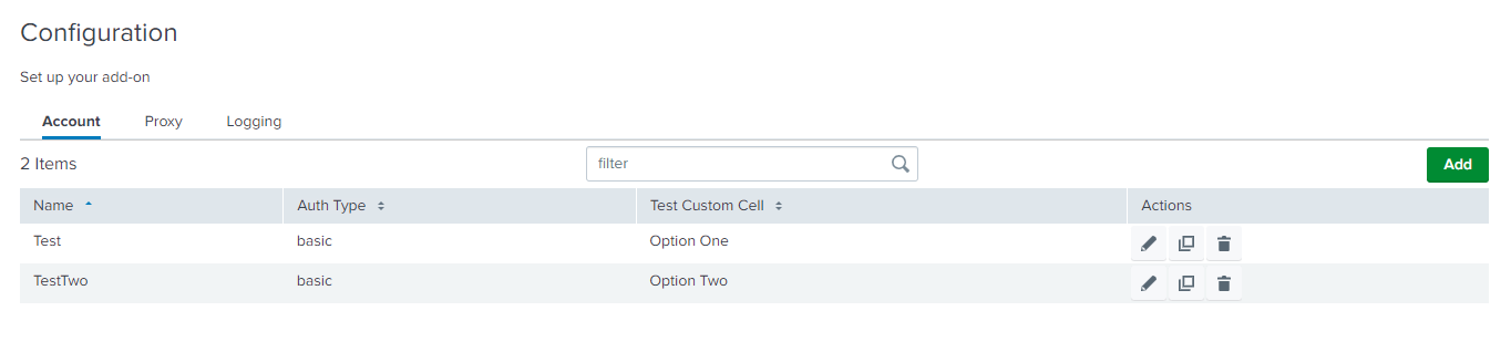
Output
This is how it looks in the UI: