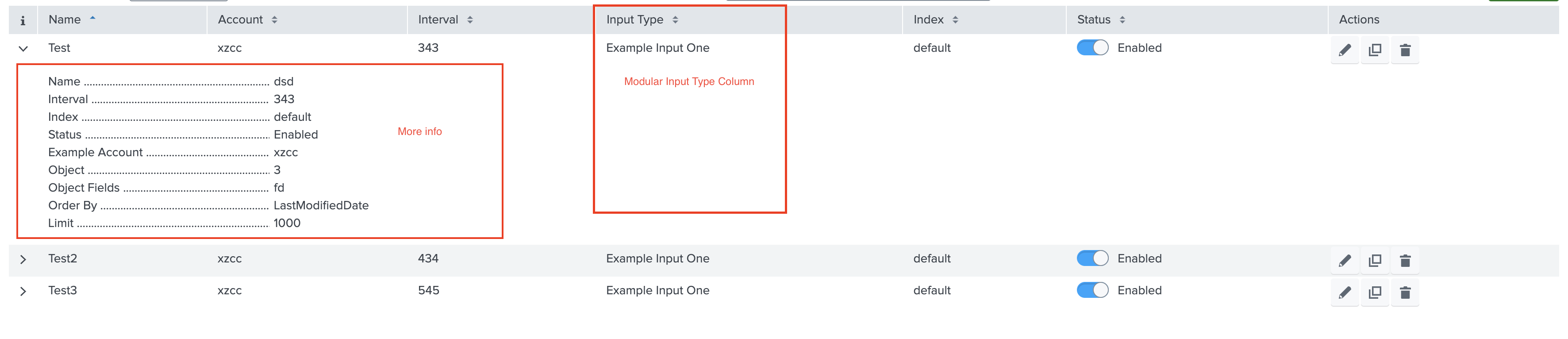
Table
This is a common feature that is used to display the account and input stanzas on the Inputs and Configuration pages, respectively.
Tables include many built-in features such as sorting, filtering, and pagination.
Properties
header* (Array Objects) specifies the list of columns in the table.field* is he name of the field where the column data will be displayed.label* is the title of the column.- mapping is used to map field values to more meaningful values.
- customCell is used to modify the default cell values.
actions* (Array) specifies what type of action can be performed on the stanza. The supported types areedit,clone, anddelete.moreInfo(Array Objects) specifies the list of fields that will be displayed in row form when the user clicks the Row Expand button.fieldis used to dispaly the data in a column.labelis the title of the column.- mapping is used to map field values to more meaningful values.
- customRow can be used to customise the moreInfo Component.
List of built-in table fields for Modular Input
If your add-on has multiple modular inputs and you want to show the input type of each one, use the following in-built field:
| Field Name | description |
|---|---|
| serviceName | It indicates the name of the Input service to be displayed in the table, for example, “example_input_one”. |
| serviceTitle | It indicates the title of the Input service to be displayed in the table, for example, “Example Input One”. |
Usage
"table": {
    "header": [
        {
            "label": "Name",
            "field": "name"
        },
        {
            "label": "Account",
            "field": "account"
        },
        {
            "label": "Input Type",
            "field": "serviceTitle"
        },
        {
            "label": "Input Service",
            "field": "serviceName"
        },
        {
            "label": "Status",
            "field": "disabled"
        }
    ],
    "moreInfo": [
        {
            "label": "Name",
            "field": "name"
        },
        {
            "label": "Interval",
            "field": "interval"
        },
        {
            "label": "Index",
            "field": "index"
        },
        {
            "label": "Status",
            "field": "disabled",
            "mapping": {
                "true": "Disabled",
                "false": "Enabled"
            }
        },
        {
            "label": "Example Account",
            "field": "account"
        }
    ],
    "actions": ["edit", "delete", "clone"]
}
Output
This is how it looks in the UI: